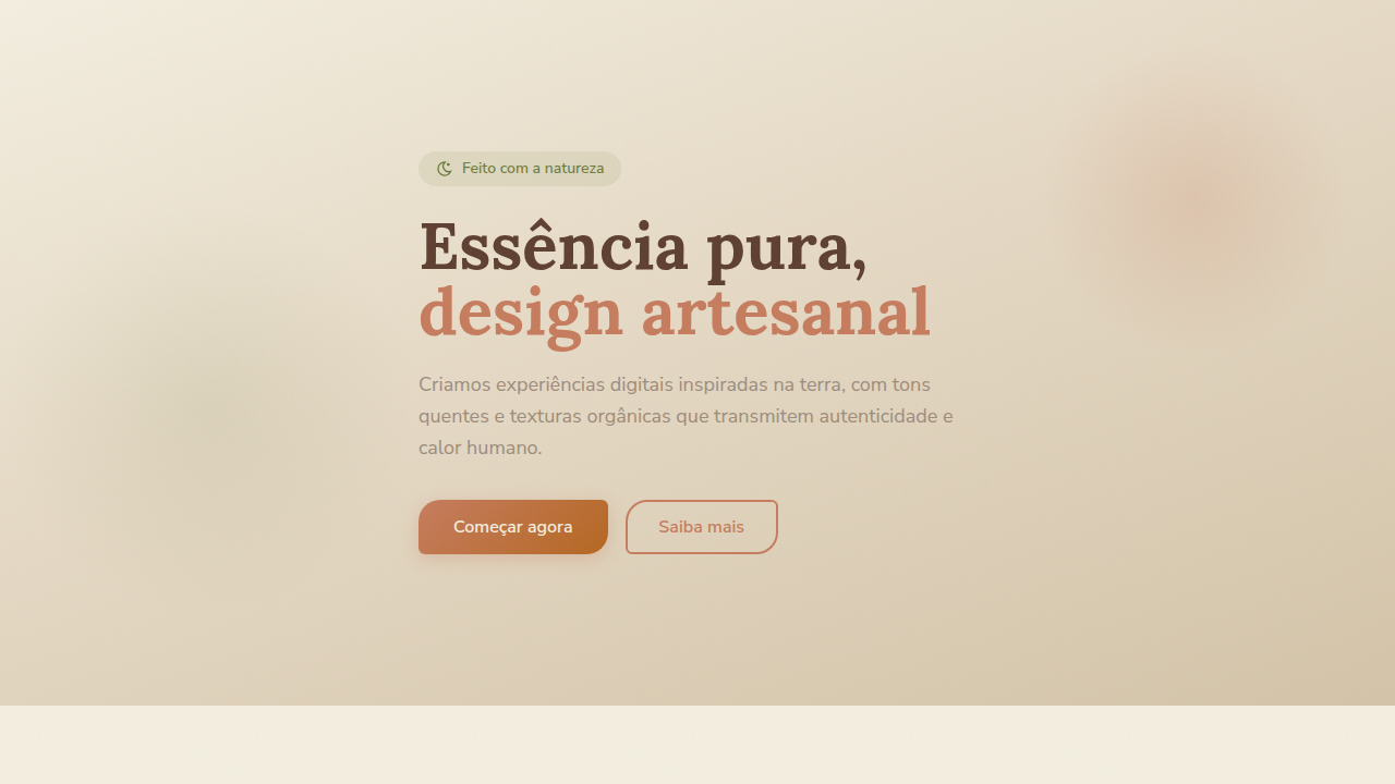
Laranja Queimado Premium
Warm, earthy, and elegant UI with a premium feel. Ideal for marcas orgânicas, cafeterias premium, produtos artesanais, restaurantes farm-to-table, lifestyle natural. AI-ready template.
Use case: Marcas orgânicas, Cafeterias premium, Produtos artesanais, Restaurantes farm-to-table, Lifestyle natural
Historical Context
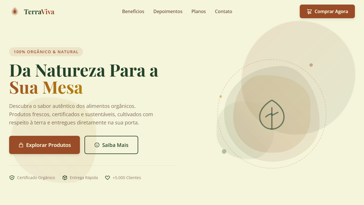
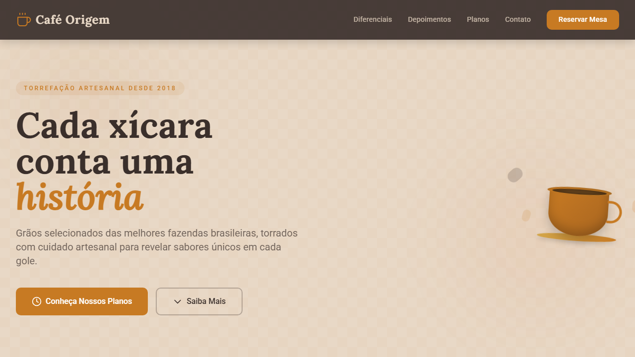
Burnt orange sits at the intersection of earth and fire — a color that humans have trusted since we first ground ochre pigments into cave walls. There's nothing accidental about its resurgence in premium contexts. While cooler palettes dominated the minimalist decade, burnt orange quietly held its ground in architecture, ceramics, and haute couture where material authenticity matters more than trend cycles. The color communicates something specific: that warmth isn't weakness. In a market saturated with clinical whites and safe navy blues, burnt orange signals confidence in craft. It reads as aged leather, terracotta, spice markets, kiln-fired glazes — all things that gain value through process and time. Hermès understood this decades ago. So did every Scandinavian architect who paired it with raw concrete. What makes burnt orange work at the premium tier is its inherent imperfection. Unlike pure orange (which screams retail energy), the burnt variant absorbs light rather than reflecting it. It feels considered rather than loud. It tells your audience you chose depth over safety, substance over sterility.
When to Use
Reach for burnt orange when your brand needs to feel rooted without feeling rustic. It's the right call for autumn product launches, natural and organic positioning, artisan goods that justify their price through craft narrative, and any luxury context where warmth needs to replace coldness without sacrificing sophistication. Avoid it for clinical, tech-forward, or youth-energy contexts — it carries too much gravity for that.
Design Principles
- Pair with deep neutrals (charcoal, warm black, raw linen) — never with other warm saturated hues that compete for attention
- Use as an accent at 15-25% ratio maximum; burnt orange commands a room and needs negative space to breathe
- Desaturate slightly for large surface areas, reserve full saturation for typographic details and interactive states
- Ground it with texture references — matte finishes, grain overlays, natural fiber photography — to reinforce its material origins
- Avoid pairing with cool greys or blue-whites that make it look muddy; stick to warm-neutral companions that share its undertone
Technical Specs
Colors
Primary
Secondary
Effects
Soft gradients, subtle natural textures (wood, linen), elegant serif typography for headings, clean sans-serif for body, minimal and diffused shadows, focus on natural light and depth, smooth transitions
Light/Dark
✓ Full
Related
Last synced: 4/1/2026