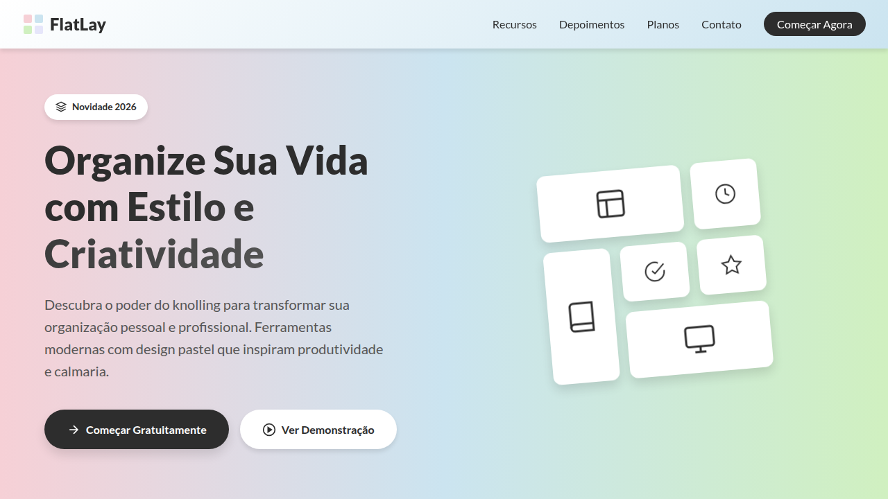
Knolling Pastel Flat Lay
Knolling landing page, flat lay style, organized objects, pastel background, clean 90 degree alignment, overhead photography look. Ideal for landing pages, modern websites. AI-ready template.
Use case: Landing pages, Modern websites
Historical Context
Knolling started on a shop floor. Andrew Kromelow, a janitor at Frank Gehry's furniture studio in 1987, began arranging tools at right angles on flat surfaces — everything parallel, everything visible. Tom Sachs adopted the practice religiously in his studio, turning it into a creative discipline. "Always be knolling" became a mantra. The idea was simple: if you can see everything, you can think clearly. Product photography picked it up fast. Magazines, catalogs, then Instagram. The flat-lay explosion of 2014–2018 turned every lifestyle brand into a knolling practitioner — skincare routines, desk setups, travel essentials, all shot from directly above on muted backgrounds. It was aspirational organization. UI design absorbed this through osmosis. The same overhead perspective, the same pastel restraint, the same obsessive alignment. E-commerce cards started mimicking flat-lay compositions. Hero sections borrowed that clinical-yet-warm tension. The photography aesthetic became the interface aesthetic — soft shadows, generous whitespace, objects floating in deliberate grids. Not skeuomorphism, not brutalism. Something quieter. Something that says: we thought about where everything goes.
When to Use
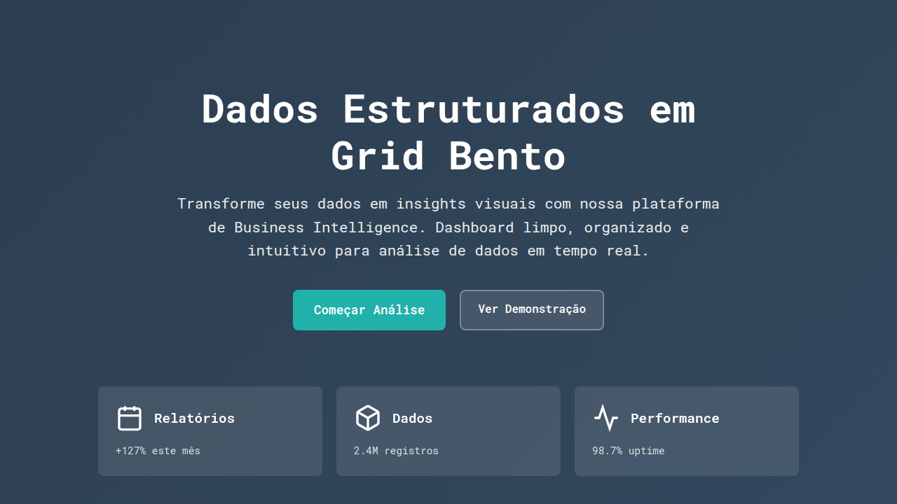
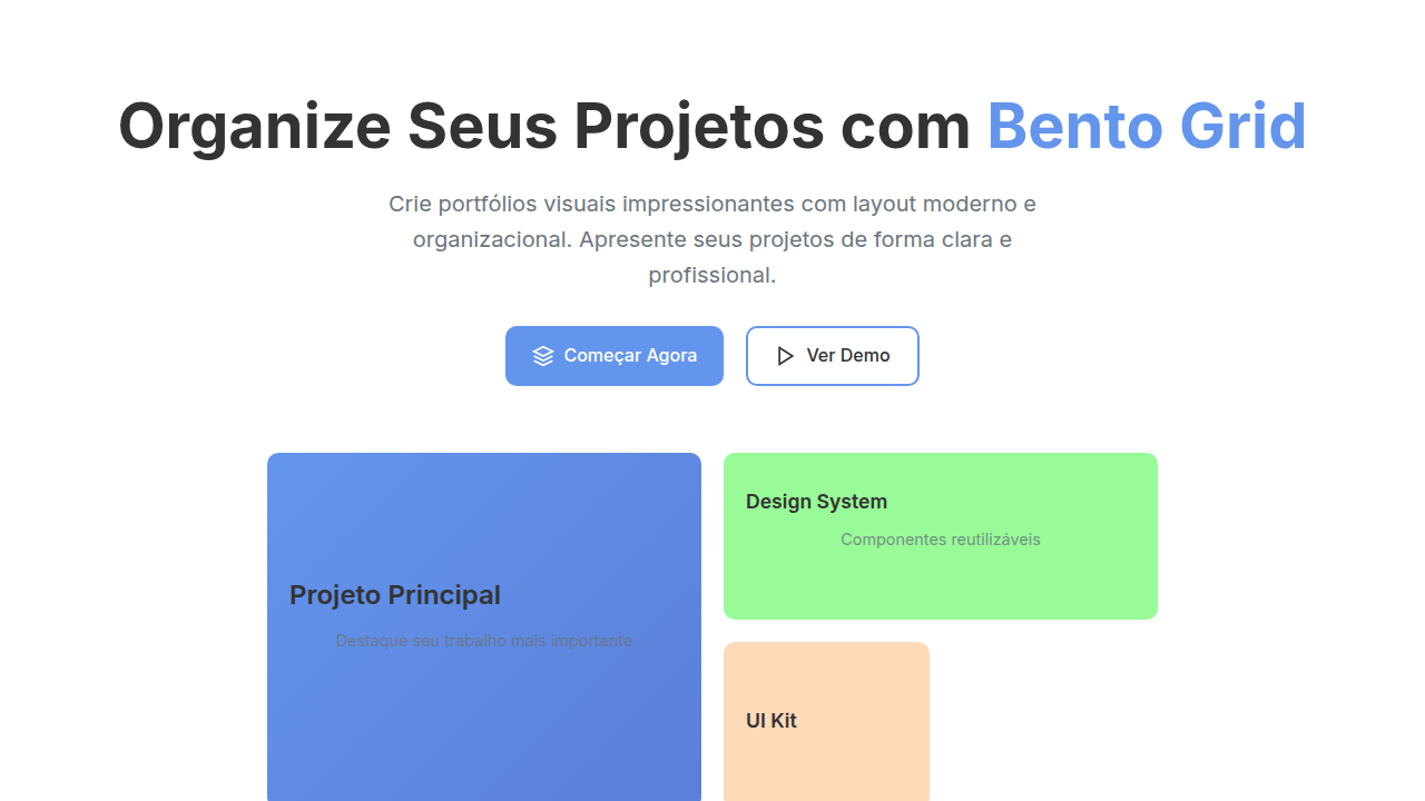
Reach for this when the product itself is the hero. E-commerce pages where you want items to feel curated, not crammed. Lifestyle brands that need warmth without visual noise. Portfolio layouts where spacing communicates taste. It works beautifully for product launches, seasonal collections, and any context where organized simplicity signals premium quality. Avoid it for data-heavy interfaces or anything requiring dense information hierarchy — knolling breathes, and it needs room to do so.
Design Principles
- Orthogonal alignment is non-negotiable — every element sits at 90° to its neighbors, no casual rotations, no 'artful' tilts
- Pastel palette as structural choice, not decoration — muted tones reduce visual weight and let product shapes do the talking
- Generous negative space is load-bearing — the emptiness between objects carries as much meaning as the objects themselves
- Top-down perspective flattens hierarchy intentionally — everything gets equal visual importance, forcing composition to create flow
- Soft shadows only, and sparingly — just enough depth to separate layers without breaking the flat-lay illusion
Technical Specs
Colors
Primary
Secondary
Effects
Photorealistic stationery items, 50/50 vertical background split, tech and analog mixture, soft natural shadows, matte paper stock.
Light/Dark
✓ Full / ✗ No
Related
Last synced: 4/1/2026