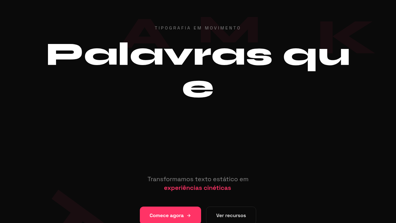
Kinetic Typography
Design with kinetic typography. Ideal for landing pages, saas. AI-ready template.
Use case: Landing pages, SaaS
Historical Context
Kinetic typography didn't start on the web. It started in darkened theaters — Saul Bass splitting words apart for Hitchcock, letters crashing into frame with the weight of a plot twist. The idea was radical: text isn't just something you read. It's something you feel. That philosophy sat dormant in motion graphics for decades, confined to After Effects timelines and broadcast bumpers. Then the web caught up. GSAP's SplitText made character-level control trivial. Framer Motion brought spring physics to individual glyphs. Suddenly, a headline could stagger in letter by letter, words could scatter on scroll, entire paragraphs could breathe with viewport movement. The barrier dropped from 'hire a motion studio' to 'npm install.' What matters now isn't the technology — it's the intent. The best kinetic type on the web today treats letterforms as choreography. Each character has timing, weight, personality. Text stopped being content to animate around. It became the animation itself.
When to Use
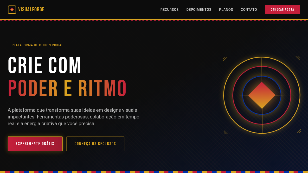
When the words ARE the experience. Agency homepages where the brand voice needs to hit physically. Portfolio pieces where craft demonstration matters more than information density. Music and entertainment sites where energy trumps readability. Brand launches where a single phrase needs to land with cinematic weight. Skip it entirely for content-heavy pages, documentation, or anywhere users need to actually read at speed. Kinetic type is a statement — not a utility.
Design Principles
- Legibility survives motion — if you can't read it mid-animation, the animation fails. Every frame should produce recognizable words.
- Timing is meaning — a slow reveal implies gravitas, a snap-in implies confidence. Don't animate at arbitrary speeds. Choose duration like you choose a typeface.
- One technique per viewport — stagger OR scale OR path. Combining multiple kinetic effects creates noise, not sophistication. Restraint separates craft from chaos.
- Respect the scroll contract — if text animates on scroll, the user must feel in control. Scrub-linked animations feel intentional. Autoplay animations mid-scroll feel like interruptions.
- Performance is non-negotiable — animate transform and opacity only. A janky text animation is worse than static text. 60fps or don't ship it.
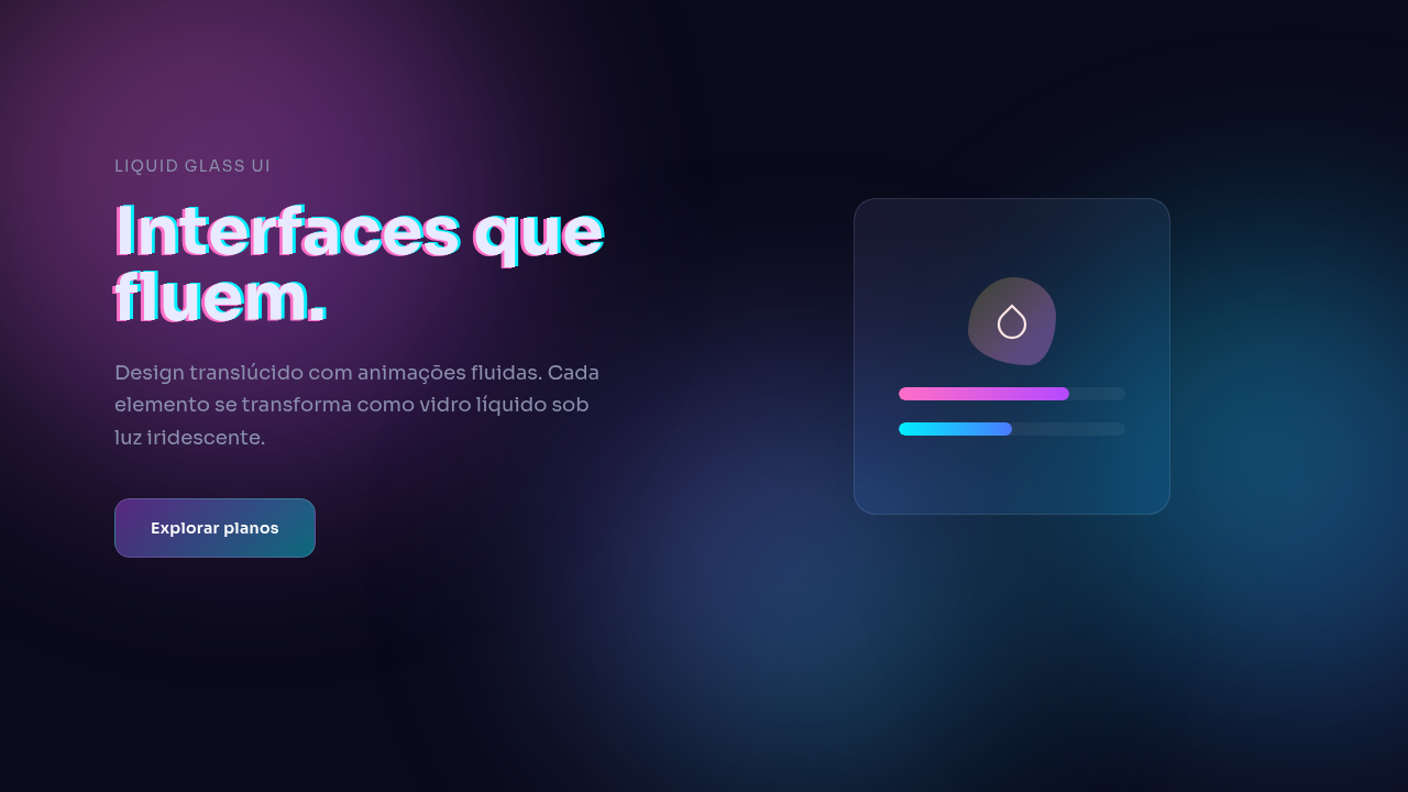
Technical Specs
Colors
Effects
@keyframes text animation, typing effect, background-clip: text, GSAP ScrollTrigger, split text
Light/Dark
✓ Full / ✓ Full
Related
Last synced: 4/1/2026