Isometric Gaming / Voxel
Design an isometric voxel gaming interface. Ideal for landing pages, saas. AI-ready template.
Use case: Landing pages, SaaS
Historical Context
Isometric projection didn't start on the web — it started in the trenches of 16-bit game design. SimCity (1989) proved you could build entire worlds on a 2:1 pixel ratio grid. Diablo took that same angular perspective and drenched it in atmosphere. The constraint was technical — true 3D was expensive — but the result was a visual language that felt deliberate, architectural, almost diagrammatic. Games like Habbo Hotel and early Flash worlds carried it into the internet era. Then Minecraft happened. Notch didn't invent voxels, but he made an entire generation see the world in cubes. Suddenly voxel art wasn't niche — it was cultural shorthand for creativity, building, ownership. The aesthetic bled into everything: album covers, brand illustrations, crypto projects. By the mid-2010s, isometric illustration had become a full-blown web design trend. Slack, Dropbox, dozens of SaaS landing pages — all using isometric scenes to explain abstract products. Some of it was lazy. The best of it retained that game-design DNA: precise grids, playful color, a sense that you could reach in and rearrange the pieces.
When to Use
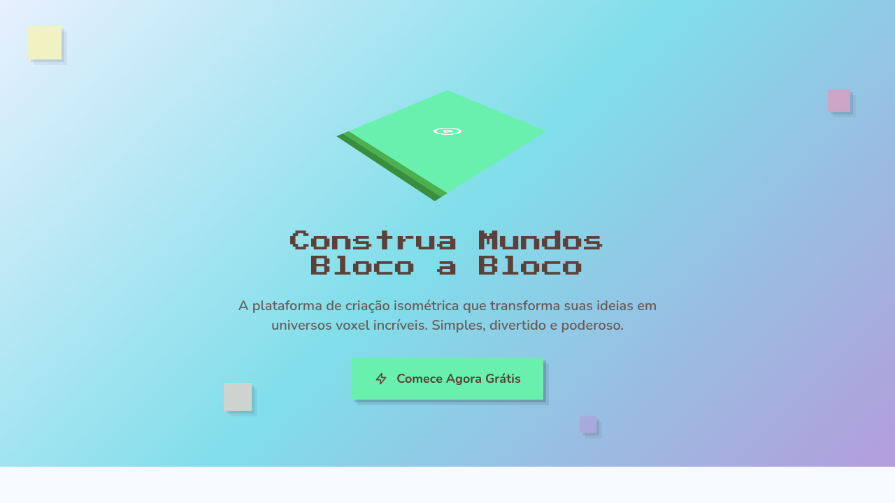
Reach for isometric/voxel when your project needs to feel buildable and playful simultaneously. It's a natural fit for gaming platforms, metaverse interfaces, NFT collections that want retro credibility, and developer portfolios that need personality without corporate polish. The style signals craft — someone placed every cube deliberately. Works beautifully for onboarding flows, feature explanations, and hero sections where you want depth without the weight of photorealism. Avoid it for anything that needs to feel organic or emotionally vulnerable.
Design Principles
- Commit to the grid — isometric projection lives or dies by consistent 30° angles and pixel-perfect alignment. One misaligned cube breaks the illusion.
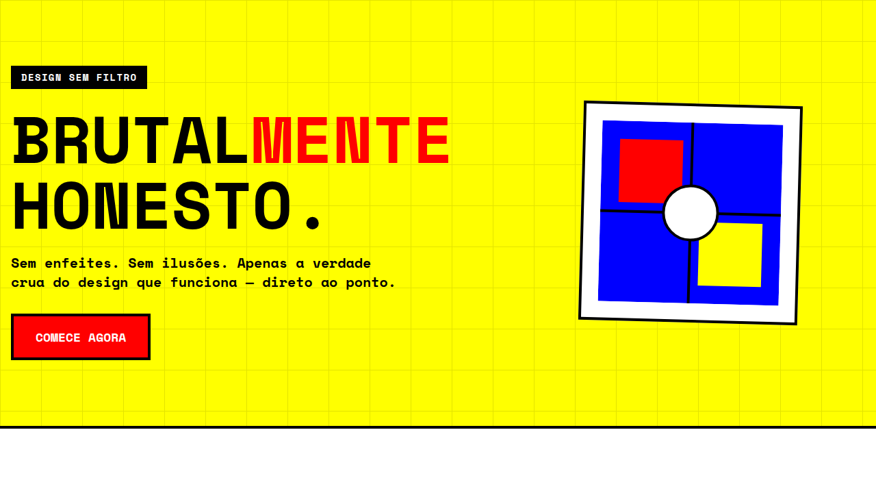
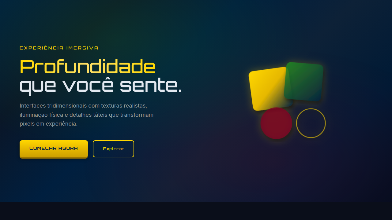
- Limit your palette aggressively. Voxel art gains charm from constraint — 8 to 12 colors maximum, with clear light/shadow faces on each cube.
- Design for modularity. The best isometric systems are built from repeatable blocks that snap together like LEGO, enabling scene composition without redrawing.
- Use depth as information hierarchy. Foreground elements carry primary content, mid-ground provides context, background sets mood — treat Z-axis like typographic scale.
- Animate sparingly but purposefully. A single rotating element or a looping particle effect gives life to a static scene without overwhelming the geometric precision.
Technical Specs
Colors
Primary
Secondary
Effects
Soft high-key ambient lighting, isometric transforms, floating animations, step-down reveal, gentle pastel shadows, bounce on interaction
Light/Dark
✓ Full / ✓ Full
Related
Last synced: 4/1/2026