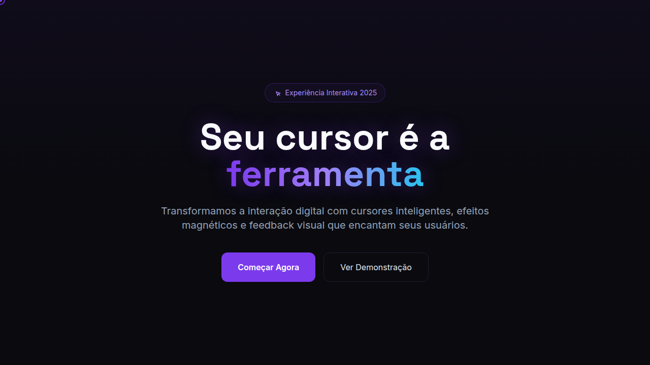
Interactive Cursor Design
Design with interactive cursor effects. Ideal for landing pages, saas. AI-ready template.
Use case: Landing pages, SaaS
Historical Context
Custom cursors have a messy, beautiful lineage. Back in the Flash era, every agency site replaced the arrow with something absurd — a spinning logo, a trailing particle system, a tiny hand that waved at you. It was maximalist and often terrible, but the impulse was right: the cursor is the one element users physically control, so why not make it part of the experience? Flash died, and custom cursors mostly disappeared with it. For nearly a decade, the default arrow ruled. Then around 2018-2019, studios like Locomotive, Aristide Benoist, and Active Theory brought them back — this time with purpose. Modern implementations use CSS cursor properties for simple swaps and JavaScript with requestAnimationFrame for physics-based followers, magnetic effects, and contextual shape-shifting. The cursor became a design tool, not a gimmick. The accessibility conversation is real and unresolved. Custom cursors can disorient users with motor impairments, break expected interaction patterns, and fail entirely on touch devices. The best implementations respect prefers-reduced-motion, maintain click target clarity, and treat the custom cursor as an enhancement layer — never replacing system defaults for users who need them. It's a tension between expression and usability that every team shipping this pattern has to navigate honestly.
When to Use
Deploy custom cursors when the brand demands a tactile, exploratory feel — creative portfolios, immersive product launches, interactive storytelling. They work when the site is already a destination experience, not a utility. Never on dashboards, never on e-commerce checkout flows, never where speed-to-task matters more than delight. If your users arrive to browse and linger, a cursor that responds to context (growing on hover, morphing near interactive elements, leaving subtle trails) adds a layer of craft. If they arrive to accomplish something specific, get out of their way.
Design Principles
- The cursor should react to context, not perform constantly — morphing on interactive elements, resting elsewhere.
- Physics matter more than decoration. Easing, lag, and magnetic pull create believability; static shape-swaps feel cheap.
- Always provide a fallback. Touch devices, reduced-motion preferences, and assistive tech users should never encounter a broken or confusing state.
- Keep the hit target honest. A custom cursor that visually drifts from the actual click point is a UX failure dressed as design.
- Trails and particles are seasoning, not the meal. One subtle trail effect beats three layered animations competing for attention.
Technical Specs
Colors
Effects
Cursor scale on hover, magnetic pull to elements, cursor morphing, trail effects, blend mode cursors, click feedback
Light/Dark
✓ Full / ✓ Full
Related


Last synced: 4/1/2026