IBM Carbon Enterprise
Design an IBM Carbon-inspired enterprise landing page. Ideal for enterprise, infraestrutura cloud, plataformas corporativas, consultoria tech. AI-ready template.
Use case: Enterprise, Infraestrutura cloud, Plataformas corporativas, Consultoria tech
Historical Context
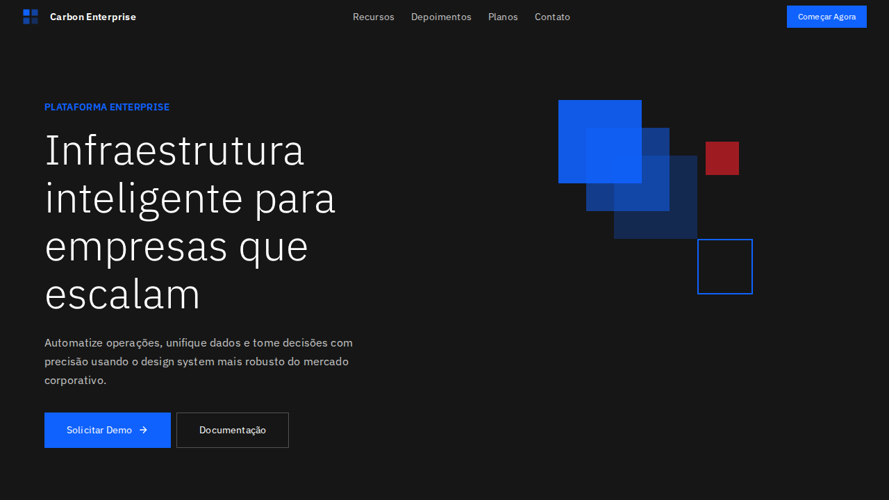
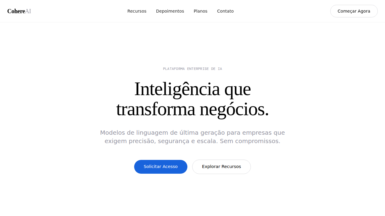
Carbon didn't emerge from a rebrand exercise or a startup's weekend hackathon. It came out of IBM's decades-long struggle with enterprise software that needed to display absurd amounts of data without making analysts want to quit. The system crystallized around 2017 when IBM finally admitted that their sprawling product portfolio—Watson, Cloud Pak, Cognos—needed a shared visual language that could handle density without collapsing into noise. What makes Carbon genuinely interesting is the constraint it was born from: real enterprise environments where a single dashboard might show 200+ data points, where users spend eight hours a day staring at tables, and where "delight" means not getting a headache by 3pm. The 2x grid, the muted cool-gray palette, the obsessive spacing tokens—none of this is arbitrary minimalism. It's information architecture disguised as a design system. Carbon's data visualization library (carbon-charts) deserves particular attention. While most design systems bolt on charting as an afterthought, IBM built theirs from the same atomic tokens. Color sequences are optimized for categorical distinction at scale, not aesthetic pleasure. That's a fundamentally different design philosophy than what you'll find in consumer-facing systems.
When to Use
Reach for Carbon when your interface is primarily about data comprehension at scale—when users need to parse, compare, and act on dense information sets across long sessions. It excels in enterprise dashboards where information hierarchy matters more than emotional engagement, in data platforms where consistency across dozens of views prevents cognitive fatigue, and in corporate tooling where accessibility compliance isn't optional. Skip it if your product needs warmth or personality. Carbon is deliberately impersonal—that's the point.
Design Principles
- Density over decoration — every pixel serves information delivery, ornament is actively hostile to the use case
- Systematic neutrality — the cool-gray foundation exists so data color carries all the semantic weight without competing with chrome
- Predictable rhythm via the 2x grid — spatial consistency reduces parsing effort across marathon work sessions
- Accessibility as structural requirement, not afterthought — WCAG AA minimum baked into token definitions, not patched in later
- Component composability for data contexts — tables, filters, charts, and controls designed to coexist in tight layouts without collision
Technical Specs
Colors
Primary
Secondary
Effects
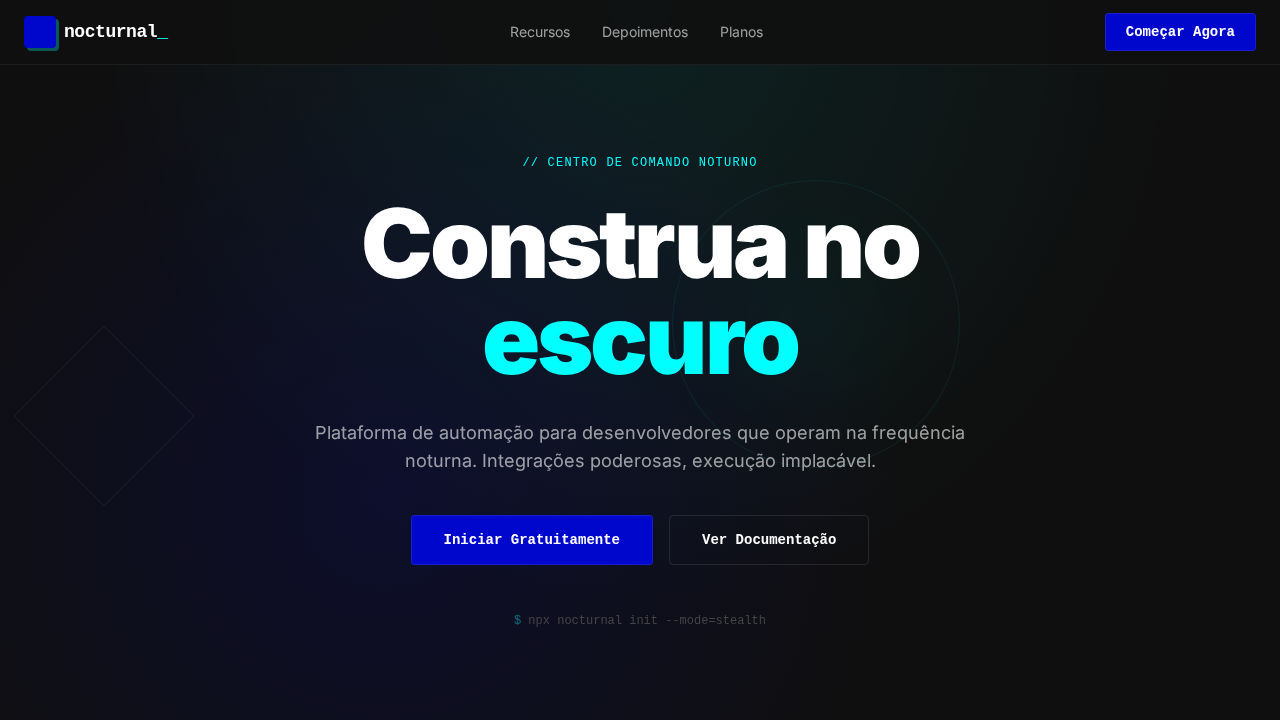
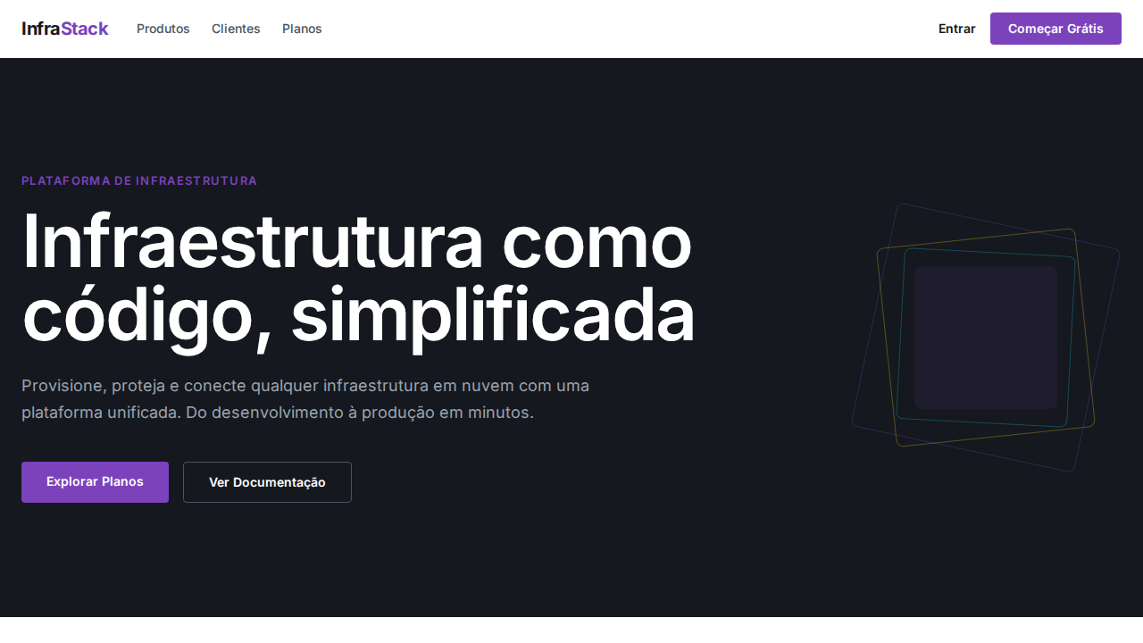
IBM Plex Sans weight 300 (Light) para display — gravitas corporativa com leveza tipográfica. Único acento: IBM Blue 60 (#0f62fe) para tudo interativo. Border-radius 0px em botões primários — retângulos sem suavização. Inputs com bottom-border (não boxed) — padrão Carbon. Profundidade via layering de cor de fundo (branco → gray 10 → gray 20) sem sombras. Grid 2x de 8px com aderência estrita. Token system --cds-* para todas as cores semânticas. Micro letter-spacing (0.16px em 14px, 0.32px em 12px).
Light/Dark
✓ Full / ✓ Full
Related
Last synced: 4/1/2026