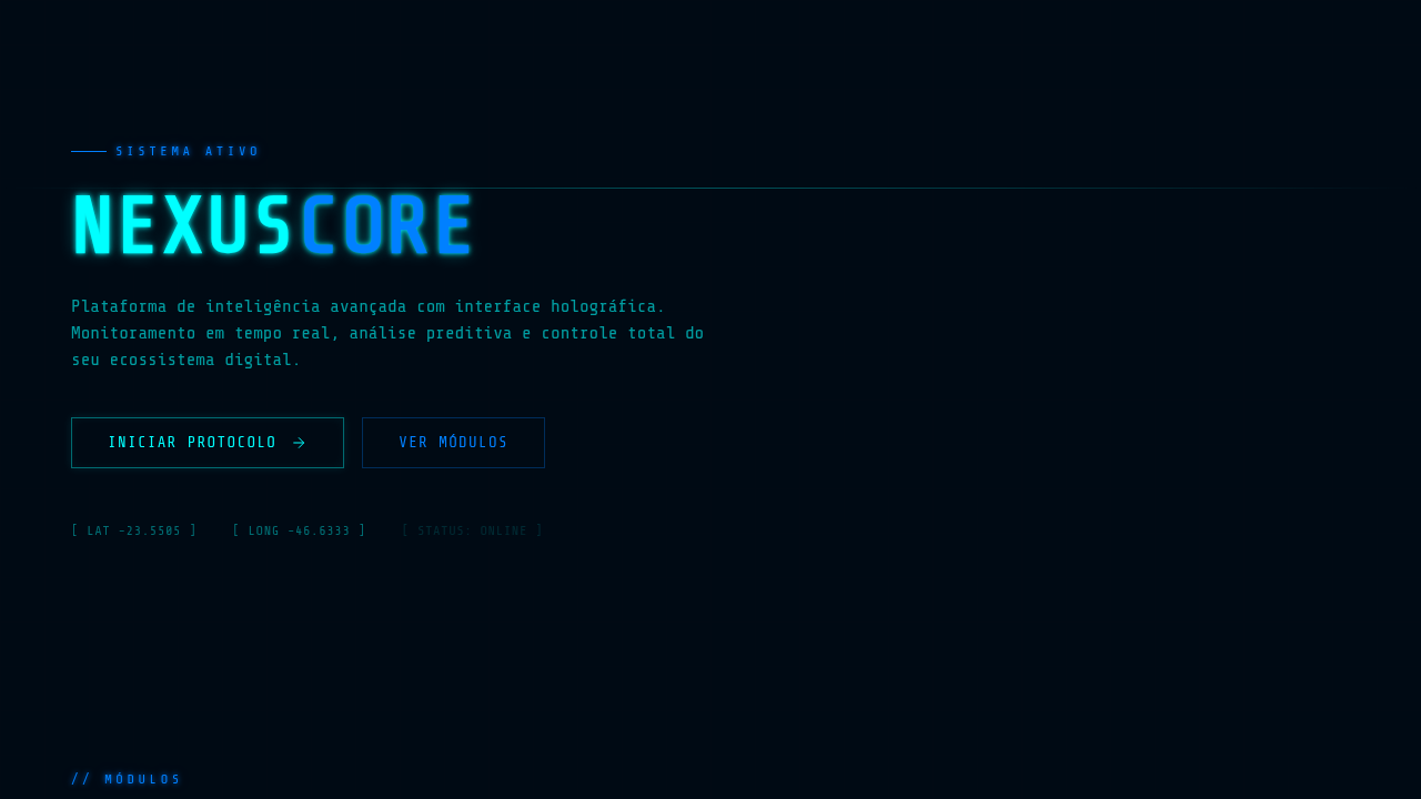
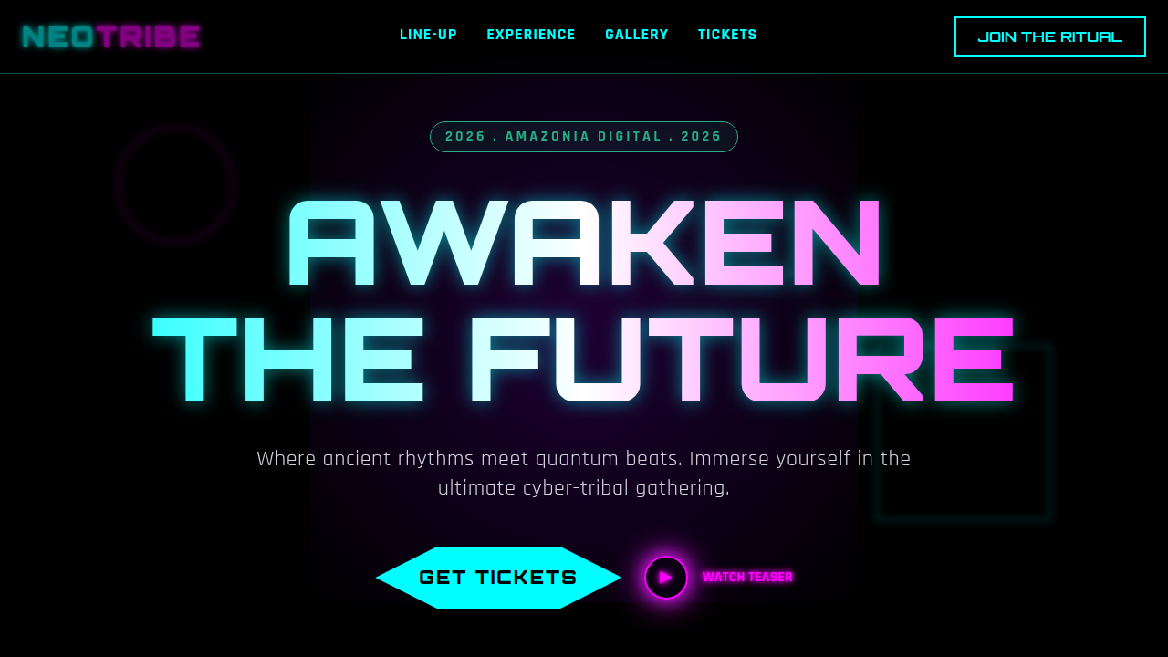
HUD / Sci-Fi FUI
Futuristic HUD (Heads Up Display) or FUI. Ideal for landing pages, saas. AI-ready template.
Use case: Landing pages, SaaS
Historical Context
Before anyone called it FUI — Fantasy User Interface — designers in Hollywood were already solving a fascinating problem: how do you make fictional technology feel inevitable? Steven Spielberg's Minority Report (2002) hired MIT researchers to prototype gestural interfaces that wouldn't exist for another decade. Then Iron Man landed in 2008, and suddenly every screen in Tony Stark's lab needed to feel operable. That film's UI work, largely uncredited at the time, spawned an entire discipline. Jayse Hansen changed the game. His work on Ender's Game, then later Avengers: Age of Ultron, proved that FUI wasn't just eye candy — it was interaction design under extreme narrative constraints. Every element needed to communicate function instantly, without a tutorial, to an audience watching at 24 frames per second. That's harder than most real product design. The discipline jumped off-screen around 2015. AR headsets needed interfaces that floated in space. VR needed diegetic UI that existed within the world. Gaming HUDs borrowed directly from film FUI language. What started as movie magic became a legitimate design practice — one where the rules of flat-screen UI simply don't apply.
When to Use
Reach for HUD aesthetics when your product lives at the edge of technology — VR/AR interfaces, gaming overlays, aerospace dashboards, or anything where users expect to feel like they're operating something powerful. It works for tech demos and pitch prototypes where you need instant "future" credibility. But be honest with yourself: if your users need to fill out forms or read long text, this style will fight you every step. FUI rewards glanceability and spatial awareness, not information density.
Design Principles
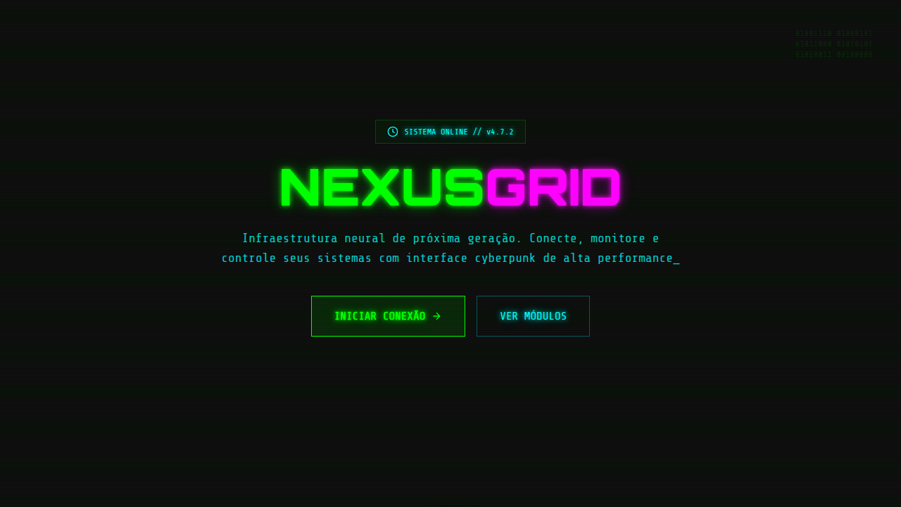
- Transparency and layering — elements exist on planes, never on solid backgrounds. Depth is communicated through opacity, not drop shadows.
- Circular geometry and radial layouts — HUDs orbit focal points. Rectangles feel earthbound; arcs and rings feel engineered for a helmet visor.
- Animated idle states — nothing is static. Subtle rotations, scanning lines, pulsing nodes. A dormant HUD still breathes.
- Monochromatic with strategic accent — one or two hues max, usually cyan or amber. Color means status, never decoration.
- Typography as data — text is always uppercase, monospaced, or both. Labels are terse. If you're writing sentences, you've left the genre.
Technical Specs
Colors
Primary
Secondary
Effects
Glow effects, scanning animations, ticker text, blinking markers, fine line drawing
Light/Dark
✓ Low / ✓ Full
Related
Last synced: 4/1/2026