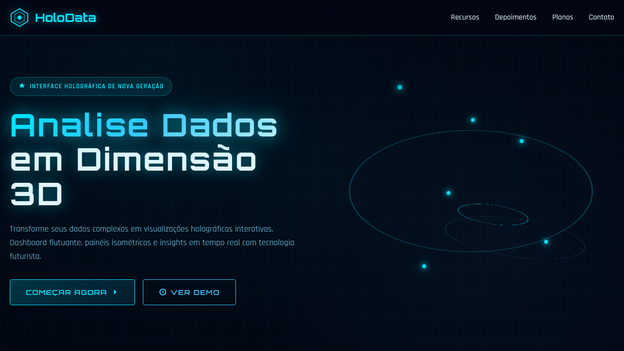
Holographic Data-Viz
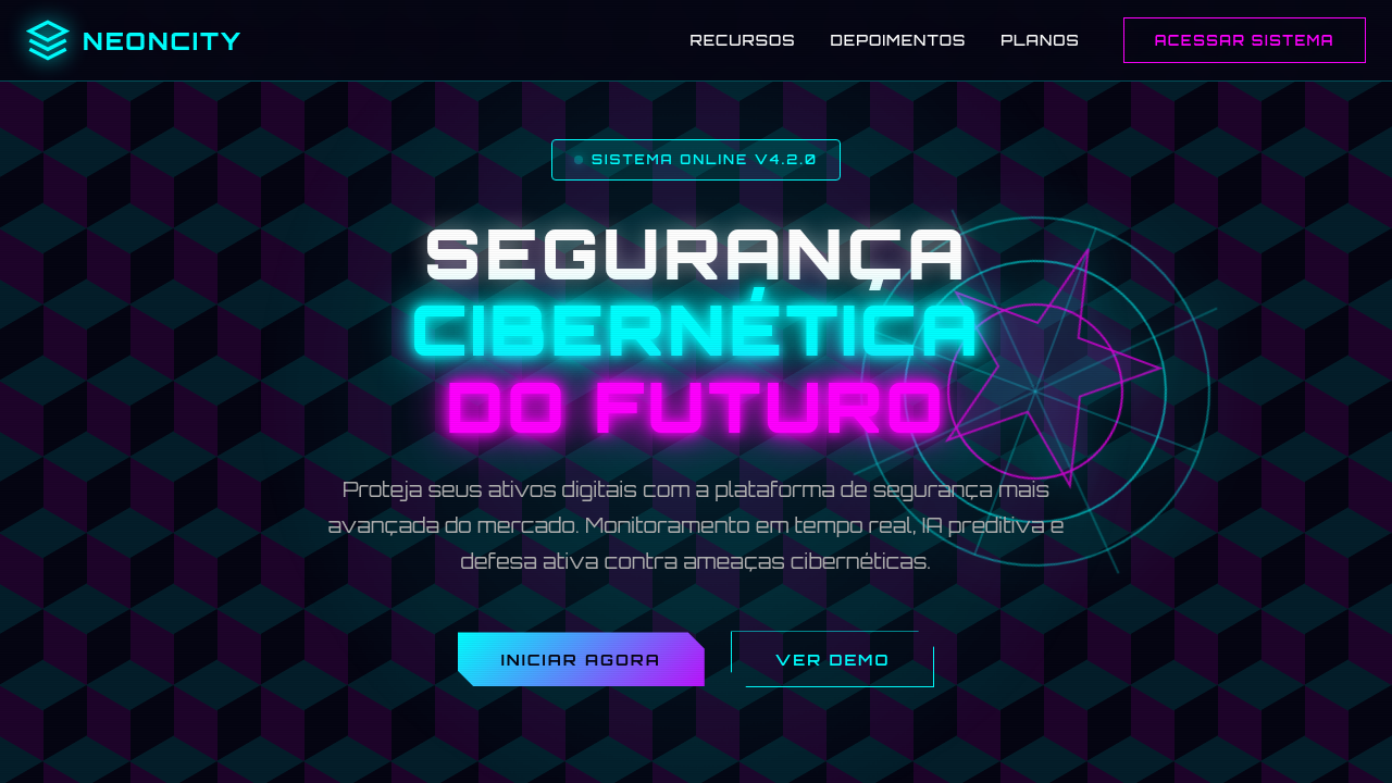
Holographic landing page, data visualization style, futuristic hud, 3d floating elements, glowing blue interface, sci-fi aesthetic. Ideal for landing pages, modern websites. AI-ready template.
Use case: Landing pages, Modern websites
Historical Context
Every designer remembers the first time they saw Tony Stark swipe through JARVIS. That moment — translucent data hanging in mid-air, responsive to gesture, dimensionally rich — rewired our collective expectation of what interfaces could be. Minority Report did it earlier, sure. But Iron Man made it aspirational. Suddenly every dashboard mockup on Dribbble wanted to float. The problem? Reality didn't cooperate. We had flat screens, fixed viewports, and RGB pixels that stubbornly refused to leave the glass. So designers faked it. Bloom effects, glassmorphism, parallax depth layers, pseudo-3D charts with dramatic perspective. The holographic aesthetic became a language unto itself — a way to signal "this is the future" even when the tech wasn't there yet. Now the gap is closing. WebGL matured. Spatial computing shipped. AR headsets actually exist in living rooms. The sci-fi reference frame is no longer fantasy — it's a design target with real constraints, real users, and real accessibility questions we never had to answer when it was just a movie prop.
When to Use
Reach for holographic data-viz when your product needs to communicate complexity without overwhelming. Data platforms drowning in dimensions. Presentation tools that need a "wow" moment without sacrificing legibility. AR/VR environments where depth is literal, not metaphorical. Sci-fi themed interfaces where the aesthetic IS the product promise. Skip it for simple dashboards — floating 3D adds cognitive load. If your data is two columns and a bar chart, this isn't your pattern.
Design Principles
- Depth serves data, not decoration — every Z-axis layer must encode meaning, never just atmosphere
- Glow responsibly — bloom and luminance guide attention hierarchy; overuse flattens everything into noise
- Ground the float — even hovering elements need spatial anchors (grids, shadows, connection lines) so users maintain orientation
- Respect the fallback — design the 2D degradation first, then elevate into 3D; the hologram is progressive enhancement
- Motion is information — rotation, pulse, and drift should communicate state changes, not just look cool
Technical Specs
Colors
Primary
Secondary
Effects
Floating isometric screens, wireframe brain models, luminous particle streams, hexagonal data blocks, glassy ethereal gradients.
Light/Dark
✗ No / ✓ Full
Related
Last synced: 4/1/2026