Grove
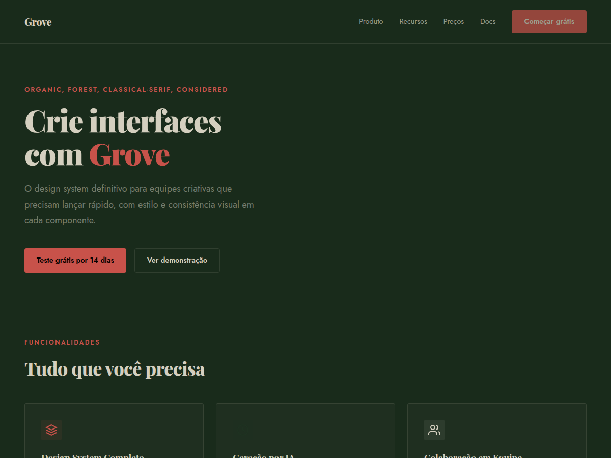
Grove — Forest-green canvas with cream type, classical Playfair serifs, and a single rust accent. Playfair Display typography. deep forest green canvas with warm bone type and a single rust-red accent. Best for sustainability brand, wellness brand, outdoor / nature product. AI-ready design system.
Use case: sustainability brand, wellness brand, outdoor / nature product, winery or restaurant, literary or arts deck, advisory deliverable, bilingual EN/CN deck
Historical Context
The pairing of deep greens with earthy rust tones isn't a trend — it's a return to something older than graphic design itself. William Morris built an entire movement around it in the 1870s, rejecting industrial aesthetics in favor of natural pigments and botanical forms. The Arts & Crafts palette was never about decoration; it was ideological. Green meant growth, craft, resistance to the machine. Playfair Display carries that same tension between refinement and groundedness. Its high contrast and sharp serifs feel editorial, almost aristocratic, but paired with forest green it reads as something rooted rather than precious. The rust accent does the heavy lifting here — it stops the palette from feeling too pristine, too "wellness brand circa 2019." Rust is the color of iron oxidizing, of leaves turning, of things that have been outside long enough to earn their texture. This combination works because it doesn't try to aestheticize nature — it references the actual material reality of organic things. Soil, bark, lichen, patina. Designers who reach for mint and sage are decorating. Grove is documenting.
When to Use
Reach for Grove when the brand has substance behind its sustainability claims — certifications, supply chain transparency, actual dirt under its fingernails. It's wrong for greenwashing. The Playfair serif demands content density: long-form storytelling, ingredient provenance, founder narratives. Works beautifully for DTC organic goods, outdoor heritage brands, regenerative agriculture, botanical skincare with real formulation stories. Avoid if the product is purely digital or the brand voice is playful — Grove is serious without being stern.
Design Principles
- Let texture do the talking — linen backgrounds, grain overlays, and paper-like surfaces over flat minimalism. The palette needs materiality to breathe.
- Playfair owns the hierarchy. Use it for headlines and pull quotes only. Pair with a humanist sans-serif for body text — never let the serif compete with itself at small sizes.
- Rust is seasoning, not the main course. Deploy it for CTAs, accent borders, and hover states. More than 15% coverage and the palette tips from earthy to aggressive.
- Embrace asymmetry and generous whitespace. Nature doesn't center-align. Let compositions feel found rather than constructed — offset grids, ragged edges, breathing room.
- Photography should feel documentary, not aspirational. Overcast light, imperfect produce, hands in soil. The design system falls apart the moment you introduce stock-photo sunshine.
Technical Specs
Colors
Primary
Secondary
Effects
display font Playfair Display for hero headlines, subtle hover (opacity 0.8, 200ms), refined focus rings, alternating light/dark sections for rhythm, forest-green full-bleed hero, rust accent rule lines, cream text
Light/Dark
✓ Full / ◐ Partial
Related


Last synced: 5/6/2026