Gradient Aurora Borealis
Gradient aurora borealis infographic. Ideal for landing pages, modern websites. AI-ready template.
Use case: Landing pages, Modern websites
Historical Context
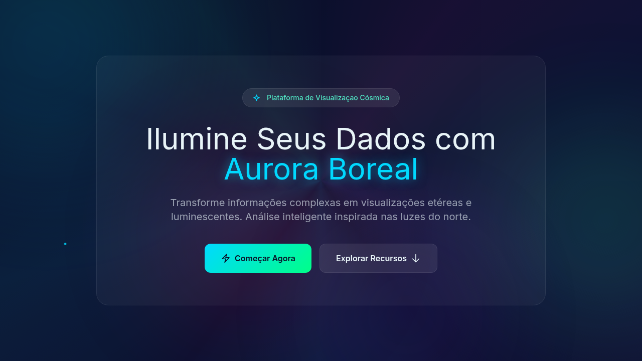
Aurora gradients in data visualization didn't start with dashboards. They started with NASA. The deep blues bleeding into greens, the magenta arcs dissolving into black — these were colors pulled from satellite imagery and repurposed by designers who understood that scientific data deserves more than bar charts on white backgrounds. The space-tech aesthetic emerged in the early 2010s when agencies and premium brands realized that luminescent color transitions could make complex datasets feel approachable without dumbing them down. What makes aurora palettes work in infographics is contrast behavior. Dark backgrounds with glowing data points mimic how we actually perceive light phenomena — bright against void. This isn't decoration. It's leveraging how human vision prioritizes luminance differences. When Bloomberg or SpaceX use these gradients in their data presentations, they're not being flashy. They're encoding hierarchy through light intensity. The premium association is earned, not arbitrary. Luminescent waves signal precision, advanced technology, the kind of care that costs money. A gradient that shifts from deep violet through teal to pale green carries implicit authority — it says this data matters, this organization operates at scale.
When to Use
Reach for aurora gradients when your data lives in scientific, aerospace, or premium-tier contexts. They excel in dark-mode dashboards where glowing data points need to pop against deep backgrounds. Perfect for annual reports that need gravitas without stuffiness, creative presentations where you want the audience to lean in, and any infographic dealing with scale — cosmic distances, market capitalizations, genomic sequences. Avoid them for casual consumer apps or anything that needs to feel warm and approachable. These gradients are cold, precise, and intentionally dramatic.
Design Principles
- Dark canvas first — aurora effects only read correctly against deep, near-black backgrounds. Never place them on white or light gray.
- Limit your luminescent range to 2-3 hue shifts maximum. Real auroras are restrained. Neon rainbow soup is a rave flyer, not a data system.
- Use glow intensity as a data encoding channel — brighter means more important. Don't waste luminance on decorative elements that carry no information.
- Maintain at least 4.5:1 contrast ratio on any text overlaying gradient regions. Beautiful is useless if unreadable.
- Animate sparingly and only along natural wave paths. Horizontal shimmer works. Random particle explosions do not. Movement should feel atmospheric, not mechanical.
Technical Specs
Colors
Primary
Secondary
Effects
Multicolor luminescent lighting, magical glow, aurora wave animations (flowing gradients), cosmic particle effects, ethereal fade transitions, light wave pulses
Light/Dark
✗ No / ✓ Full
Related


Last synced: 4/1/2026