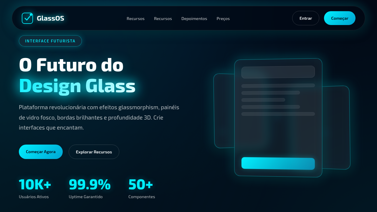
Futuristic UI Glassmorphism
Glassmorphism landing page, futuristic glass ui, transparent panels, blur effects, glowing edges, dark background, 3d interface. Ideal for landing pages, modern websites. AI-ready template.
Use case: Landing pages, Modern websites
Historical Context
Glassmorphism didn't emerge from nowhere. It's the logical endpoint of a decades-long oscillation between flat and dimensional UI. Apple's iOS 7 introduced translucent panels in 2013 — a quiet rebellion against skeuomorphism that planted the seed. But the futuristic variant? That owes more to science fiction than to Cupertino. Think Minority Report interfaces, holographic HUDs in Iron Man, the layered transparency of Blade Runner 2049's data screens. Designers watched those films and thought: what if software actually felt like that? The technical unlock came around 2020 when backdrop-filter finally shipped across browsers without catastrophic performance hits. Suddenly you could layer frosted panels over dynamic backgrounds without faking it with static blurs. The aesthetic exploded on Dribbble, got a name, got overused, got dismissed — and then matured. What survived the hype cycle is the futuristic strain. Not the soft pastel cards of 2021, but something harder-edged. Panels with subtle luminous borders, dark substrates, chromatic refractions at the edges. It stopped trying to look like frosted glass and started looking like engineered light. That's where it lives now — at the intersection of material honesty and speculative fiction.
When to Use
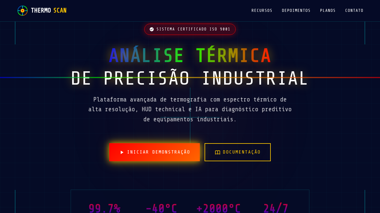
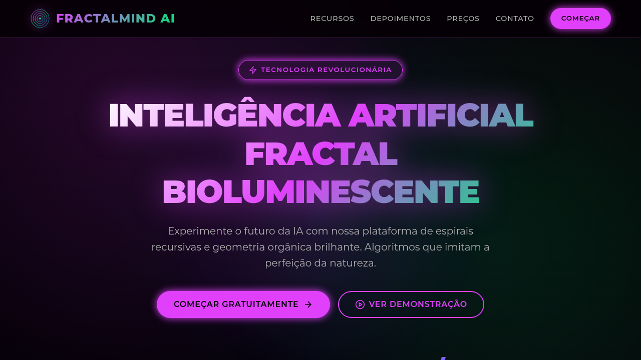
When your product needs to communicate sophistication without weight. Futuristic glassmorphism works in data-dense environments — dashboards, analytics platforms, monitoring tools — where layered transparency creates natural depth hierarchy without adding visual mass. It's ideal for sci-fi themed applications, premium SaaS interfaces, and any context where you want users to feel like they're operating advanced technology. Skip it for content-heavy reading experiences or anything targeting low-powered devices. The blur computations are real, and so is the cognitive load if you overdo the layers.
Design Principles
- Depth through transparency, not shadow — let background content bleed through at 8-15% opacity to establish spatial relationships without drop-shadow crutches
- Border luminance as hierarchy signal — use 1px borders with rgba white (0.08 to 0.15) to separate planes; brighter borders mean closer to the viewer
- Dark substrates only — futuristic glass collapses on light backgrounds; maintain a base below 20% lightness so the frosted layers actually register as distinct planes
- Restrained blur radius — keep backdrop-filter between 12px and 24px; anything higher looks like a loading state, anything lower loses the glass metaphor entirely
- Chromatic accents at interaction points — reserve color (electric blue, cyan, violet) for borders on hover, focus rings, and active states; the glass stays neutral, the light tells you where to act
Technical Specs
Colors
Primary
Secondary
Effects
Isometric 3D rendered assets, glowing circuit board traces, glass-like panels, luminous neon, internal luminescence.
Light/Dark
✗ No / ✓ Full
Related
Last synced: 4/1/2026