Flat Design Financeiro Seguro
Secure and efficient flat design landing page for a personal finance management app. Ideal for landing pages, modern websites. AI-ready template.
Use case: Landing pages, Modern websites
Historical Context
Money is emotional. Every finance app fights the same battle: how do you show someone their debt without making them close the app? Mint figured it out early. Strip everything back. No gradients pretending to be chrome, no faux-leather textures from the skeuomorphic era. Just numbers, color-coded categories, and white space to breathe. The flat interface wasn't a style choice — it was a psychological one. YNAB took it further. Their entire philosophy is "give every dollar a job," and the UI reflects that clarity. Flat cards, muted backgrounds, bold type for the numbers that matter. No decoration competing with your budget. Monzo brought the same thinking to banking itself — that hot coral card wasn't just branding, it was a signal that money doesn't have to feel like a mahogany desk and a stern advisor. The pattern holds across the category. Flat design in finance isn't minimalism for aesthetics. It's minimalism as trust. When you remove visual noise, you remove anxiety. The interface says: this is simple, you can handle this, your money is under control.
When to Use
When your users are already stressed. Banking apps, budget trackers, savings tools, debt payoff calculators — anywhere people interact with their own financial reality. Flat design works here because it reduces cognitive load at the exact moment users need clarity most. Choose this system when trust and approachability matter more than visual richness. Skip it if you're building trading platforms or crypto dashboards where information density and real-time data demand more visual hierarchy than flat patterns naturally provide.
Design Principles
- Reduce visual weight proportionally to financial anxiety — the more sensitive the data, the quieter the interface
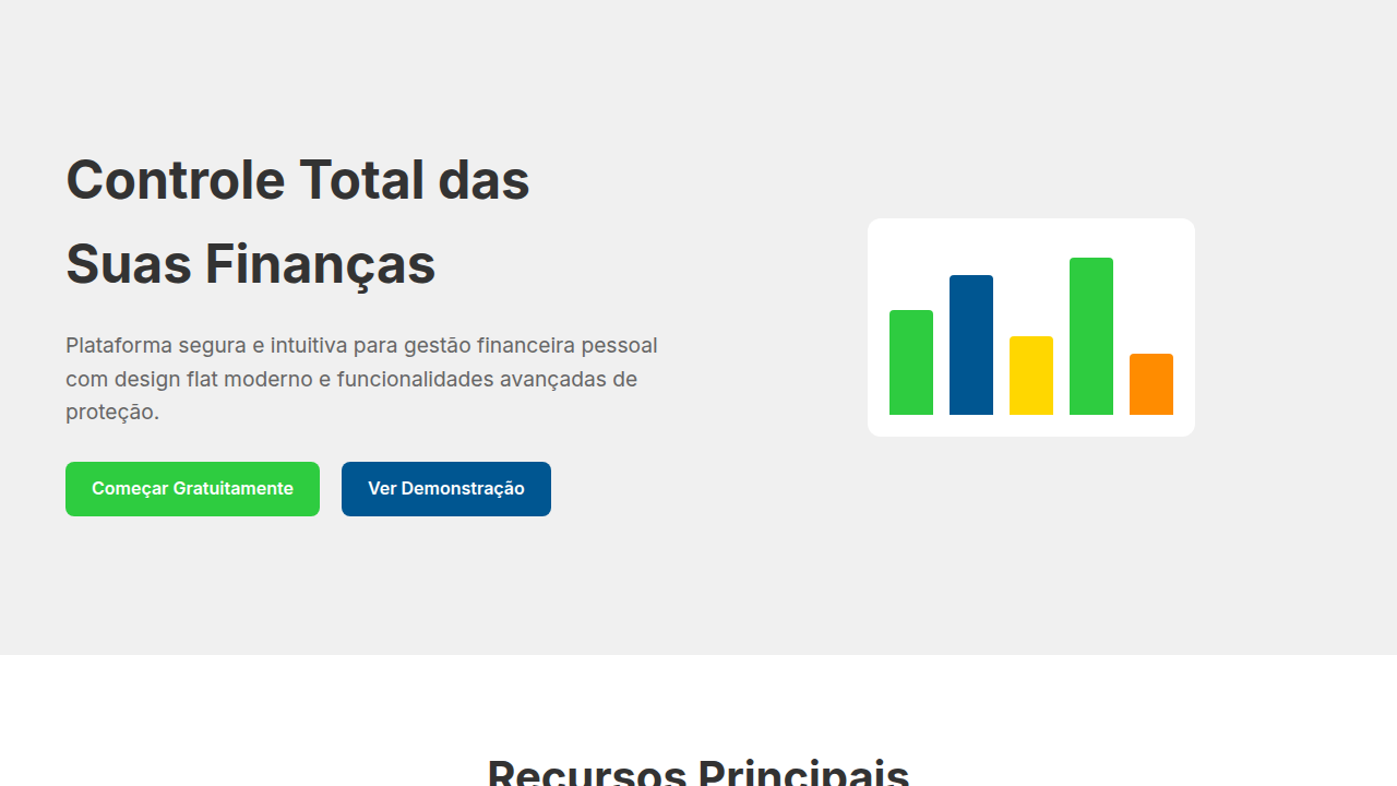
- Use color as semantic signal, never as decoration. Green means growth, red means attention needed, and that's the entire palette story
- Generous whitespace around monetary figures. Numbers need room to be read without triggering overwhelm
- Flat doesn't mean lifeless — subtle elevation on interactive cards and soft shadows on CTAs maintain affordance without breaking the calm
- Typography carries the hierarchy alone. One bold weight for balances, one regular for labels, one light for secondary context. No borders or boxes needed to separate information
Technical Specs
Colors
Primary
Secondary
Effects
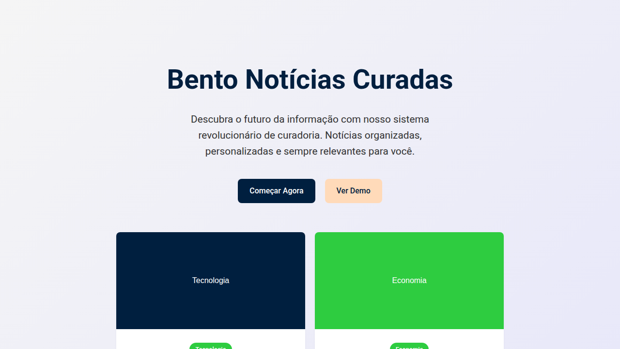
Elementos de interface planos com gráficos de dados claros, cores que indicam status (verde para positivo, vermelho para negativo), tipografia sans-serif legível, ícones de segurança simples, micro-interações de balanço com feedback visual, transições de elementos rápidas e funcionais.
Light/Dark
✓ Full / ✗ No
Related

Last synced: 4/1/2026