Flat Design Educacional Vibrante
Design an engaging and interactive flat design landing page for an e-learning platform. Ideal for landing pages, modern websites. AI-ready template.
Use case: Landing pages, Modern websites
Historical Context
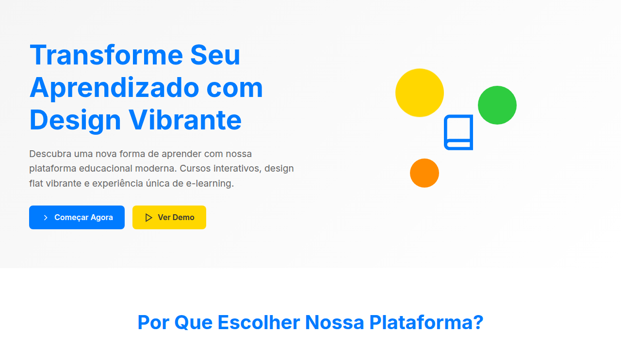
Flat design found its loudest, most joyful expression in education. When Duolingo launched with that lime green owl and those chunky, shadow-free illustrations, it wasn't just a style choice — it was a pedagogical one. Bold, unmodulated color reduces cognitive load. There's nothing to decode visually, so all your mental energy goes to the actual learning. Khan Academy followed a similar logic: clean backgrounds, solid-color UI elements, minimal ornamentation. The content breathes. What makes educational flat design distinct from, say, Microsoft's Metro era is the vibrancy. These aren't muted corporate palettes. They're saturated, warm, almost toy-like. That's intentional. Color psychology in learning environments isn't new — Montessori classrooms have used bold primaries for a century. Digital flat design just translated that principle to pixels. The approach democratized learning interfaces. When everything looks approachable and nothing looks intimidating, the barrier to starting drops. A calculus lesson wrapped in friendly purple and orange feels less like homework and more like play. That's the whole trick.
When to Use
When your users need encouragement more than information density. E-learning platforms where completion rates matter. Kids' apps where delight drives engagement. Interactive courses that compete with TikTok for attention. Onboarding flows that teach product features without feeling like documentation. Anywhere the goal is 'I can do this' rather than 'this looks serious.' Not ideal for dense reference material or professional certification platforms where credibility signals matter more than approachability.
Design Principles
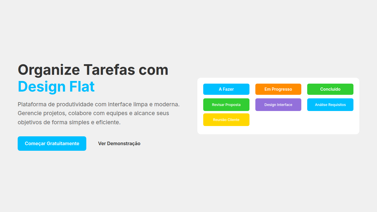
- High-saturation palette with 4-6 bold primaries — no gradients, no shadows deeper than 2px. Each color maps to a content category or progress state, creating wayfinding through hue alone.
- Generous whitespace between interactive elements. Touch targets oversized by 20-30% beyond minimum. Everything breathable, nothing cramped. The layout itself communicates 'take your time.'
- Illustration style: geometric, flat, character-driven. Figures have simple expressions and exaggerated proportions. They celebrate mistakes (confetti on retry, not red X marks). The visual language rewards participation over perfection.
- Typography pairing: one rounded sans-serif for UI and headings (friendly), one clean geometric sans for body text (readable). Weight contrast does the hierarchy work that shadows and borders would do elsewhere.
- Micro-interactions use position and scale — never opacity fades alone. Elements bounce, slide, grow. Motion confirms action and maintains the playful register without becoming distracting during focused learning moments.
Technical Specs
Colors
Primary
Secondary
Effects
Elementos de interface planos com ícones ilustrativos, cores primárias e secundárias vibrantes para categorização, tipografia sans-serif legível, ilustrações vetoriais animadas, micro-interações de progresso com feedback visual, transições de elementos suaves e funcionais.
Light/Dark
✓ Full / ✗ No
Related
Last synced: 4/1/2026