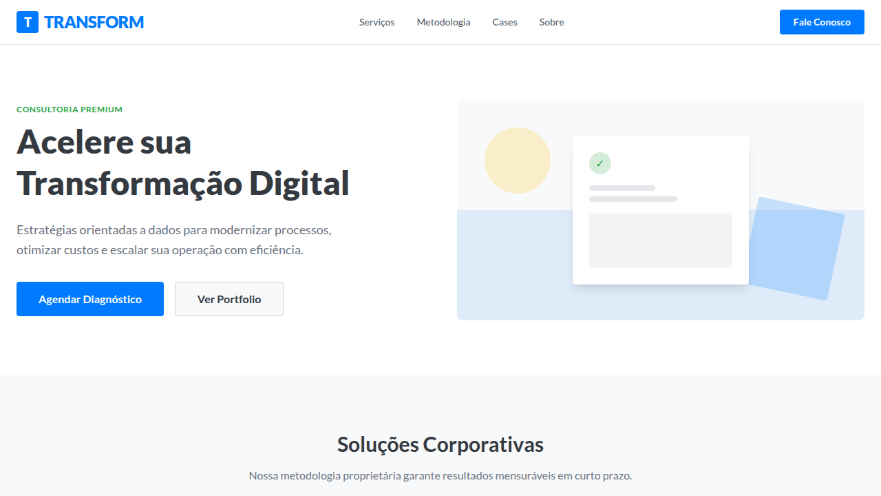
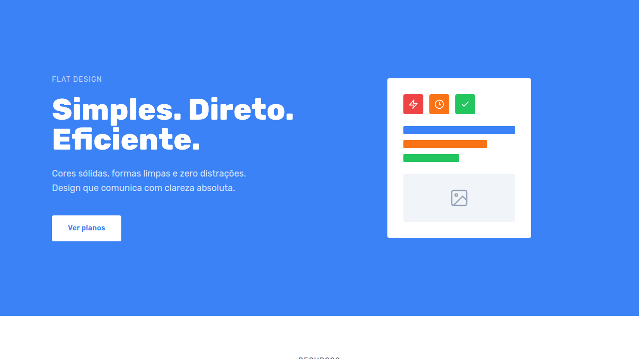
Flat Design Corporativo
Corporate flat design landing page. Ideal for landing pages, saas. AI-ready template.
Use case: Landing pages, SaaS
Historical Context
Corporate flat design didn't win on merit alone — it won on safety. When Microsoft stripped Chrome of its Aero glass in 2012 and Google flattened everything into Material, enterprise teams finally had permission to stop pretending skeuomorphism was necessary. The boardroom exhaled. Clean geometry, solid colors, predictable grids. Nobody gets fired for choosing flat. And that's precisely the tension. Flat became the uniform of serious software — the navy suit of interface design. It signals competence, structure, reliability. Every enterprise SaaS from 2014 onward adopted some version of it because it photographs well in pitch decks and offends absolutely no one. The visual language of "we are a real company." But here's what nobody says out loud: most corporate flat design is boring on purpose. The trade-off is real. You gain instant credibility and cross-cultural neutrality. You lose memorability. You lose the thing that makes someone actually enjoy using your tool on a Tuesday afternoon. The best practitioners know this and smuggle personality back in through motion, spacing rhythm, and typographic choices — not through the color palette.
When to Use
When trust matters more than delight. Enterprise dashboards, B2B platforms, internal tools where users didn't choose to be there — they were assigned. Corporate sites that need to convey stability to procurement teams and CTOs scanning your homepage for thirty seconds. Anywhere the audience penalizes whimsy. Also works when you have twelve product teams shipping independently and need a visual language simple enough that nobody can break it.
Design Principles
- Reduction over decoration — every element earns its pixel. If it's not communicating hierarchy or state, remove it.
- Consistent density — maintain uniform spacing and predictable rhythm so users build spatial memory across screens.
- Color as signal, not atmosphere — reserve saturation for status, actions, and alerts. Let neutrals do the structural work.
- Typography carries the personality — when surfaces are flat and colors are muted, type weight, size contrast, and font choice become your entire voice.
- Structured flexibility — build rigid grid systems with intentional breakpoints for content variation. Flat doesn't mean static.
Technical Specs
Colors
Primary
Secondary
Effects
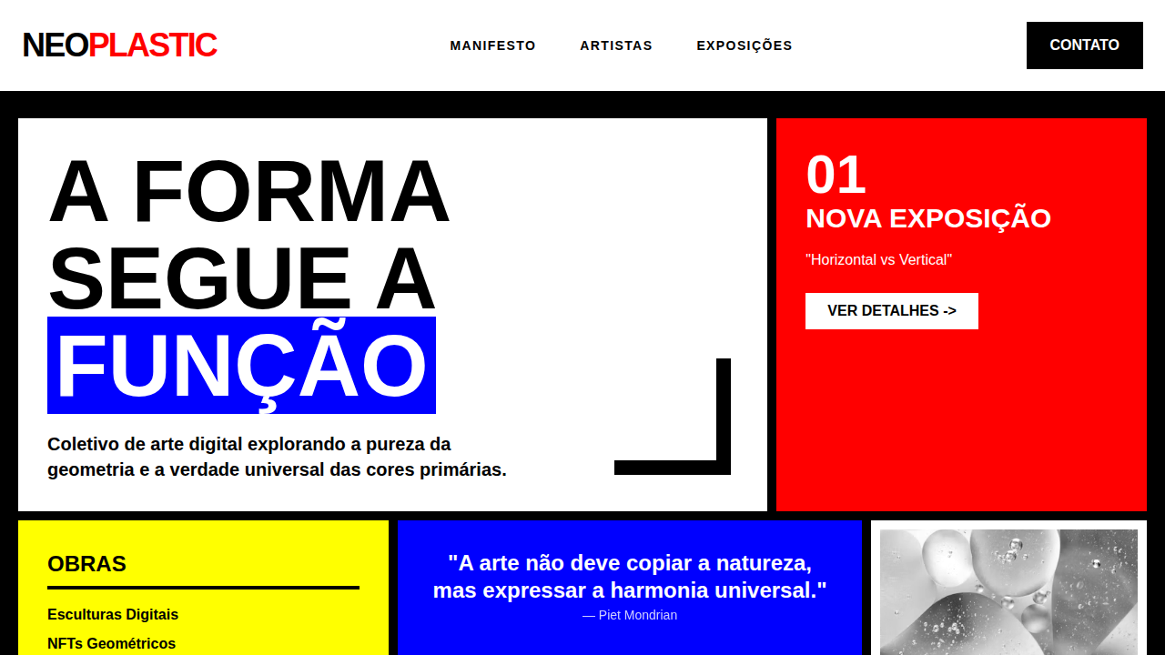
Sharp corners, solid colors, clean typography, intuitive icons, simple animations, clear visual hierarchy, focus on usability, grid-based layout
Light/Dark
✓ Full / ✗ No
Related
Last synced: 4/1/2026