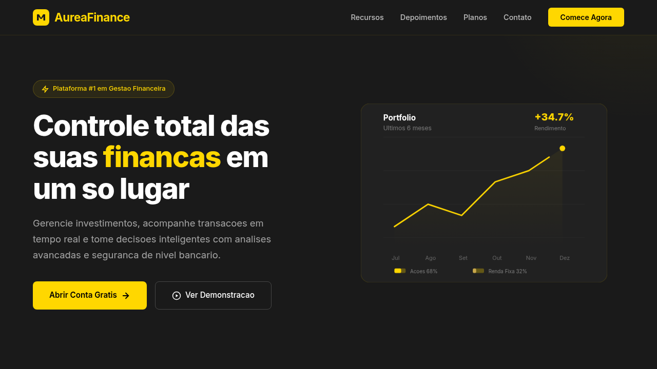
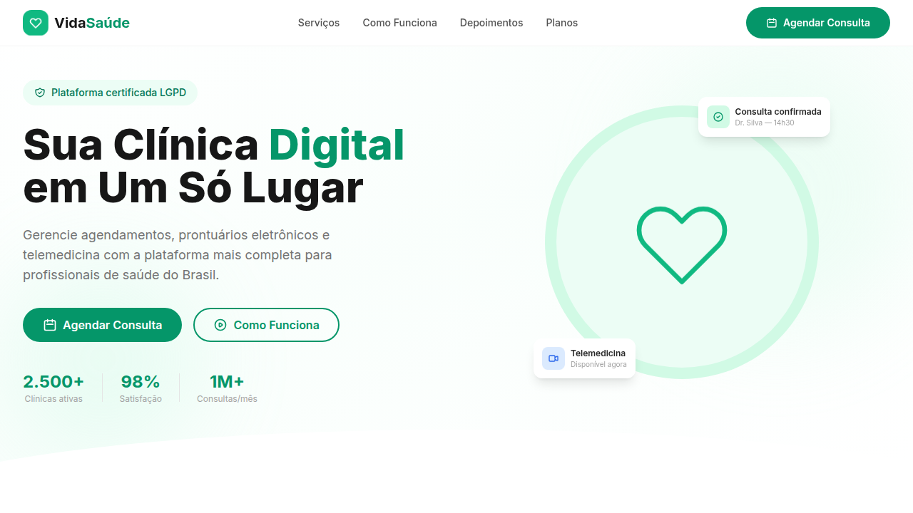
FinTech Plataforma Financeira
Fintech landing, finance dashboard, charts, security, gold and dark palette, premium, trust, transactions, cards, modern UI. Ideal for landing pages, modern websites. AI-ready template.
Use case: Landing pages, Modern websites
Historical Context
Before 2015, banking interfaces were hostile territory. Dense tables, cryptic transaction codes, layouts that screamed "we built this for mainframes and never looked back." Then Revolut, N26, and Nubank flipped the script. They understood something incumbents refused to see: money is emotional, and the interface should respect that. The neobank revolution wasn't just about mobile-first. It was about treating the card as product — a physical artifact that extended the brand into wallets and Instagram posts. Nubank's purple card became a cultural symbol in Brazil. N26's transparent card whispered minimalism. Revolut's metal cards said "I'm in on this." The visual metaphor worked because it collapsed the distance between brand and daily life. What followed was a design language shift across the entire finance vertical. Dark dashboards with glowing accent colors. Smooth transaction feeds that felt like social timelines. Charts that actually invited exploration instead of punishing curiosity. Fintech made finance feel approachable — not by dumbing it down, but by finally designing it for humans who carry phones, not briefcases.
When to Use
Reach for this theme when you're building anything that touches money and needs to feel trustworthy without feeling stiff. Neobank onboarding flows, payment confirmations, investment dashboards, transaction histories, spending breakdowns. It works for consumer fintech apps that compete on experience, and for B2B financial platforms that need to signal modernity to enterprise buyers still stuck on legacy interfaces. If your product shows balances, moves funds, or visualizes financial data — start here.
Design Principles
- Trust through clarity — every number, every status, every action must be immediately parseable. Ambiguity in finance isn't a UX problem, it's an anxiety trigger.
- Data density without overwhelm — financial interfaces carry more information per square centimeter than almost any other vertical. Use hierarchy, whitespace, and progressive disclosure ruthlessly.
- Motion as confirmation — subtle animations on transactions, balance updates, and transfers aren't decoration. They're receipts. They tell users "yes, that happened."
- Color with intent — green for gains, red for losses, sure. But go deeper. Use color temperature to separate accounts, muted tones for historical data, vibrant accents only for actionable moments.
- The card metaphor scales — rounded rectangles with subtle shadows aren't just aesthetic. They map to the mental model of cards, accounts, and containers that users already carry in their pockets.
Technical Specs
Colors
Primary
Secondary
Effects
Fundo escuro com detalhes em dourado, gráficos minimalistas em SVG, hover com glow sutil (box-shadow), animações de números incrementais, cards com sombra e borda suave.
Light/Dark
✗ No / ✓ Full
Related
Last synced: 4/1/2026