Executive Dashboard
Design an executive dashboard. Ideal for landing pages, modern websites. AI-ready template.
Use case: Landing pages, Modern websites
Historical Context
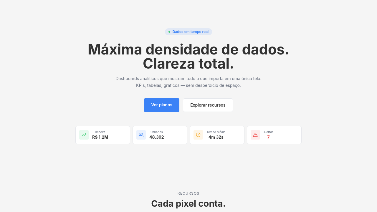
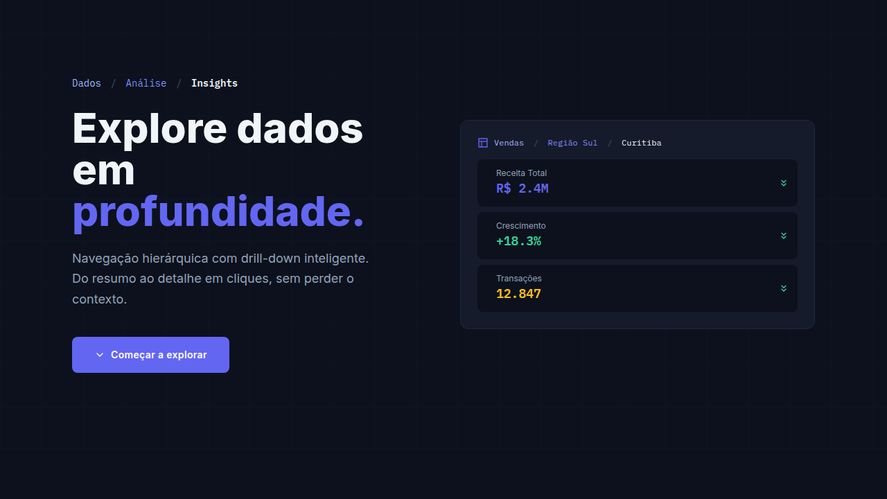
Executive dashboards exist because CEOs don't analyze data — they consume signals. The distinction matters. An analyst dashboard is a workspace: filters, drill-downs, forty charts competing for attention. An executive dashboard is a verdict. Three numbers. Maybe five. Green or red. Done. This pattern crystallized in the 2010s when mobile-first thinking forced designers to ask: what if the viewer has exactly six seconds? Turns out, that's generous for most C-suite interactions. The 'glanceable' philosophy isn't dumbing things down — it's respecting that a CEO's job is decision-making, not data exploration. They need the answer, not the journey. The best executive dashboards borrow more from editorial design than from BI tools. Think magazine covers, not spreadsheets. A single dominant metric anchors the hierarchy. Supporting figures provide context without demanding attention. Everything else lives one tap away, for the rare moment someone actually wants to dig deeper.
When to Use
When your audience makes decisions but doesn't build queries. Board meetings where you have ninety seconds to communicate company health. Monday morning standups where leadership needs a pulse check, not a deep dive. Investor updates. Status walls in offices. Anywhere the viewer's next action is 'got it' or 'let's talk about this one number' — never 'let me filter by region.' If someone needs to slice the data, this isn't their screen.
Design Principles
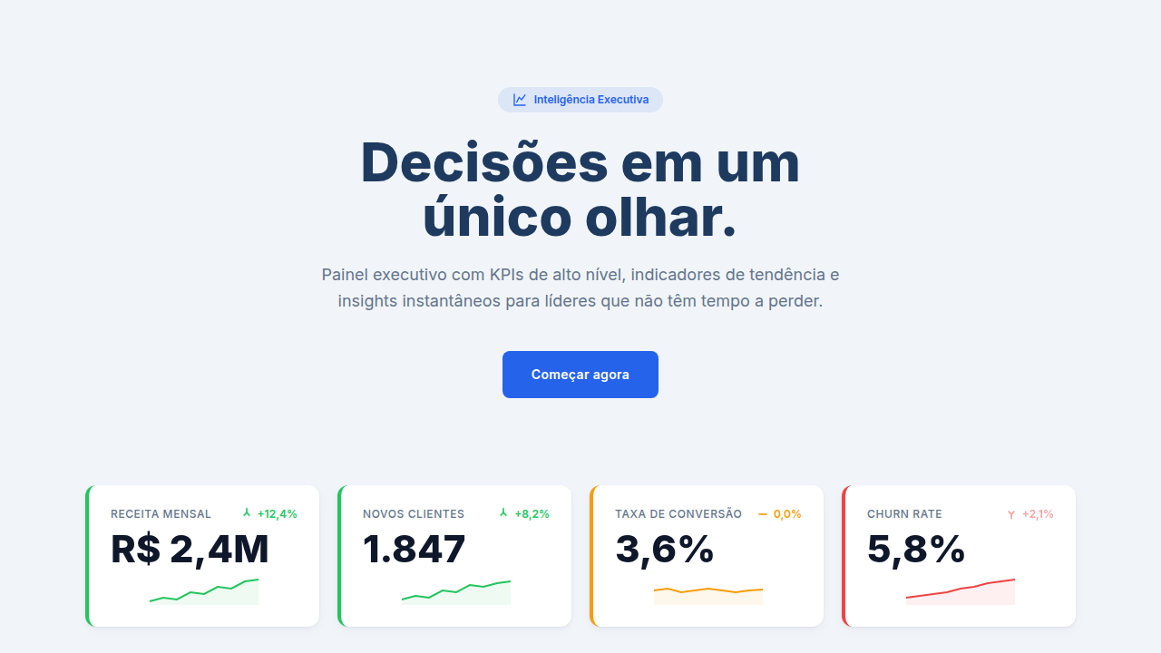
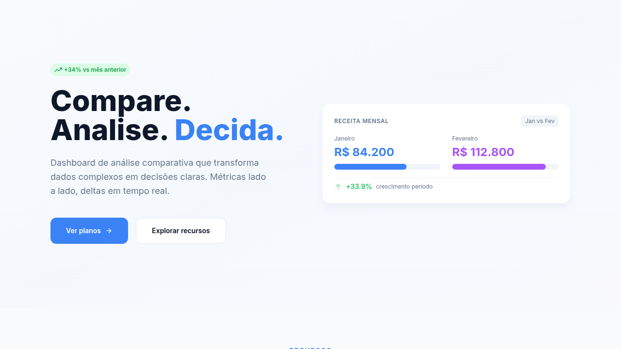
- One dominant metric per view — if everything is big, nothing is big
- Color as status, not decoration — green/amber/red should be the fastest read on screen
- Negative space is information — crowding signals that you don't know what matters
- Trend over snapshot — a number without direction is trivia, not intelligence
- Progressive disclosure, not progressive overload — detail exists one interaction away, never competing with the headline
Technical Specs
Colors
Effects
KPI value animations (count-up), trend arrow direction animations, metric card hover lift, alert pulse effect
Light/Dark
✓ Full / ✓ Full
Related
Last synced: 4/1/2026