Estilo Suíço Científico
Design an academic and precise Swiss Style landing page for an online scientific publication. Ideal for landing pages, modern websites. AI-ready template.
Use case: Landing pages, Modern websites
Historical Context
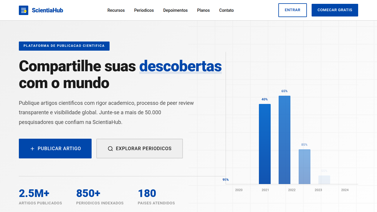
The Swiss style didn't arrive in laboratories by accident. It was pulled there — by necessity. When you're presenting dense datasets, complex nomenclature, and multi-variable relationships, decoration isn't just unhelpful, it's hostile. The International Typographic Style gave scientific publishing what it desperately needed: a grid rigid enough to hold chaos. Think of the journal layouts from ETH Zürich in the 1960s, or the CERN technical reports that followed. Columns weren't aesthetic choices — they were information architecture. Müller-Brockmann's grids weren't designed for posters alone; they were systems for managing cognitive load. The same 12-column structure that organized a concert announcement could hold a periodic table, a regression analysis, or a phylogenetic tree. That's not coincidence. That's universality. What makes this lineage matter today: scientific communication still drowns in noise. The Swiss approach strips interfaces back to pure signal. No gradients softening the data. No rounded corners pretending complexity is friendly. Just structure, hierarchy, and the quiet confidence that the content speaks loudest when nothing else is shouting.
When to Use
Deploy this when credibility is non-negotiable. Research institutions presenting findings. Academic journals that need to feel authoritative without feeling dated. Science platforms where users scan abstracts, compare figures, and drill into methodology — all in one session. It works when your audience is trained to read critically and will notice (and distrust) visual fluff. If your content includes tables, citations, data visualizations, or structured metadata, this style won't fight the material. It'll frame it.
Design Principles
- Grid as epistemology — every spatial decision should reflect information hierarchy, not decoration. Columns exist to separate concerns, not to look balanced.
- Typographic restraint with purpose — one sans-serif family, strict scale, generous leading. Let whitespace do the work that color refuses to.
- Data-first density — embrace information-rich layouts. Don't fear long pages; fear unclear ones. Density is acceptable when scanability is preserved.
- Monochromatic confidence — restrict palette to black, white, and one functional accent. Color means something or it means nothing.
- Systematic repetition — headers, captions, labels, and footnotes follow identical patterns page after page. Predictability builds trust in academic contexts.
Technical Specs
Colors
Primary
Secondary
Effects
Layouts de grid com forte ênfase em tipografia e legibilidade, uso de sans-serif (Akzidenz-Grotesk/Roboto) para corpo e títulos, gráficos e tabelas de dados limpos, micro-interações de destaque de texto e links, transições de página rápidas e diretas.
Light/Dark
✓ Full / ✗ No
Related
Last synced: 4/1/2026