Estilo de Experiência de Compra Contínua
Functional and trustworthy landing page for a premium subscription service. Ideal for landing pages, modern websites. AI-ready template.
Use case: Landing pages, Modern websites
Historical Context
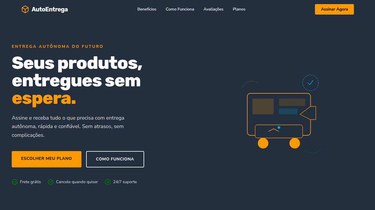
Before Amazon patented one-click in 1999, buying online felt like filling out a mortgage application. That single patent rewired how an entire industry thinks about friction. Suddenly, every unnecessary form field was a leak in the funnel. Checkout UX became its own discipline — not a subfield of information architecture, but a craft obsessed with milliseconds and micro-decisions. The visual language followed. Trust badges, progress indicators, persistent cart totals — these weren't decorative choices. They were answers to anxiety. Early e-commerce looked like a catalog stapled to a database. The shift toward seamless commerce demanded a new aesthetic: one where logistics infrastructure becomes invisible and the interface feels less like software, more like intention made tangible. Omnichannel pushed it further. When a cart persists from phone to laptop to physical store, the design system isn't styling pages anymore — it's maintaining continuity across realities. The futuristic layer isn't about looking sci-fi. It's about making distributed cloud systems feel like a single, breathing surface.
When to Use
Reach for this when commerce needs to feel effortless rather than transactional. Marketplace apps where browsing and buying blur together. Checkout flows that need to collapse twelve steps into perceived zero. Retail tech platforms bridging physical inventory with digital storefronts. Any omnichannel experience where the user shouldn't notice they've crossed a system boundary. Particularly strong for high-frequency purchase environments — grocery, fashion, subscriptions — where repeat friction compounds into churn.
Design Principles
- Invisible infrastructure — cloud complexity stays behind the curtain; users see only momentum
- Progressive commitment — reveal cost and consequence gradually, never front-load cognitive debt
- Persistent state as trust — a cart that remembers across devices signals reliability louder than any badge
- Velocity over decoration — every animation must accelerate perceived speed, never stall it
- Contextual confidence — surface the right reassurance (shipping, returns, security) exactly when doubt arises, not before
Technical Specs
Colors
Primary
Secondary
Effects
Layouts limpos e focados no produto, micro-interações de compra, animações de carregamento eficientes, tipografia clara (sans-serif), elementos de confiança (selos, avaliações), visualizações de rota de entrega, transições suaves.
Light/Dark
✓ Full / ✗ No
Related
Last synced: 4/1/2026