Estilo de Dados Empresariais
Robust and secure landing page for an Autonomous Database. Ideal for landing pages, modern websites. AI-ready template.
Use case: Landing pages, Modern websites
Historical Context
Enterprise data interfaces spent decades looking like they hated their users. Gray rows, tiny monospace type, zero hierarchy. The database was powerful — the UI was punishment. Then Snowflake showed up and proved you could wrap petabyte-scale queries in something that didn't feel like a mainframe terminal. Databricks followed, leaning into notebooks and collaborative workflows. Suddenly data platforms had opinions about whitespace. The shift wasn't cosmetic. It was philosophical. These tools recognized that the people querying data weren't all DBAs anymore — they were analysts, PMs, marketers. The interface had to flatten the learning curve without dumbing down the power. That's a brutal design constraint. What emerged is a distinct aesthetic: structured density with breathing room. Dark-mode-first palettes that reduce eye strain during long sessions. Tables that actually communicate hierarchy through subtle color shifts rather than heavy borders. Status indicators that parse at a glance. The futuristic feel isn't decoration — it signals competence. When you're trusting a tool with your company's data infrastructure, it better look like it knows what it's doing.
When to Use
Reach for this when you're building anything that surfaces structured data at scale. Database management consoles, cloud infrastructure dashboards, ETL pipeline monitors, admin panels where power users live eight hours a day. It works when your users expect density — they want information, not hand-holding. But it also works when you need to onboard less technical stakeholders without a separate 'simple mode.' The style bridges that gap between raw capability and visual clarity.
Design Principles
- Density without claustrophobia — pack information tight but maintain scannable rhythm through consistent spacing tokens and typographic hierarchy
- Status communicates instantly — every data state (healthy, warning, critical, stale) must be parseable in peripheral vision, not just on hover
- Tables are first-class citizens — not an afterthought component but the primary canvas, designed with the same care you'd give a hero section
- Dark mode is the default context — design for sustained screen time, low-light environments, and the reality that data workers live in dark themes
- Progressive disclosure over simplification — never hide power, but layer it so the surface reads clean and depth reveals on intent
Technical Specs
Colors
Primary
Secondary
Effects
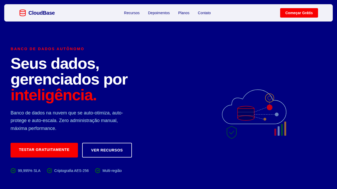
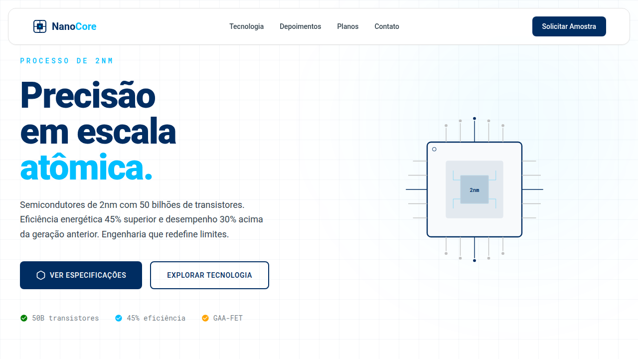
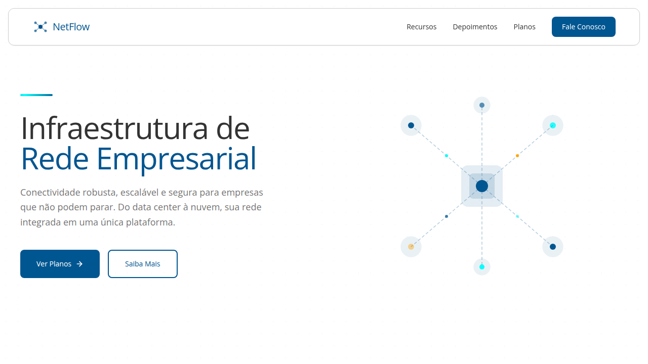
Visualizações de dados complexos, diagramas de arquitetura de nuvem, brilhos sutis em elementos de segurança, tipografia corporativa e limpa, micro-interações de status de sistema, elementos modulares, animações de fluxo de dados.
Light/Dark
✓ Full / ✗ No
Related
Last synced: 4/1/2026