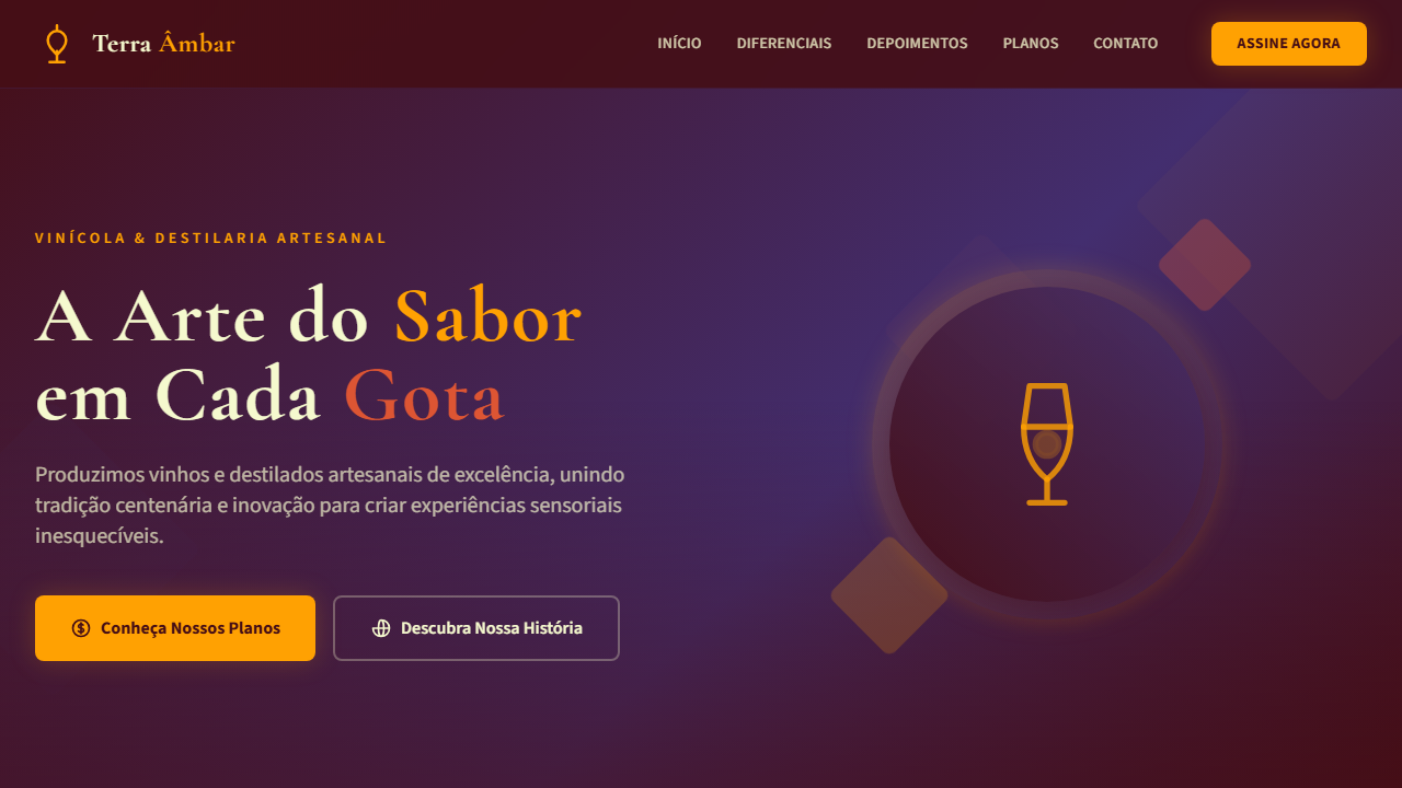
Ember & Amethyst Premium
Vibrant, bold, and luxurious UI that fuses fiery warmth with regal depth. Ideal for marcas de moda premium, gastronomia autoral, entretenimento e eventos, vinícolas e destilarias, creative agencies. AI-ready template.
Use case: Marcas de moda premium, Gastronomia autoral, Entretenimento e eventos, Vinícolas e destilarias, Creative agencies
Historical Context
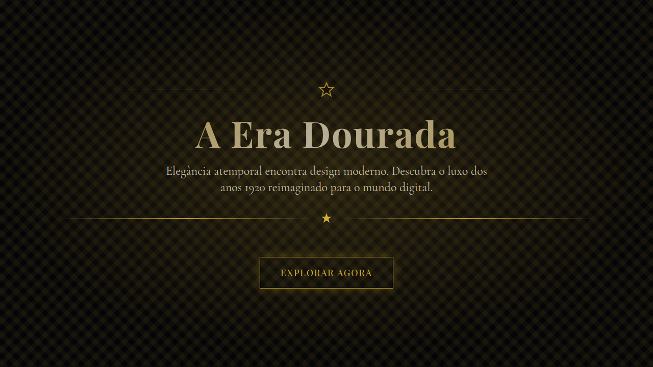
Orange and purple sit opposite enough on the wheel to create tension, but share just enough red undertone to feel intentional rather than accidental. This pairing has roots in theatrical poster design of the 1960s and 70s — think Saul Bass meets psychedelia — where the goal was to arrest attention from across a street. The combination fell out of mainstream favor during the minimalism wave, dismissed as "too much." That dismissal was always wrong. What makes ember orange paired with amethyst purple genuinely premium is the temperature contrast. Ember reads as physical warmth — fire, copper, aged whiskey. Amethyst reads as cool depth — gemstone, twilight, velvet. Together they create a chromatic push-pull that feels expensive because it demands confidence to execute. Cheap brands don't attempt this palette because it punishes timidity. Every element needs to commit fully or the whole thing collapses into carnival territory. The recent resurgence in maximalist branding has given this combination new legitimacy. Brands tired of the same navy-and-white safety blanket are reaching for palettes that actually say something. Ember and amethyst says: we're not afraid of being remembered.
When to Use
Deploy this palette when the brief calls for presence over subtlety. It works for creative studios that need their brand to feel as bold as their output, luxury event design where the space itself should feel like an experience, premium product packaging competing for shelf attention, and any context where "tastefully quiet" is the wrong answer. Avoid it for healthcare, finance, or anything requiring institutional trust — this palette is too opinionated for those verticals.
Design Principles
- Commit fully to saturation — desaturated versions of these hues look muddy and indecisive, not refined
- Use ember as the action color and amethyst as the grounding color, never split them 50/50 or you lose hierarchy
- Dark backgrounds (near-black with purple undertone) let both colors breathe without competing with white space
- Typography should be bold-weight and confident — thin typefaces fight the palette's inherent energy
- Reserve pure white for critical contrast moments only; warm off-whites and cool lavender tints integrate better
Technical Specs
Colors
Primary
Secondary
Effects
Bold gradient overlays (orange-to-purple diagonals), dramatic shadow depth, warm ambient glow on CTAs, expressive serif headlines with generous tracking, geometric accent shapes via clip-path, vibrant hover state color shifts, smooth 400ms transitions with ease-out
Light/Dark
✓ Full
Related
Last synced: 4/1/2026