Editorial Grid / Magazine
Design an editorial magazine layout. Ideal for landing pages, saas. AI-ready template.
Use case: Landing pages, SaaS
Historical Context
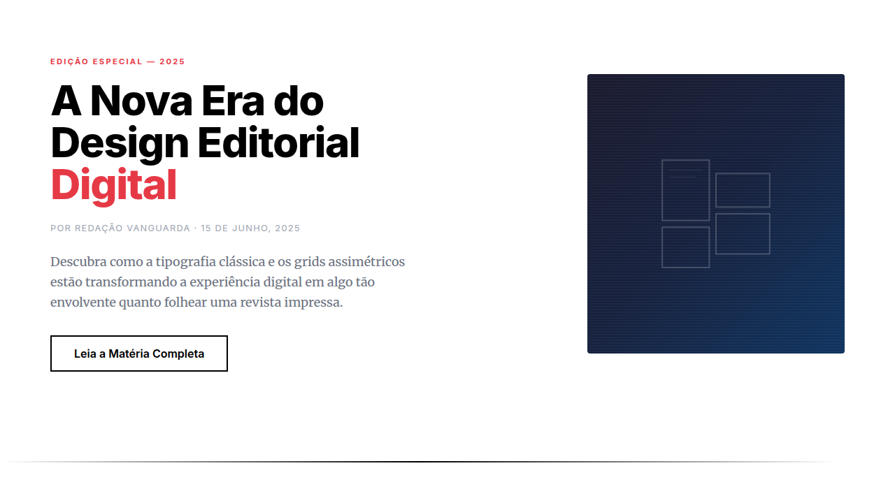
Print editorial design spent a century perfecting the art of guiding eyes across a page. Brodovitch at Harper's Bazaar, Neville Brody at The Face — they understood that white space is structure, not absence. Columns weren't containers; they were rhythm. Then the web happened and we lost all of it. Floats gave us two columns if we were lucky. The editorial tradition — asymmetric grids, pull quotes bleeding into margins, type that breathes differently at different scales — was simply impossible to build. We faked it with absolute positioning and prayed nothing broke. CSS Grid changed everything around 2017-2018, but it took publications like Bloomberg Businessweek's digital edition and the NYT's Snow Fall descendants to prove the model. They showed that a browser could hold the same tension between order and surprise that a printed spread delivers. Grid template areas, subgrid, container queries — suddenly the vocabulary matched the ambition. Magazine layout on the web stopped being a metaphor and became a real practice.
When to Use
When content deserves presence. Long-form journalism, cultural criticism, photo essays, annual reports — anything where the reading experience IS the product. Not dashboards. Not SaaS. Editorial grids demand content worth lingering over. If your users scan and leave, pick something simpler. But if you're building for readers who settle in, who scroll slowly, who notice when a pull quote lands perfectly against an image — this is your foundation.
Design Principles
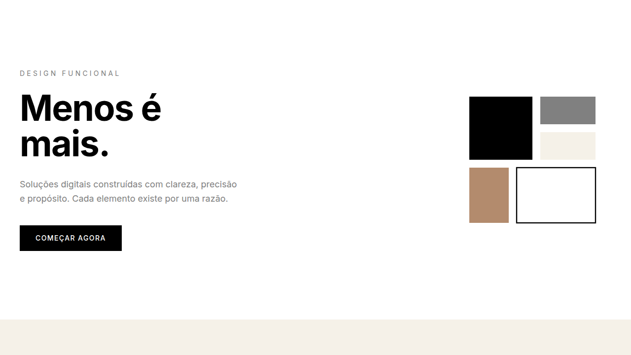
- Asymmetry over symmetry — equal columns are for spreadsheets, not stories. Let one column dominate, let others support.
- Typography carries the hierarchy — size contrast does the work that color does elsewhere. A 64px headline next to 16px body copy creates its own grid.
- Whitespace is intentional, not leftover — margins and gaps are compositional choices. They control pace the way silence controls music.
- Content breaks the grid on purpose — pull quotes, full-bleed images, and inset elements should violate the column structure deliberately. Controlled tension.
- Vertical rhythm matters more than alignment — consistent baseline grids and spacing scales keep the page feeling composed even when layouts shift dramatically between sections.
Technical Specs
Colors
Primary
Effects
Smooth scroll, reveal on scroll, parallax images, text animations, page-flip transitions
Light/Dark
✓ Full / ✓ Full
Related
Last synced: 4/1/2026