Editorial de Viagem Sofisticado
Design an elegant and aspirational editorial landing page for a luxury travel blog. Ideal for landing pages, modern websites. AI-ready template.
Use case: Landing pages, Modern websites
Historical Context
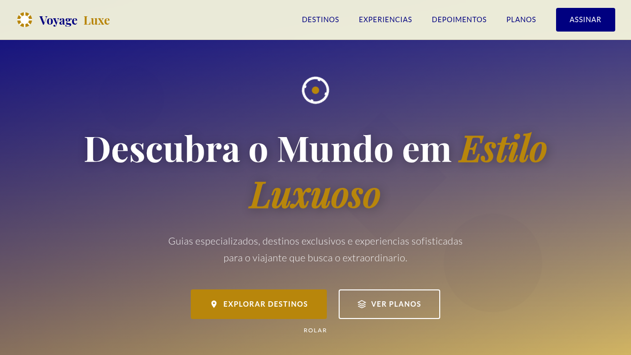
The luxury travel editorial owes everything to print. Condé Nast Traveler established the formula in the eighties: full-bleed photography, restrained serif typography, and white space treated as a material rather than absence. Monocle refined it further — tighter grids, considered paper stock choices, a rejection of visual noise. The magazine said: we respect your intelligence enough to let the image breathe. Translating this to screens required killing sacred cows. The fixed column gave way to fluid containers. But the core tension remained — photography must dominate without becoming wallpaper. The best digital travel editorials (Cereal, Kinfolk's travel issues, Suitcase Magazine online) solve this by treating viewport height as their bleed edge. One image. Full screen. Then text arrives with ceremony, not apology. What separates luxury travel layouts from generic blog templates isn't budget — it's restraint. Every element earns its pixel. The typography doesn't compete with Santorini sunsets; it frames them. Negative space isn't laziness, it's the visual equivalent of a pause between courses at a tasting menu.
When to Use
When content leads with photography and the writing deserves room to land. Travel magazines translating print DNA to responsive layouts. Luxury tourism brands that need editorial credibility over conversion urgency. Experience blogs where the reading itself should feel like slow travel — unhurried, considered, worth lingering over. Not for itinerary-heavy utility content or SEO-first listicles.
Design Principles
- Photography is architecture, not decoration — images define the spatial rhythm of the entire page, dictating where text lives and how readers breathe between sections
- Typography plays second chair deliberately — refined serifs at generous sizes, but never louder than the destination itself; the typeface should feel like a whispered recommendation
- White space is the luxury signal — cramped layouts read as budget travel; generous margins and vertical rhythm communicate the same exclusivity as a half-empty restaurant with a six-month waitlist
- Pacing over density — alternate between immersive full-viewport moments and intimate text blocks; the scroll should feel like turning pages in a well-edited magazine, not consuming a feed
- Restrained color palette drawn from photography — let the destinations provide chromatic richness; UI elements stay neutral, warm grays, off-whites, and the occasional rule line to anchor hierarchy
Technical Specs
Colors
Primary
Secondary
Effects
Imagens de destinos em tela cheia, tipografia serifada clássica para títulos e sans-serif para corpo, layouts de coluna variados, micro-interações de hover em imagens com descrições, transições de seção suaves e com paralaxe, elementos decorativos de mapa e bússola.
Light/Dark
✓ Full / ✗ No
Related
Last synced: 4/1/2026