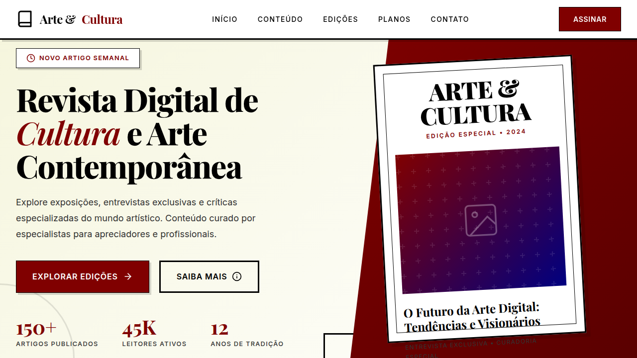
Editorial Contemporâneo
Design an artistic and immersive editorial landing page for a contemporary culture and art digital magazine. Ideal for landing pages, modern websites. AI-ready template.
Use case: Landing pages, Modern websites
Historical Context
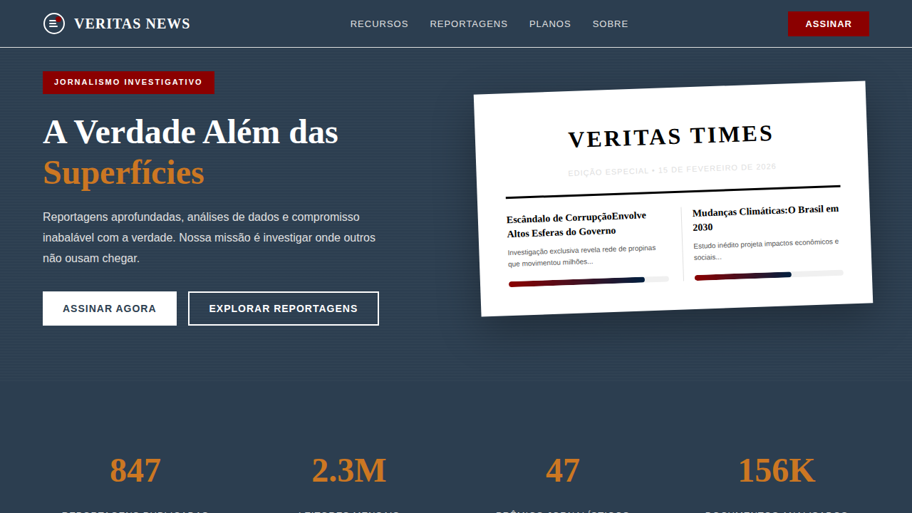
For years, digital magazines were just PDFs with ambition. Flipbooks, page-curl animations, the whole embarrassing theater of pretending a screen was paper. It took until roughly 2013-2015 for editorial design online to find its own voice — and that voice belonged largely to the NYT's digital features team and Bloomberg Businessweek's web presence. The NYT's Snow Fall wasn't the first longform interactive piece, but it broke something open in the industry's imagination. Suddenly editorial meant scroll-driven narrative, typographic drama at viewport scale, and imagery that breathed between paragraphs rather than sitting trapped in columns. Bloomberg took a different angle — irreverent, almost confrontational layouts where type became illustration and whitespace became editorial stance. What emerged from this era is contemporary editorial: design that treats the browser as a first-class publishing medium. Not print nostalgia. Not blog minimalism. A third thing — where the layout itself carries opinion, where typographic hierarchy does the work that art direction once monopolized in print.
When to Use
When content demands authority and atmosphere simultaneously. Online magazines that need to feel curated, not templated. Cultural criticism where the visual tone signals intellectual weight before a single word is read. Art publications where the design must hold its own against the work it presents. Any context where you need readers to slow down, to treat the screen like something worth their full attention rather than another feed to scroll past.
Design Principles
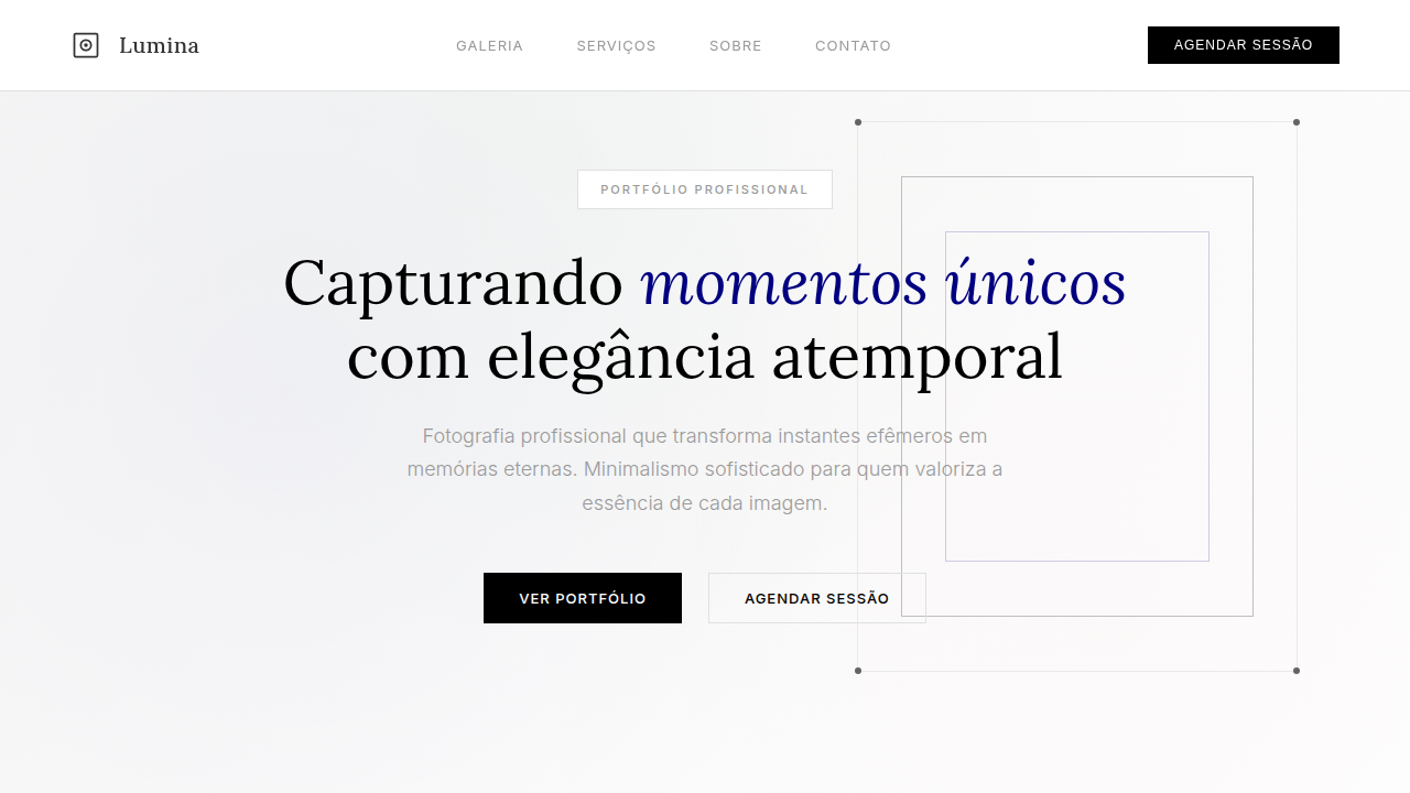
- Typography carries the editorial voice — size, weight, and spacing are opinions, not defaults. A 120px serif headline isn't decoration, it's a statement about what matters on the page.
- Whitespace is editorial real estate, not empty space. The pause between sections, the breathing room around a pull quote — these are pacing decisions, same as a film editor choosing where to cut.
- Imagery operates at two scales only: dominant or absent. Medium-sized photos are the hallmark of indecision. Either the image commands the viewport or the typography does. Pick one per section.
- Vertical rhythm creates reading tempo. Tight leading in body copy for density and momentum. Generous gaps between sections for cognitive reset. The scroll itself becomes a narrative device.
- Restraint in color — let one or two accent choices do heavy lifting against a near-monochrome foundation. Editorial confidence reads as reduction, not addition.
Technical Specs
Colors
Primary
Secondary
Effects
Tipografia contrastante (serifada decorativa para títulos, sans-serif legível para corpo), composição multicamadas com imagens e texto, foco em conteúdo visual de alta qualidade, elementos decorativos (linhas, molduras), micro-interações de destaque de artigo, transições de página com efeito de "virar revista".
Light/Dark
✓ Full / ✗ No
Related
Last synced: 4/1/2026