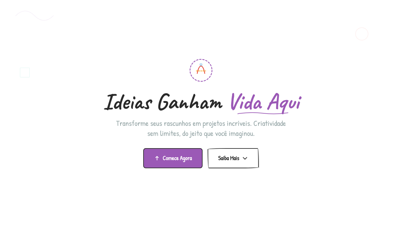
Doodle / Sketch Livre
Doodle sketch infographic. Ideal for landing pages, modern websites. AI-ready template.
Use case: Landing pages, Modern websites
Historical Context
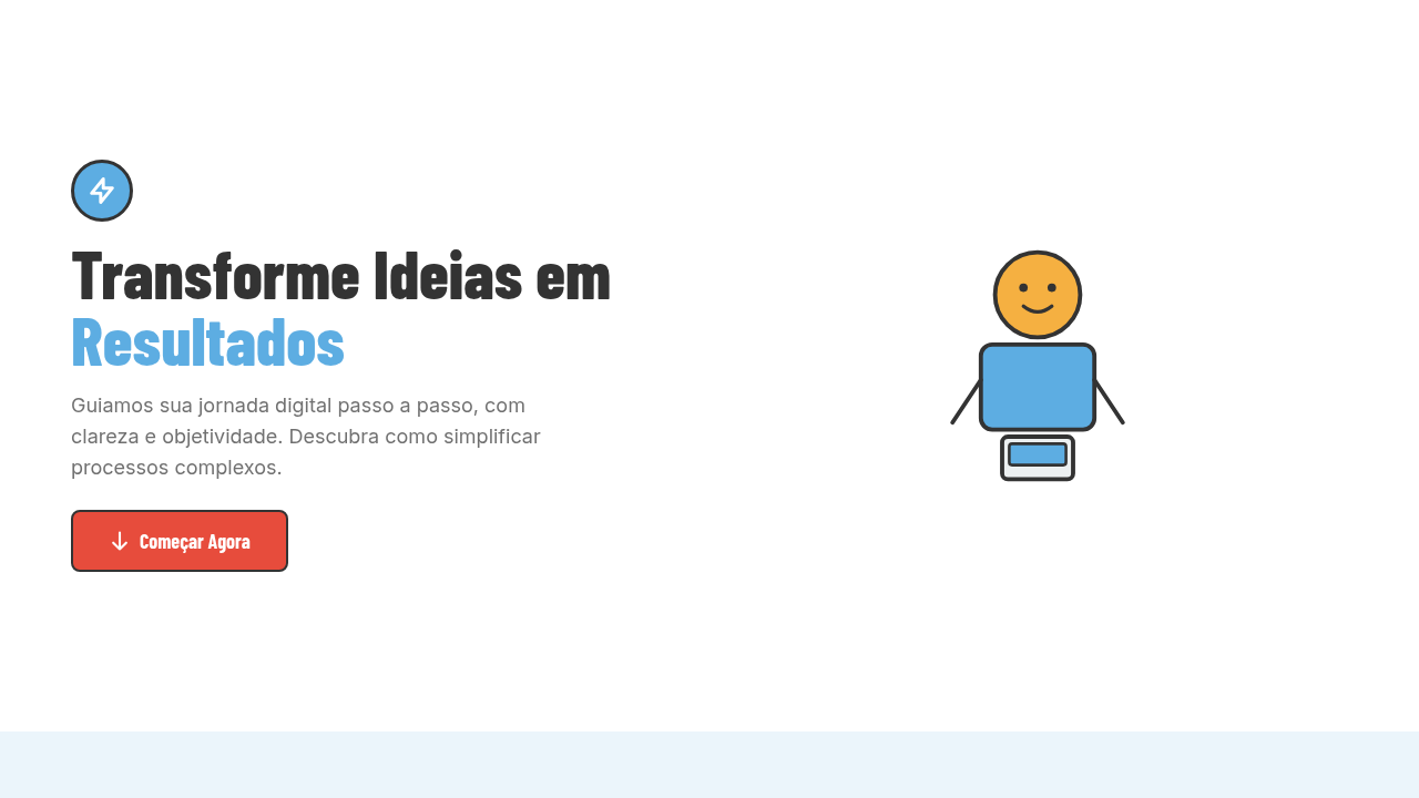
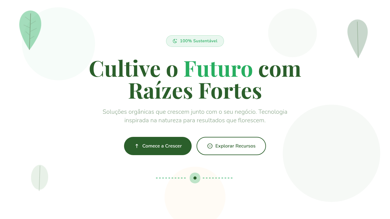
Long before Figma or Illustrator, people explained complex ideas with a marker and a napkin. The back-of-envelope sketch has always been the fastest path from confusion to clarity — messy, immediate, human. That tradition never really left; it just went digital. Excalidraw changed the conversation in 2020. Suddenly a free, open-source tool proved that wobbly lines and imperfect shapes could communicate architecture diagrams, user flows, and data relationships better than polished vector art. tldraw followed with the same conviction: roughness is a feature, not a bug. The aesthetic signals "this is a draft, think with me" — which lowers the stakes and invites collaboration in ways a pixel-perfect chart never could. Hand-drawn infographics tap into something cognitive. When data looks sketched, viewers slow down. They read instead of glance. The imperfection creates intimacy — it feels like someone sat across from you and drew it out. That's why education platforms, brainstorming tools, and whiteboard apps keep reaching for this style. It makes the complex feel approachable, and the intimidating feel like a conversation.
When to Use
Reach for doodle-style data graphics when you need to lower cognitive barriers. Education products explaining new concepts. Brainstorming sessions where polish would kill momentum. Internal presentations where "draft energy" keeps feedback flowing. Whiteboard apps that need to feel like thinking-out-loud, not finished deliverables. Avoid it for financial reports, regulatory dashboards, or anywhere precision signals trust. The sketch aesthetic says "let's explore" — make sure that's actually what you mean.
Design Principles
- Embrace wobble — perfectly imperfect strokes signal approachability and invite participation over passive consumption.
- Limit your palette — two or three colors max, hand-picked. Doodle style falls apart when it gets visually noisy.
- Maintain consistent roughness — mixing sketch elements with crisp vector art creates uncanny dissonance. Commit to the aesthetic fully.
- Prioritize legibility over charm — whimsy is worthless if people can't read the labels or follow the data flow.
- Design for annotation — leave whitespace and visual breathing room so users feel they can add to it, not just look at it.
Technical Specs
Colors
Primary
Secondary
Effects
Soft natural informal lighting, doodle drawing animations (stroke-dasharray), sketch reveal on scroll, wobble effects, hand-drawn path animations
Light/Dark
✓ Full / ✓ Full
Related
Last synced: 4/1/2026