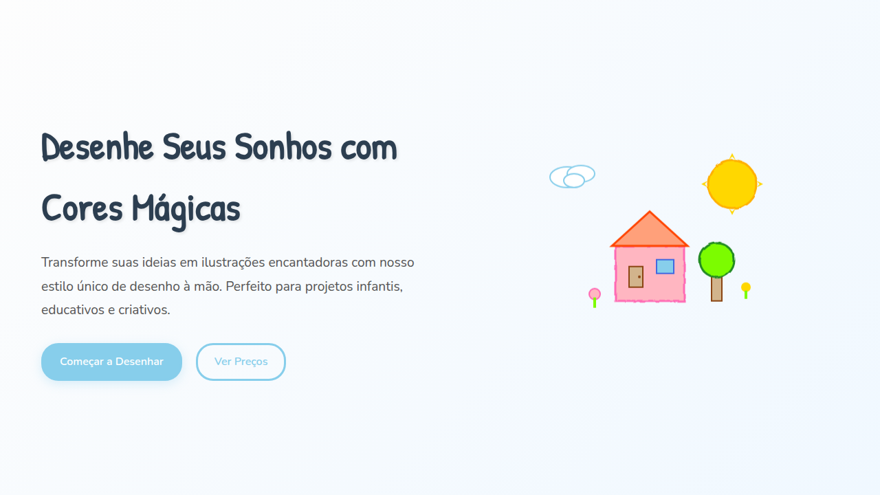
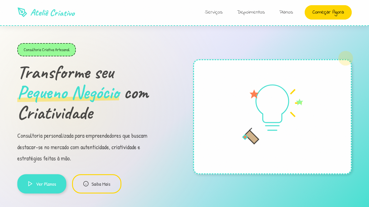
Desenho à Mão Lúdico
Playful and organic hand-drawn landing page for a children's illustrator blog. Ideal for landing pages, modern websites. AI-ready template.
Use case: Landing pages, Modern websites
Historical Context
Before screens existed for children, picture books did all the heavy lifting. Wobbly lines, uneven fills, visible brushstrokes — these weren't flaws. They were invitations. A child sees a perfectly rendered sphere and thinks "object." A child sees a lopsided circle with crayon texture and thinks "mine." Digital products for kids spent years chasing vector perfection. Flat design made everything clean, scalable, lifeless. Then studios like Toca Boca and Sago Mini proved what illustrators always knew: imperfection is warmth. A hand-drawn button feels touchable in a way a rounded rectangle never will. The slight wobble of a line communicates safety — someone human made this, for you. The resurgence isn't nostalgia. It's developmental psychology dressed as aesthetics. Young brains respond to organic shapes, irregular edges, visible process. When a character looks like it could have been drawn by an older sibling, the interface stops being software and starts being a companion. That's the gap hand-drawn fills — not decoration, but emotional architecture.
When to Use
When your audience is under ten and trust matters more than efficiency. Children's apps where delight drives engagement. Educational platforms that need to feel like play, not homework. Parenting brands competing against clinical medical aesthetics. Any product where a parent's first impression needs to say "gentle" before it says "functional." Skip it for dashboards, data-heavy interfaces, or anywhere credibility depends on precision.
Design Principles
- Embrace line weight variation — uniform strokes read as mechanical, not handmade. Let thickness breathe.
- Limit your palette to 4-6 colors max, slightly desaturated. Children's illustration doesn't mean rainbow explosion — it means considered warmth.
- Build texture into fills, not onto them. Grain, paper noise, and visible brush overlap should feel structural, not filtered on after.
- Scale imperfection with intent — wobbly at small sizes feels charming, wobbly at hero scale feels broken. Calibrate the shake.
- Leave negative space generous. Hand-drawn elements need room to breathe or they collapse into visual noise fast.
Technical Specs
Colors
Primary
Secondary
Effects
Ilustrações desenhadas à mão como elementos principais, tipografia que simula escrita manual, texturas de papel e giz, bordas irregulares, micro-interações de hover com animações de rabisco, transições de seção com efeito de "virar página" de caderno.
Light/Dark
✓ Full / ✗ No
Related
Last synced: 4/1/2026