Data-Dense Dashboard
Data-dense dashboard. Ideal for landing pages, modern websites. AI-ready template.
Use case: Landing pages, Modern websites
Historical Context
Dashboards didn't start pretty. They started as literal instrument panels — cockpit gauges, factory readouts, walls of blinking lights. The digital version inherited that DNA: cram everything into one screen so the operator never has to click away. Edward Tufte gave us the vocabulary to talk about why some of those screens worked and others were garbage. Data-ink ratio. Chartjunk. The idea that every pixel should earn its place. His influence is still the gravitational center of dashboard design, whether people have read him or not. The 2010s brought a wave of democratized tooling — Grafana, Metabase, Looker — that made it trivially easy to throw twelve charts on a page and call it a dashboard. Which meant most dashboards became noise. The real craft isn't adding widgets. It's knowing which ones to kill. Modern data-dense dashboards walk a razor's edge: show enough to eliminate tab-switching, but structure it so the eye knows where to land first. The best ones feel calm despite containing enormous amounts of information. That's the trick. Density without chaos.
When to Use
When your users are power users who live in the product eight hours a day. Analytics platforms, FinTech trading desks, DevOps war rooms, BI tools — anywhere the cost of switching context is higher than the cost of visual complexity. Not for casual consumers. Not for marketing sites. This pattern assumes your audience already has mental models for reading charts and tables. If they don't, you need a simpler narrative layout instead.
Design Principles
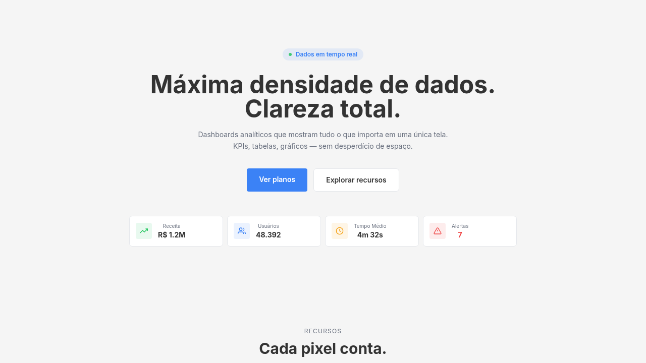
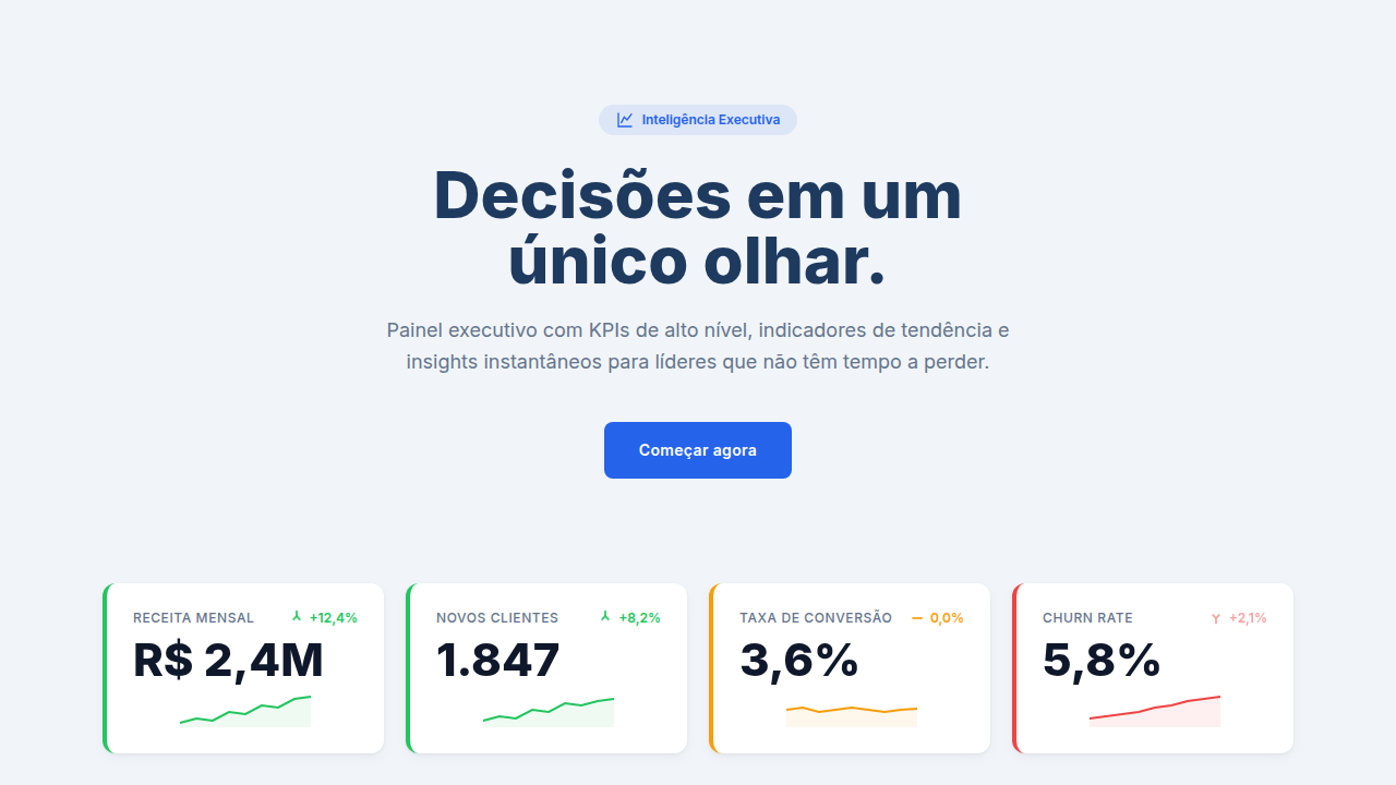
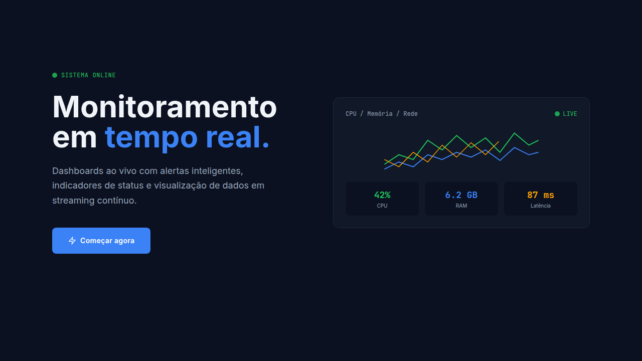
- Establish a clear visual hierarchy through size and position — the most critical KPI gets the biggest card, top-left. Everything else is secondary until proven otherwise.
- Use a consistent, tight spacing grid (8px base) so density feels intentional rather than accidental. White space is structure, not decoration.
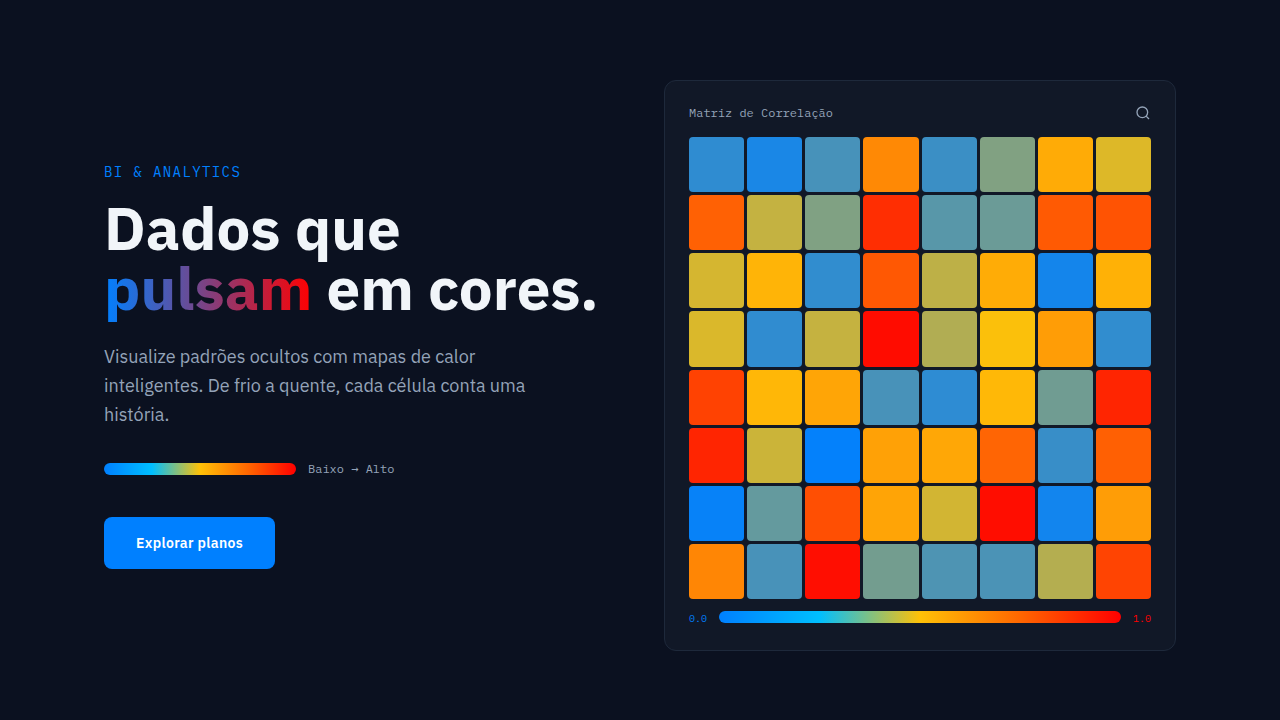
- Limit your color palette to functional meaning — red for alerts, green for healthy, blue for neutral. Decorative color in a dashboard is noise.
- Design for glanceability first, drill-down second. A user should extract the system's health status in under three seconds without reading any labels.
- Treat data tables as first-class citizens, not afterthoughts. Proper monospace numerals, right-aligned numbers, frozen headers, and zebra striping aren't optional — they're baseline.
Technical Specs
Colors
Primary
Secondary
Effects
Hover tooltips, chart zoom on click, row highlighting on hover, smooth filter animations, data loading spinners
Light/Dark
✓ Full / ✓ Full
Related
Last synced: 4/1/2026