Dark Portfolio Hero
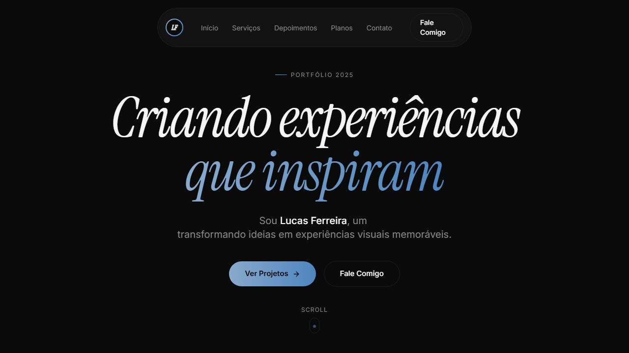
Dark portfolio with animated loading screen (2.7s): counter 000→100 via rAF, rotating words with AnimatePresence, gradient progress bar (#89AACC to #4E85BF) with glow. Ideal for portfólios de desenvolvedores, designers criativos, freelancers fullstack, sites pessoais premium. AI-ready template.
Use case: Portfólios de desenvolvedores, Designers criativos, Freelancers fullstack, Sites pessoais premium
Historical Context
The dark cinematic hero owes its DNA to two parallel lineages: demo scene culture and film title sequences. In the early 2000s, Flash portfolios weaponized loading screens — turning wait time into theater. Designers like Joshua Davis and 2Advanced Studios proved that the entrance *was* the portfolio. The loading bar became a stage curtain. When Flash died, that theatrical energy went dormant until GSAP and WebGL revived it around 2016. The second thread is Saul Bass through Kyle Cooper through Ash Thorp. Title sequences taught us that mood precedes content. A dark field with precise typography and choreographed motion tells the viewer: this person controls every pixel. The dark portfolio hero isn't decoration — it's a credibility signal. It says you understand timing, contrast, and restraint before anyone scrolls. Today these heroes dominate Awwwards and creative studio sites because they solve a real problem: establishing artistic authority in under three seconds. The darkness isn't aesthetic preference — it's functional. It kills distraction and forces the eye to follow motion.
When to Use
Deploy when the work speaks louder than words — illustration portfolios, motion reels, creative dev showcases. Ideal when your audience judges craft before content. Works beautifully as a loading-to-hero transition where the reveal *is* the first impression. Skip it for anything requiring immediate information density, e-commerce, or contexts where dark UI creates accessibility friction. Best paired with a single focal animation or typographic statement — never both competing.
Design Principles
- Darkness as negative space — black isn't a color choice, it's the removal of everything that isn't your focal point
- Choreographed reveals over instant loads — earn attention through sequenced motion, never dump everything on screen simultaneously
- Typography as architecture — one typeface at cinematic scale anchors the composition more than any illustration could
- GSAP as instrument, not crutch — every tween must have narrative purpose; if you can't explain why something moves, kill it
- Loading state as first act — treat the pre-content moment as designed space, not technical debt to apologize for
Technical Specs
Colors
Primary
Secondary
Effects
VÍDEO: Stream HLS (~17s loop) com animação abstrata de fluido escuro. Ondas e gradientes orgânicos em tons de azul marinho profundo (#1a2a4a) e preto, com movimento suave e contínuo sem texto ou objetos. Aspect ratio ~2:1 (332x160px storyboard). Overlay preto 20% sutil e gradient fade inferior (h-48 from bg to transparent) fundem o vídeo no fundo #0a0a0a da página. Cria atmosfera contemplativa e premium para o portfólio. | EFEITOS CSS: Loading screen animado (2.7s): contador 000→100 via requestAnimationFrame, palavras rotativas (Design→Create→Inspire) com AnimatePresence, barra de progresso gradiente azul com glow, fade-out 0.6s. Hero com vídeo HLS de fundo (fluid/wave dark blue), overlay preto 20%, gradient fade inferior h-48. Pill navbar flutuante com logo gradiente azul ring 36x36px, links pill active state, botão Say hi com gradient border hover. Headline massiva Instrument Serif italic com GSAP entrance (y 50→0, 1.2s). Role cycling a cada 2s com fade-in. Scroll indicator com dot animado translateY loop 1.5s. Botões CTA com gradient border hover technique
Light/Dark
✗ Not Recommended / ✓ Full
Related
Last synced: 4/1/2026