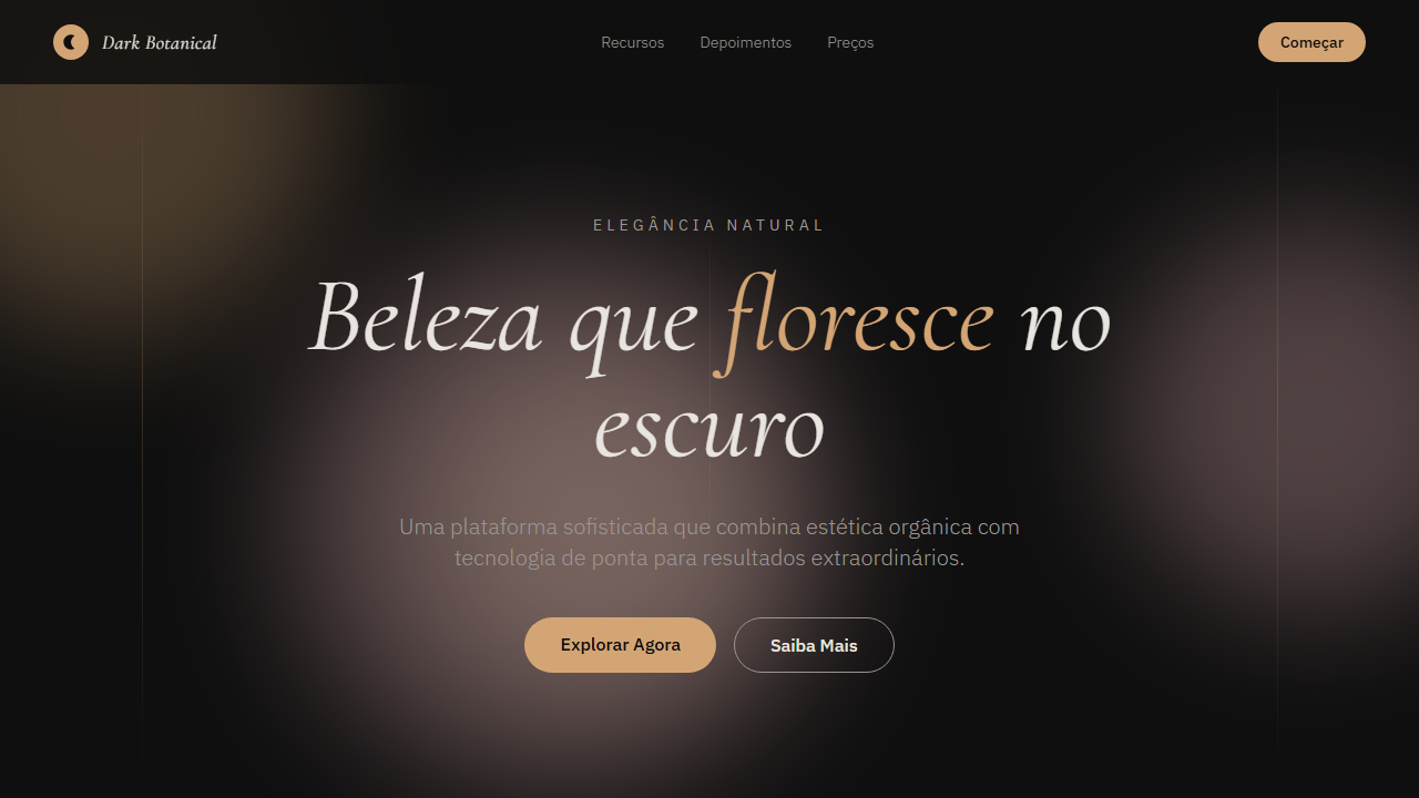
Dark Botanical
Design an elegant, sophisticated dark landing page with artistic premium feel. Ideal for marcas de luxo, joalherias, spas premium, art galleries, vinícolas. AI-ready template.
Use case: Marcas de luxo, Joalherias, Spas premium, Art galleries, Vinícolas
Historical Context
Dark botanical aesthetics trace back to Dutch Golden Age still life painting — those moody, almost funereal arrangements of tulips and peonies against pitch-black backgrounds. Artists like Rachel Ruysch and Jan van Huysum weren't just painting flowers; they were painting decay, mortality, the fleeting nature of beauty. That tension between life and darkness is exactly what makes this theme so compelling in design. The revival hit fashion and interiors hard in the 2010s — House of Hackney's maximalist dark florals, Gucci's romantic gothic prints under Alessandro Michele. In digital, it matured as brands realized dark UI didn't have to mean cold and sterile. You could bring warmth through organic forms. Byredo, Aesop, and Le Labo all dance around this territory — restraint meets nature meets shadow. What separates good dark botanical work from costume-shop gothic is restraint in saturation. The flowers aren't bright. They're muted, dusty, almost bruised. The darkness isn't pure black — it's deep forest green, aubergine, charcoal with warm undertones. That subtlety is everything.
When to Use
Reach for dark botanical when the brand needs to feel expensive without feeling corporate. It works beautifully for luxury cosmetics, niche fragrance, premium skincare — anything where the product itself is sensory and intimate. Also strong for editorial fashion, high-end floral brands, boutique hospitality, and artisanal spirits. Avoid it for anything that needs to feel accessible or cheerful. This theme whispers; it doesn't wave.
Design Principles
- Desaturate your botanicals — bruised mauves and dusty sage over saturated greens. The flowers should feel like they've been pressed in a Victorian journal, not picked this morning.
- Layer depth through texture, not just color. Grain, noise, subtle paper textures in backgrounds prevent the dark palette from feeling flat or screen-like.
- Typography should be high-contrast and editorial — a refined serif at large scale against the darkness. Let letterforms breathe; tight tracking kills the elegance.
- Use negative space aggressively. Dark botanical gets cluttered fast. The darkness itself is a design element — protect it, don't fill it.
- Metallics (aged gold, tarnished copper) as accents only — never as primary elements. One foil-stamped detail elevates; three make it look like a wedding invitation.
Technical Specs
Colors
Primary
Secondary
Effects
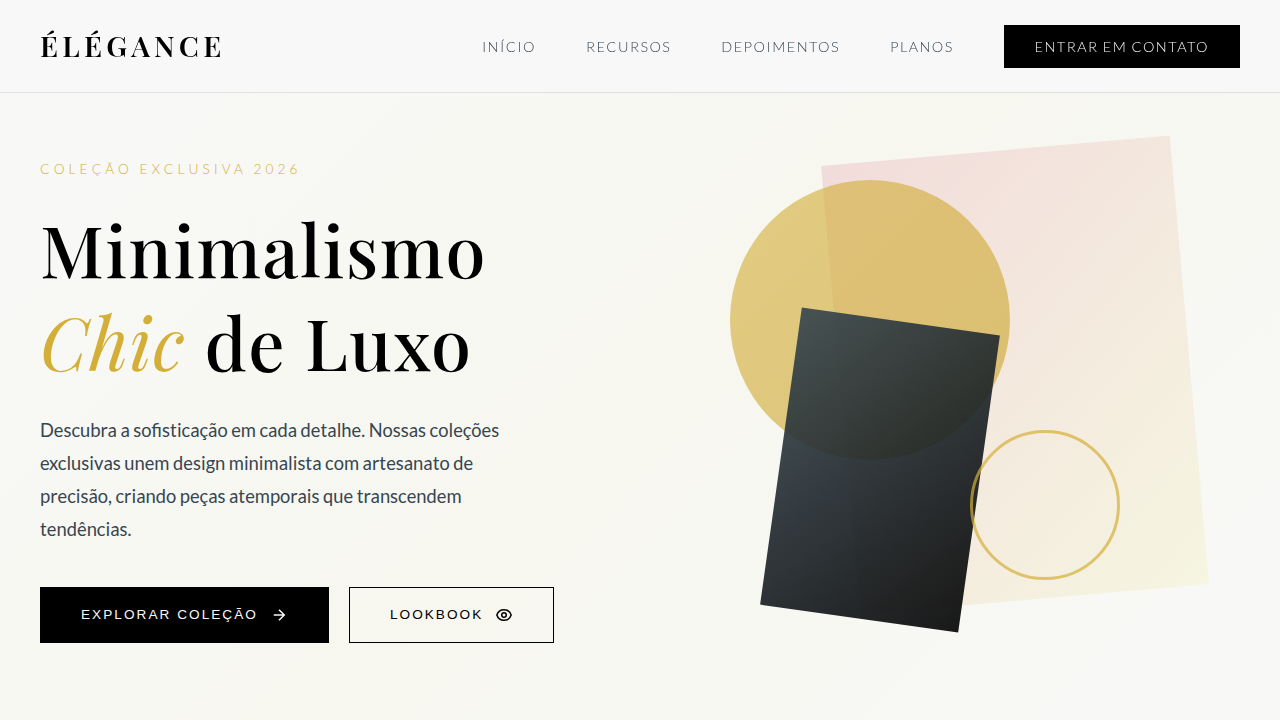
Abstract soft gradient circles (blurred, overlapping), warm color accents (pink, gold, terracotta), thin vertical accent lines, italic signature typography, no illustrations only abstract CSS shapes, smooth transitions 350ms
Light/Dark
✗ No / ✓ Full
Related
Last synced: 4/1/2026