Daisy Days
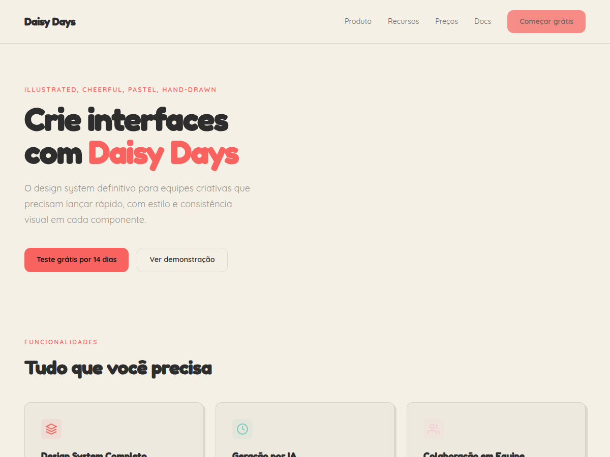
Daisy Days — Cheerful pastel deck with hand-drawn daisies, stars, and rainbows. Friendly, soft, and warm. Fredoka One typography. warm cream base with a full pastel rainbow (mint, lavender, peach, sky, soft pin. Best for education / classroom, kids product launch, wellness program. AI-ready design system.
Use case: education / classroom, kids product launch, wellness program, community workshop, creator portfolio (craft / illustration), team kickoff, wedding / baby shower planning
Historical Context
Hand-drawn florals have anchored children's visual culture since the Arts and Crafts movement rejected industrial sterility in favor of organic, imperfect linework. The daisy — simple enough for a child to draw, universal enough to transcend language — became shorthand for innocence across decades of picture books, nursery textiles, and educational materials. The pastel rainbow palette here isn't arbitrary nostalgia. It descends directly from the soft chromatic ranges popularized by Japanese kawaii culture in the 1970s and later absorbed into Western children's branding through Sanrio's global expansion. That specific intersection — Western botanical illustration meets Eastern color sensibility — created the visual language we now instinctively read as 'gentle, playful, safe.' Fredoka One anchors the typography with rounded terminals that echo the petal shapes themselves. It's a deliberate rejection of the geometric sans-serifs that dominated children's branding in the 2010s. The font says: we're not trying to look modern, we're trying to feel warm. That distinction matters when you're designing for audiences who process emotion before information.
When to Use
Reach for Daisy Days when the brief demands warmth without infantilizing the product. It works beautifully for spring campaign hero graphics, children's stationery lines, and playful packaging where you need visual softness that still holds structure. Avoid it for anything requiring authority or minimalism — this system has opinions and they're all about joy. Best deployed at larger scales where the hand-drawn texture reads clearly rather than collapsing into visual noise.
Design Principles
- Imperfection is intentional — every wobbly line signals human touch over algorithmic precision
- Color stays soft but never washed out; pastels should feel saturated enough to pop on white substrates
- Typography and illustration share formal DNA — rounded letterforms mirror petal geometry to unify the system
- Whitespace is generous; hand-drawn elements need breathing room or they read as clutter rather than charm
- Scale hierarchy matters more here than in geometric systems — delicate linework disappears below 24px
Technical Specs
Colors
Primary
Secondary
Effects
display font Fredoka One for hero headlines, playful hover animations (scale 1.03, 200ms), bouncy click states, hand-drawn SVG daisy/star decorations, 6px chunky offset shadows, rounded sans
Light/Dark
✓ Full / ✗ None
Related

Last synced: 5/6/2026