Cyberpunk UI
Cyberpunk interface. Ideal for landing pages, saas. AI-ready template.
Use case: Landing pages, SaaS
Historical Context
The cyberpunk visual language didn't start in UI design. It started in rain-soaked cinematography — Ridley Scott's Blade Runner in 1982 gave us the blueprint: neon bleeding through fog, kanji stacked on megastructures, CRT glow on wet pavement. For decades it stayed in film and illustration. Then something shifted. The gaming industry legitimized it as interaction design. Deus Ex: Human Revolution introduced HUD overlays as a coherent UI system — not decoration, but functional information architecture rendered in amber and black. CD Projekt's Cyberpunk 2077 pushed further: scanlines, glitch transitions, data streams as navigation. Suddenly designers had a reference library for building real interfaces this way. What makes cyberpunk work as UI (not just aesthetic) is its roots in terminal culture. Monospace type, high-contrast color on dark backgrounds, information density — these aren't just vibes. They're the same principles that make developer tools readable at 2am. The style found its audience because the audience was already living in dark mode.
When to Use
Reach for cyberpunk UI when your product lives in the space between technology and subculture. Crypto dashboards, blockchain explorers, game launchers, dev tools with personality — these are natural fits. It works when your users expect density over whitespace, when dark mode isn't a toggle but the entire identity. Skip it for anything requiring warmth, trust signals for mainstream audiences, or contexts where accessibility needs to come before atmosphere. This style rewards technical users who read interfaces like code.
Design Principles
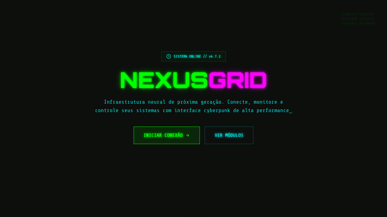
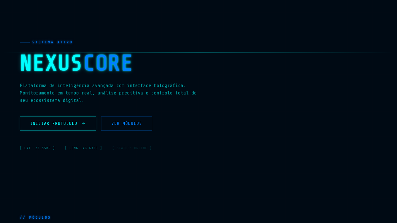
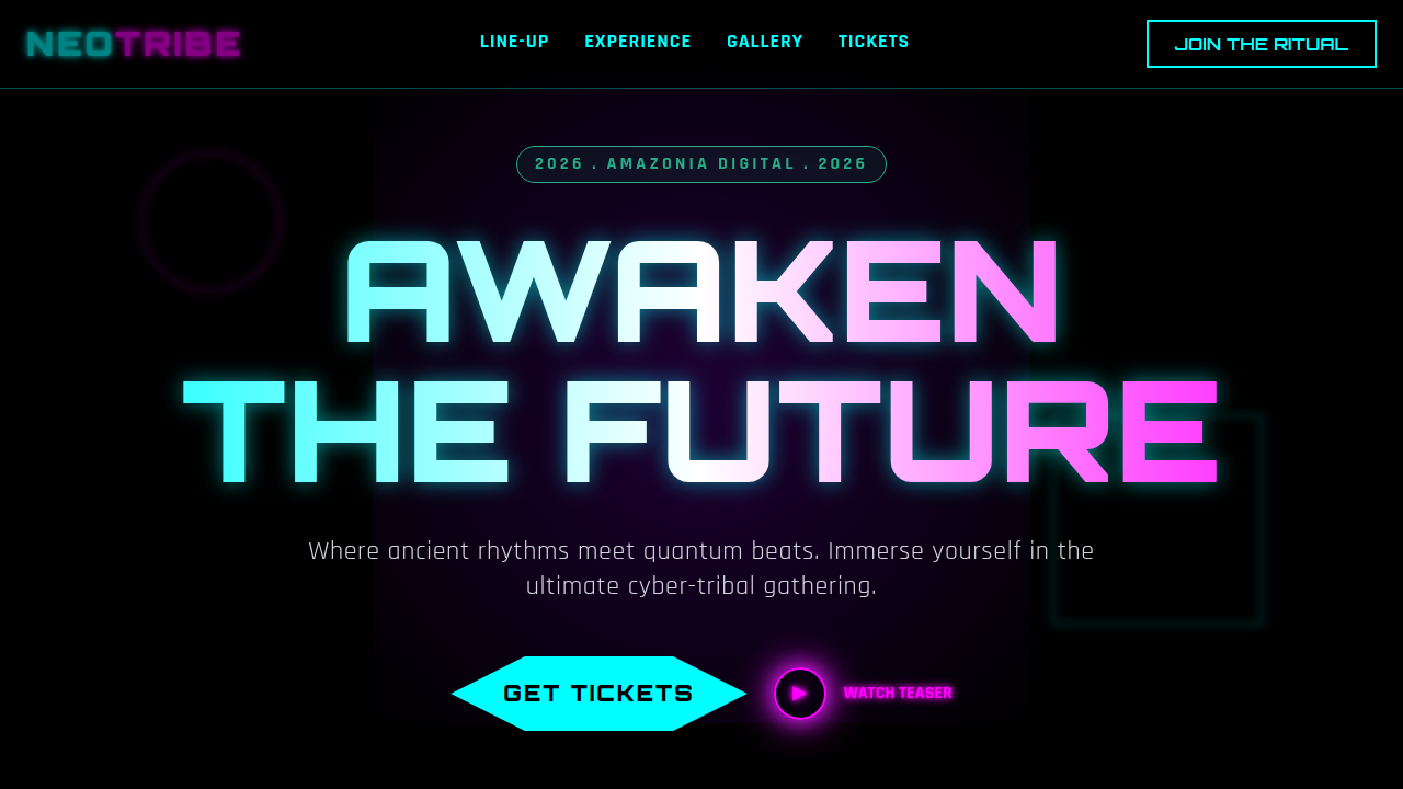
- Dark-first, always — pure black or near-black backgrounds with neon accents at 10-15% surface coverage maximum. The glow means nothing if everything glows.
- Information as aesthetic — treat data density as a feature. HUD overlays, stat readouts, coordinate displays. If it looks like a cockpit, you're on track.
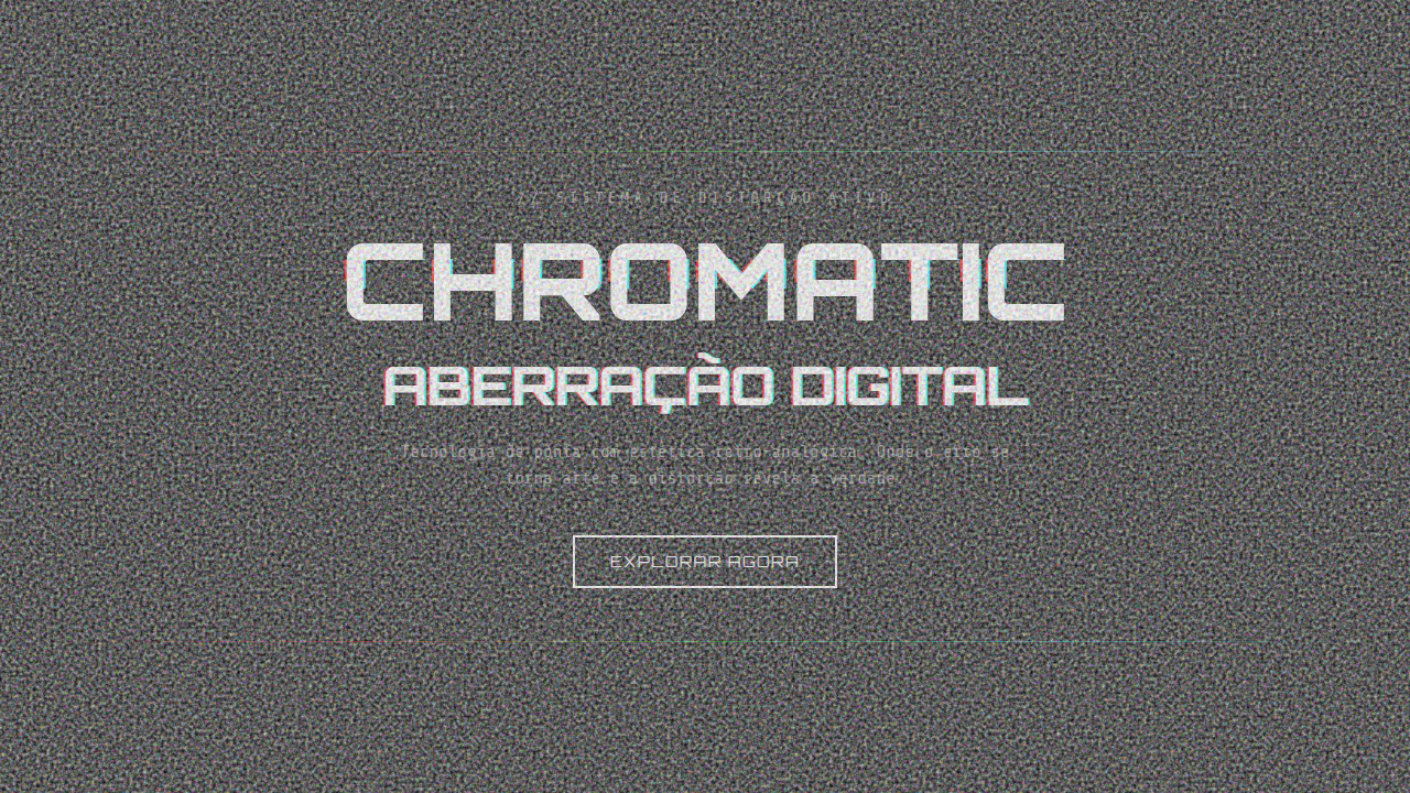
- Controlled glitch — chromatic aberration, scanlines, and noise are seasoning, not the meal. One glitch effect per view. Two and you're a MySpace page.
- Monospace hierarchy — use terminal typefaces for data and system text, pair with a geometric sans for headings. The contrast between human and machine type creates tension.
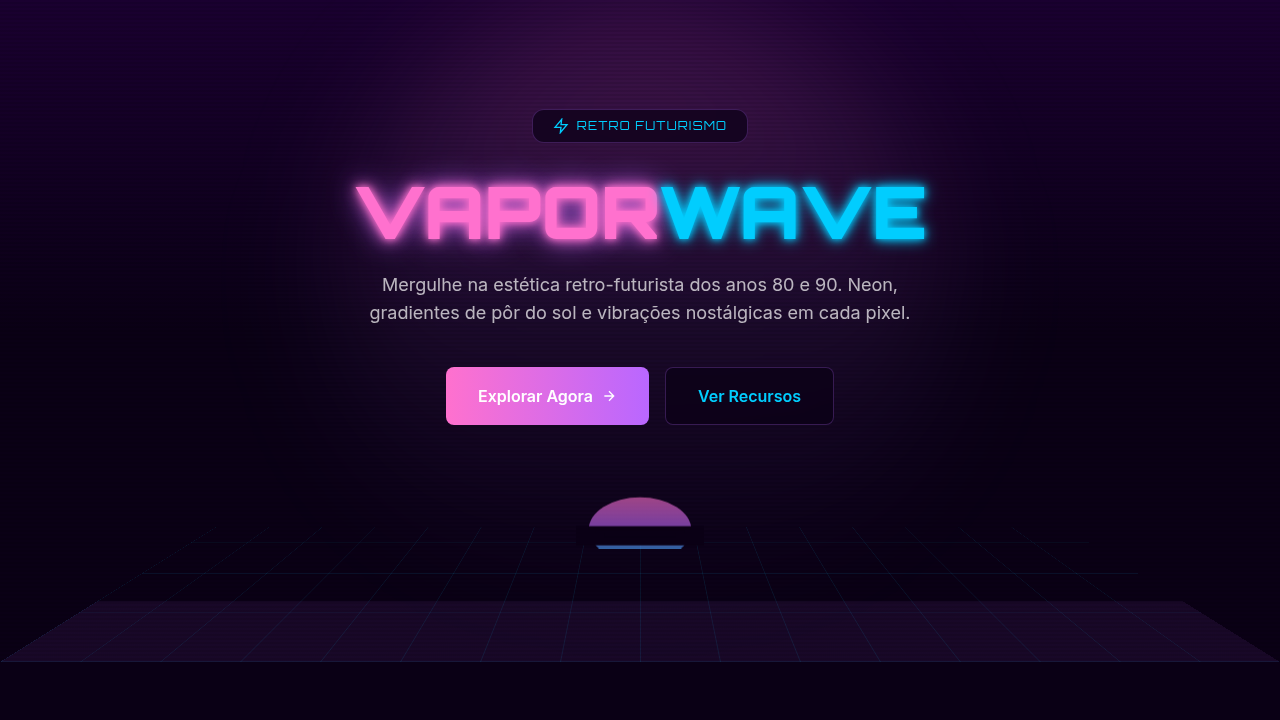
- Color as signal — neon cyan, magenta, electric green aren't palette choices, they're semantic. Each color means something. Assign them to states and never break the mapping.
Technical Specs
Colors
Primary
Effects
Neon glow (text-shadow), glitch animations (skew/offset), scanlines (::before overlay), terminal fonts
Light/Dark
✗ No / ✓ Only
Related
Last synced: 4/1/2026