Cyberpunk Dark Mode Flow
Cyberpunk dark mode landing page, sleek flow design, neon blue accents, circuit patterns, modern dark ui, tech aesthetic. Ideal for landing pages, modern websites. AI-ready template.
Use case: Landing pages, Modern websites
Historical Context
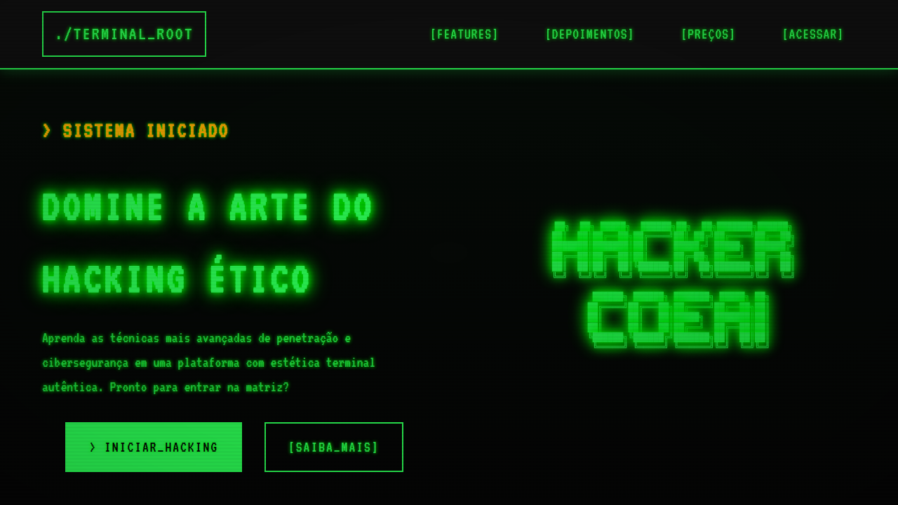
Cyberpunk as a visual language didn't start with Blade Runner, but that's where it learned to breathe. The rain-slicked neons of Ridley Scott's Los Angeles gave designers permission to treat darkness not as absence but as canvas. By the late 2010s, dark mode had gone mainstream — iOS, Android, every SaaS tool scrambling to flip their whites to near-blacks. But cyberpunk dark mode is something else entirely. It's not about reducing eye strain. It's about building atmosphere. The lineage runs through Tron's light cycles, Ghost in the Shell's data overlays, and the terminal aesthetics of early hacker culture. What changed is fidelity. Modern displays render deep blacks and saturated neons with zero compromise. Designers working in crypto dashboards and dev tools noticed: when your interface already lives in a terminal-adjacent world, why fight it? Lean into the glow. Let data streams pulse like arterial flow through a circuit board. This isn't nostalgia cosplay. It's a functional acknowledgment that dense information environments benefit from high-contrast luminous hierarchies against void-dark backgrounds. The cyberpunk frame just happens to make it feel alive.
When to Use
Reach for this when your product lives in the dark by default — developer environments, blockchain explorers, real-time trading interfaces, gaming dashboards. Anywhere users spend hours staring at dense data and need visual hierarchy that doesn't flatten under fatigue. It works when your audience already self-selects into dark themes and expects interfaces that feel engineered, not decorated. Skip it for consumer apps targeting broad demographics. This is a power-user aesthetic with zero patience for softness.
Design Principles
- Darkness is structural, not decorative — use true blacks and near-blacks as load-bearing negative space, not just inverted whites
- Neon is hierarchy — reserve saturated cyan, magenta, and electric green for interactive elements and live data; everything else stays muted
- Motion implies data flow — subtle directional animations should suggest information moving through systems, never looping aimlessly
- Contrast is earned — every bright element must justify its luminance through function; gratuitous glow is visual debt
- Layer depth through opacity and blur — create z-axis without drop shadows by using translucent panels and backdrop filters against the void
Technical Specs
Colors
Primary
Secondary
Effects
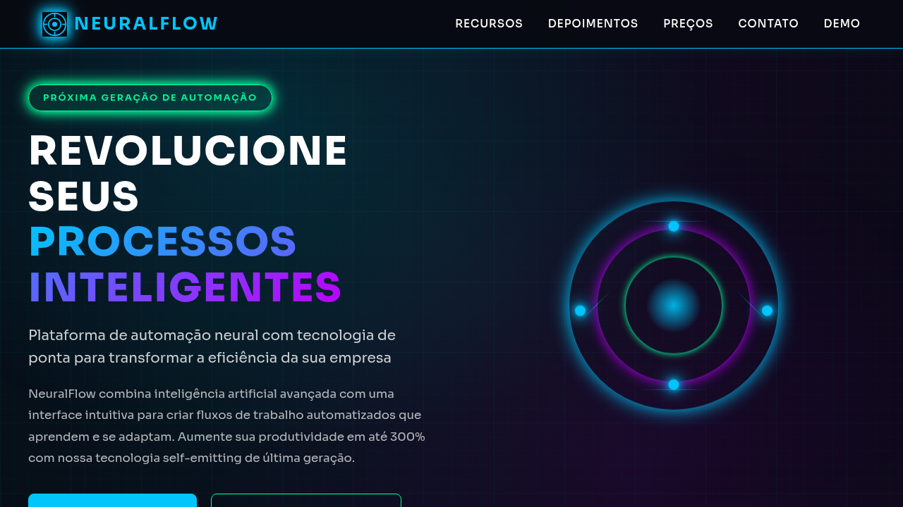
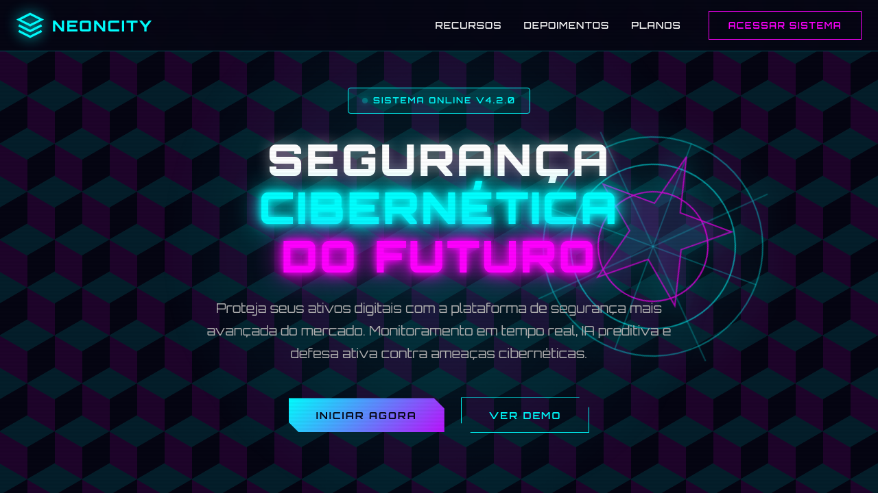
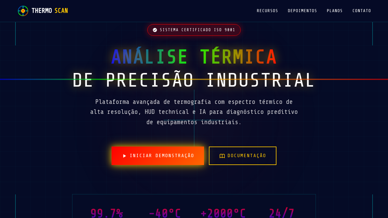
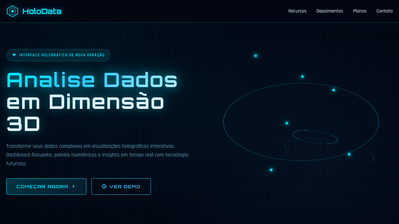
Glowing borders, rounded rectangular containers, faint circuit-board background patterns, smooth digital matte, self-emitting neon strokes.
Light/Dark
✗ No / ✓ Full
Related

Last synced: 4/1/2026