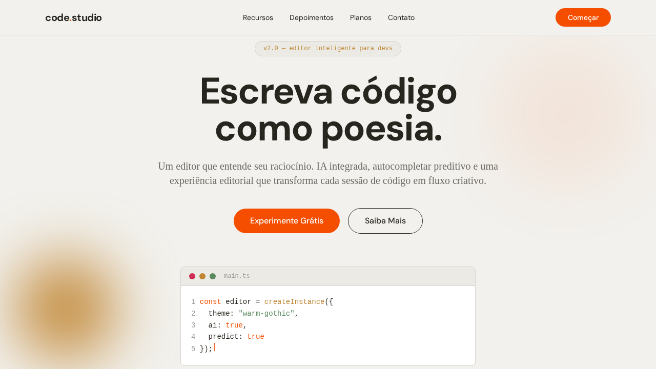
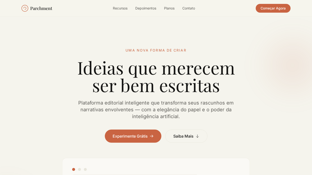
Cursor Warm Gothic
Cursor-inspired warm landing page. Ideal for editores de código ai, ferramentas developer, ides inteligentes, plataformas de coding. AI-ready template.
Use case: Editores de código AI, Ferramentas developer, IDEs inteligentes, Plataformas de coding
Historical Context
When Cursor launched with serif typography in their marketing and product identity, it felt like a quiet rebellion. Every other developer tool was screaming in geometric sans-serifs — Inter, SF Pro, the usual suspects — trying to look fast, clean, technical. Cursor chose warmth. They chose a gothic serif that whispered editorial confidence instead of startup velocity. This wasn't accidental. The warm gothic approach — serifs with generous x-heights, slightly rounded terminals, ink-trap details that nod to print heritage — positions Cursor as the thinking developer's tool. It says: we respect your intelligence. We're not trying to gamify your workflow or reduce coding to button-mashing. The typography carries the weight of a literary magazine, not a SaaS dashboard. The boldness here is in the restraint. In a market where every AI coding tool races to look more futuristic than the last, Cursor's serif identity ages like wood, not plastic. It borrows from the editorial tradition where type was chosen to be read for hours — exactly what developers do with code.
When to Use
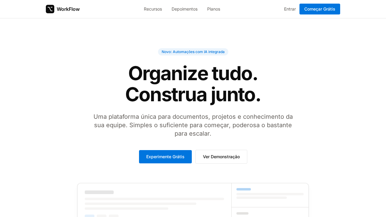
Reach for this pairing when your product needs to feel intelligent rather than merely fast. It works beautifully for AI coding tools that want to distance themselves from the generic developer aesthetic, technical writing platforms where long-form readability matters, and any developer product that treats its users as craftspeople rather than operators. Avoid it for dashboards demanding extreme data density or products targeting junior developers who expect gaming-adjacent energy.
Design Principles
- Serif for body, sans for UI chrome — never reverse this hierarchy or you lose the editorial signal entirely
- Warm means warm: favor cream backgrounds over pure white, let the type breathe against surfaces that don't vibrate
- Generous line-height (1.6–1.75 for body) because the entire point is sustained reading comfort, not information density
- Contrast through weight, not color — use bold and semibold to create hierarchy instead of reaching for accent hues that fight the typographic calm
- Let whitespace do the structural work; if you need heavy dividers or card borders, you've already lost the editorial thread
Technical Specs
Colors
Primary
Secondary
Effects
Canvas off-white quente (#f2f1ed) com texto warm near-black (#26251e) com subtom amarelado. Gothic display font com letter-spacing agressivo negativo (-2.16px em 72px). Serif body font com swash alternates para passagens editoriais. Bordas em espaço de cor oklab para uniformidade perceptual. Acento laranja (#f54e00) para links e marca. Pill elements com radius extremo. Hover muda texto para crimson (#cf2d56).
Light/Dark
✓ Full / ✗ Not Recommended
Related
Last synced: 4/1/2026