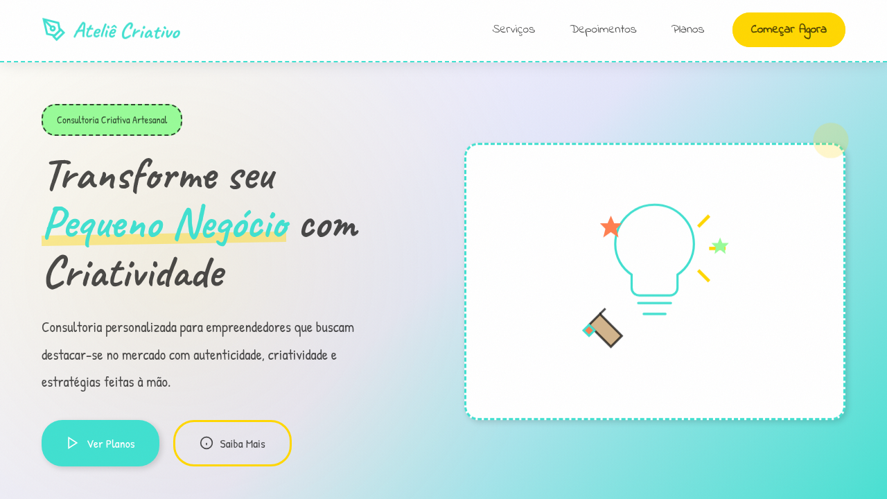
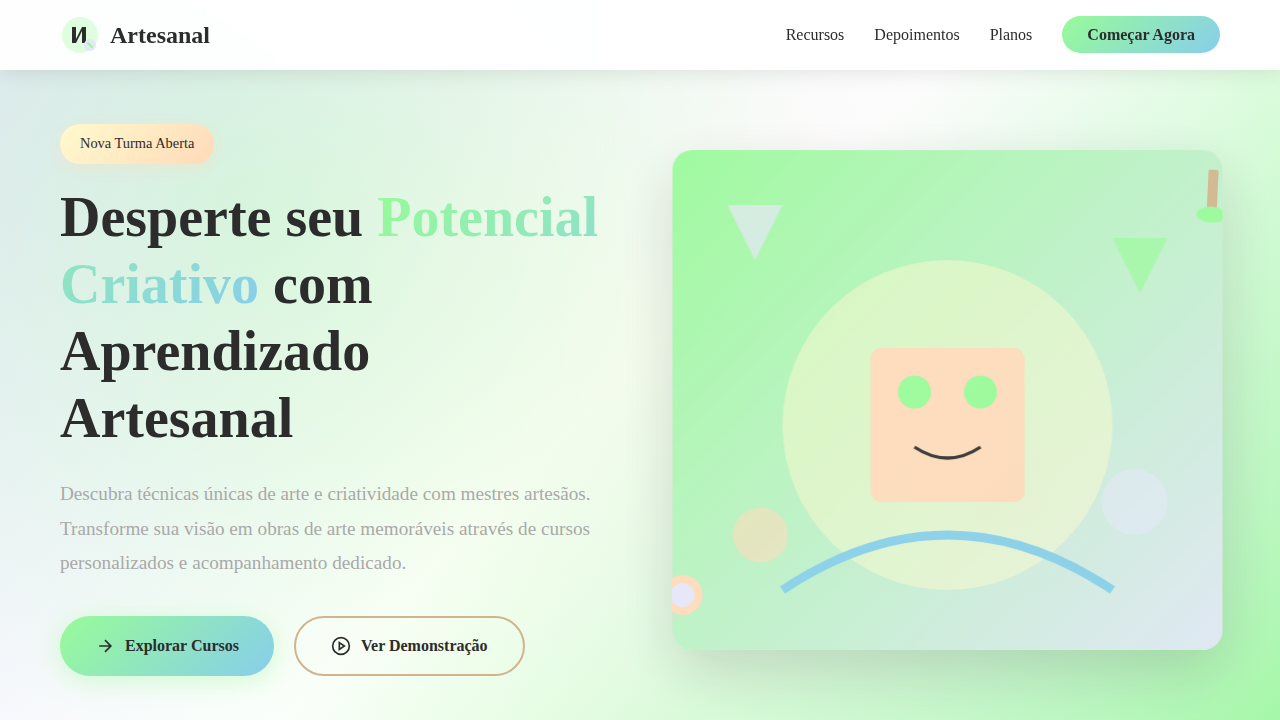
Criatividade Artesanal e Pessoal
Personal and creative hand-drawn landing page for a small business creative consulting firm. Ideal for landing pages, modern websites. AI-ready template.
Use case: Landing pages, Modern websites
Historical Context
Before Canva templates and brand-in-a-box kits flattened everything into the same geometric sans-serif grid, freelancers owned their visual identity through craft. Hand-lettered logos, risograph textures, ink splatter borders — these weren't aesthetic choices, they were survival tactics. When you're competing against agencies with six-figure brand budgets, the one thing they cannot replicate is your hand. The artisanal branding movement traces back to the early 2010s letterpress revival and Etsy-era maker culture, but its roots run deeper — into zine communities, sign painting traditions, and the DIY punk ethic that said 'rough edges are the point.' Freelance illustrators and creative consultants adopted these codes not out of nostalgia but necessity. A wobbly baseline or a scanned paper texture signals something corporate design cannot: that a single human made this, deliberately, with intent. Today the tension is sharper than ever. AI-generated assets push visual homogeneity further. The handmade mark — imperfect, personal, unrepeatable — becomes the clearest signal of authorship a small creative practice can deploy.
When to Use
When the brand IS the person. Solo consultants, illustrators selling their eye, small studios where the founder's taste is the product. Deploy when differentiation depends on visible craft rather than scalable systems — portfolio sites, proposal decks, social presence for creatives who need to feel singular, not templated. Avoid for anything requiring multi-designer consistency at scale; this approach trades repeatability for personality on purpose.
Design Principles
- Visible hand — preserve evidence of human process: scanned textures, brush strokes, tool marks, irregular edges that prove a person was here
- Constraint as signature — limit your palette, your tools, your grid deliberately; the restrictions you choose become recognizable faster than any logo
- Warmth over precision — favor optical alignment over mathematical alignment, organic rhythm over rigid repetition, breath over density
- Material honesty — if it references print, ink, or paper, ground it in real material behavior; fake textures read as decoration, real ones read as craft
- Personal mythology — build a visual language from your actual references, obsessions, and working methods rather than borrowing trending aesthetics wholesale
Technical Specs
Colors
Primary
Secondary
Effects
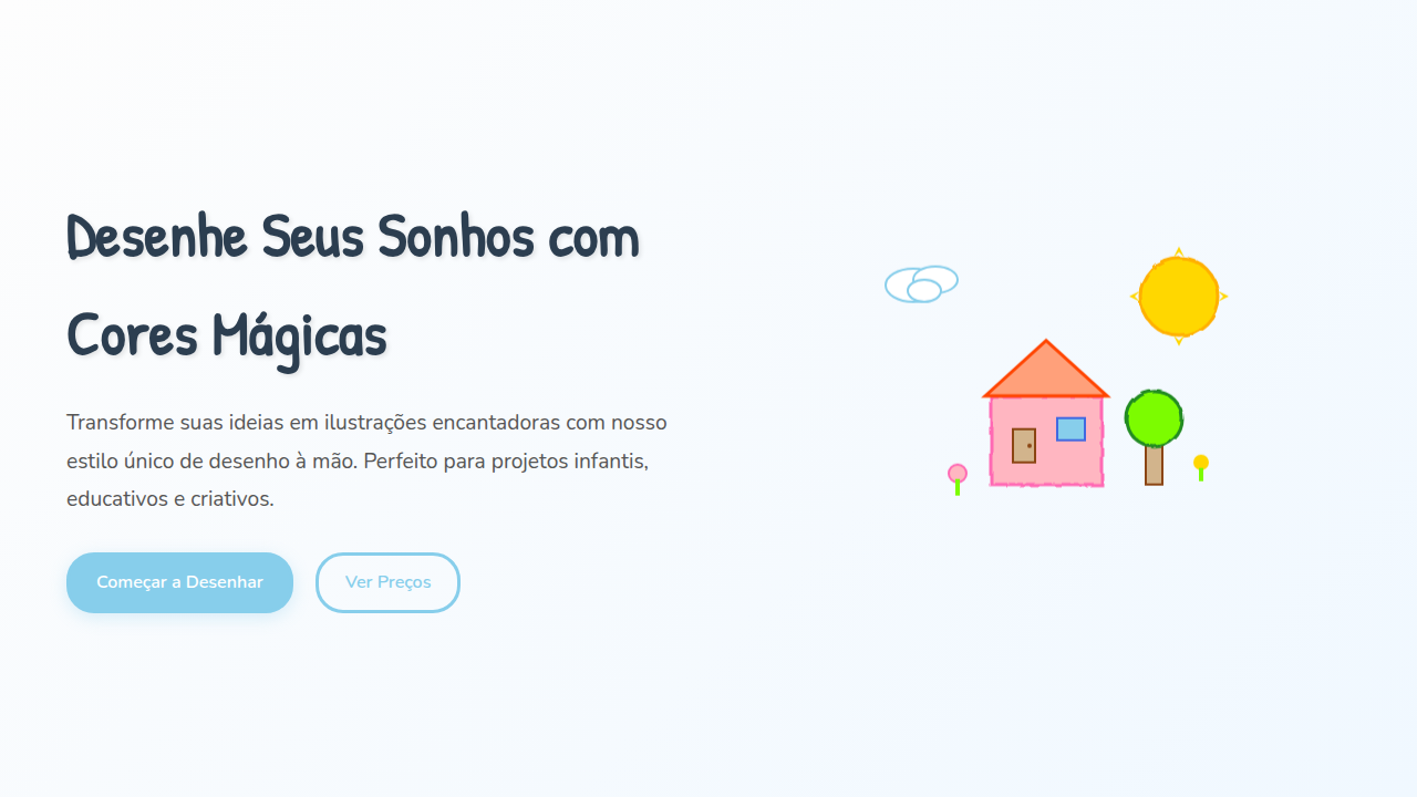
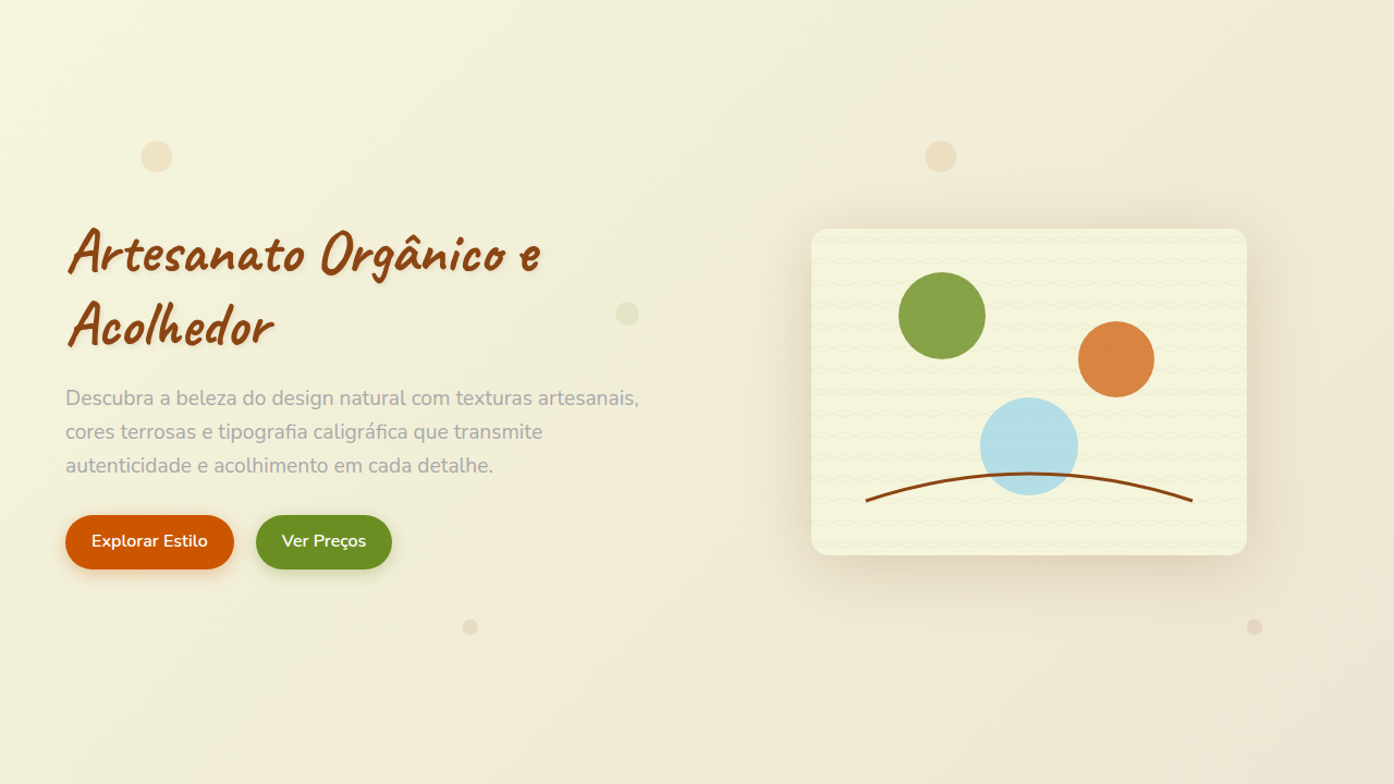
Ilustrações de ícones desenhados à mão, tipografia que simula escrita em diário, texturas de papel amassado, bordas com efeito de lápis, micro-interações de hover com efeito de "desenho" progressivo, transições de seção com efeito de "rascunho".
Light/Dark
✓ Full / ✗ No
Related
Last synced: 4/1/2026