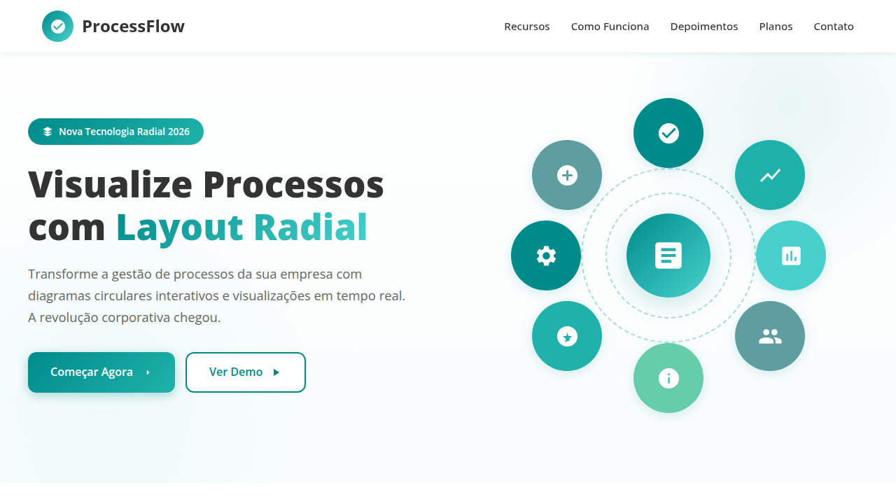
Corporate Radial Process
Corporate landing page, radial process visualization, clean white background, teal accent, structured layout, flat design. Ideal for landing pages, modern websites. AI-ready template.
Use case: Landing pages, Modern websites
Historical Context
Radial process diagrams didn't start on screens. They started on whiteboards, napkins, and the backs of strategy decks where someone drew a circle with arrows because linear thinking wasn't cutting it. The idea that business processes loop — that output feeds input, that review informs planning — is ancient. But visualizing it cleanly? That took decades of bad clip art and worse PowerPoint templates. The corporate world latched onto circular flow diagrams in the late '90s when consulting firms needed ways to make iterative methodology look inevitable. McKinsey had cycles. Deloitte had wheels. Every strategy deck featured some variation of arrows chasing each other around a center point. The visual grammar was established: rotation equals continuity, segments equal phases, and the center holds the governing idea. The jump from static slides to interactive web components changed what radial diagrams could do. Suddenly segments could expand, phases could animate in sequence, and hover states could reveal depth without cluttering the overview. The form stayed familiar — executives still recognize the shape instantly — but the medium finally caught up with the complexity these diagrams were always trying to communicate.
When to Use
Reach for radial process components when your content is genuinely cyclical — when step five feeds back into step one, when there's no true beginning or end. They work beautifully in strategy decks where you need to communicate continuous improvement, iterative methodology, or recurring business cycles. Corporate presentations love them because they compress complex workflows into a single glanceable shape. But be honest with yourself: if your process is actually linear with a fixed start and finish, a radial layout will confuse more than clarify. The circle implies perpetual motion. Use it when that's true.
Design Principles
- Equal visual weight per segment — if one phase dominates visually, viewers assume it dominates temporally, which breaks the cyclical contract
- Directional flow must be unambiguous — clockwise is the default reading direction in Western contexts, and any deviation needs explicit arrow indicators
- The center is prime real estate — use it for the governing concept or leave it empty; never waste it on decorative elements
- Limit segments to 3–7 phases — beyond seven, the slices become too thin to label legibly and the diagram collapses into visual noise
- Animation should reinforce sequence, not decorate — if segments animate in, they should follow the flow direction at a pace that lets each label register before the next appears
Technical Specs
Colors
Primary
Secondary
Effects
Semi-circular timeline, segmented process arc, white simple glyphs inside colored segments, flat vector clean matte finish.
Light/Dark
✓ Full / ✗ No
Related

Last synced: 4/1/2026