Construtivismo de Eventos Dinâmicos
Design an energetic and innovative constructivist landing page for a design and innovation conference. Ideal for landing pages, modern websites. AI-ready template.
Use case: Landing pages, Modern websites
Historical Context
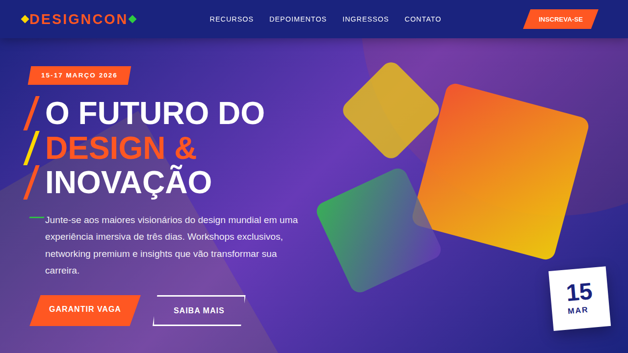
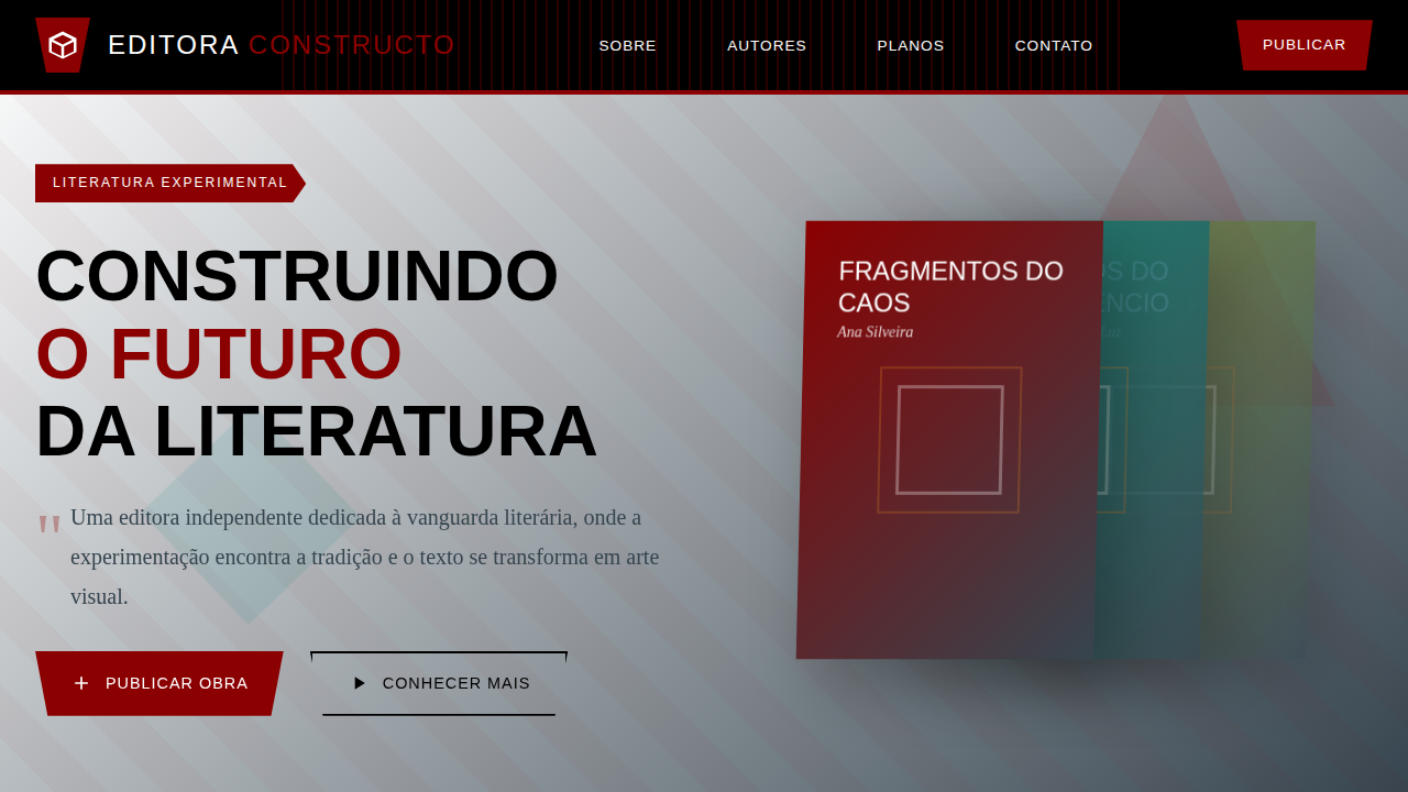
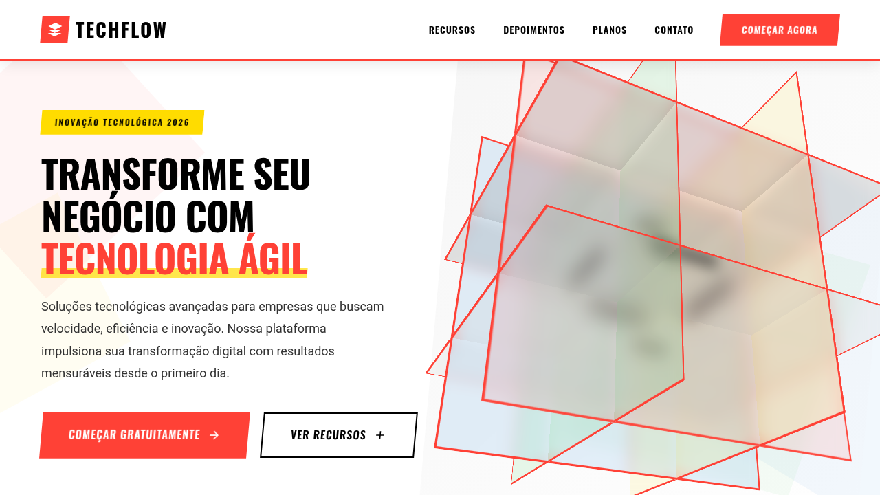
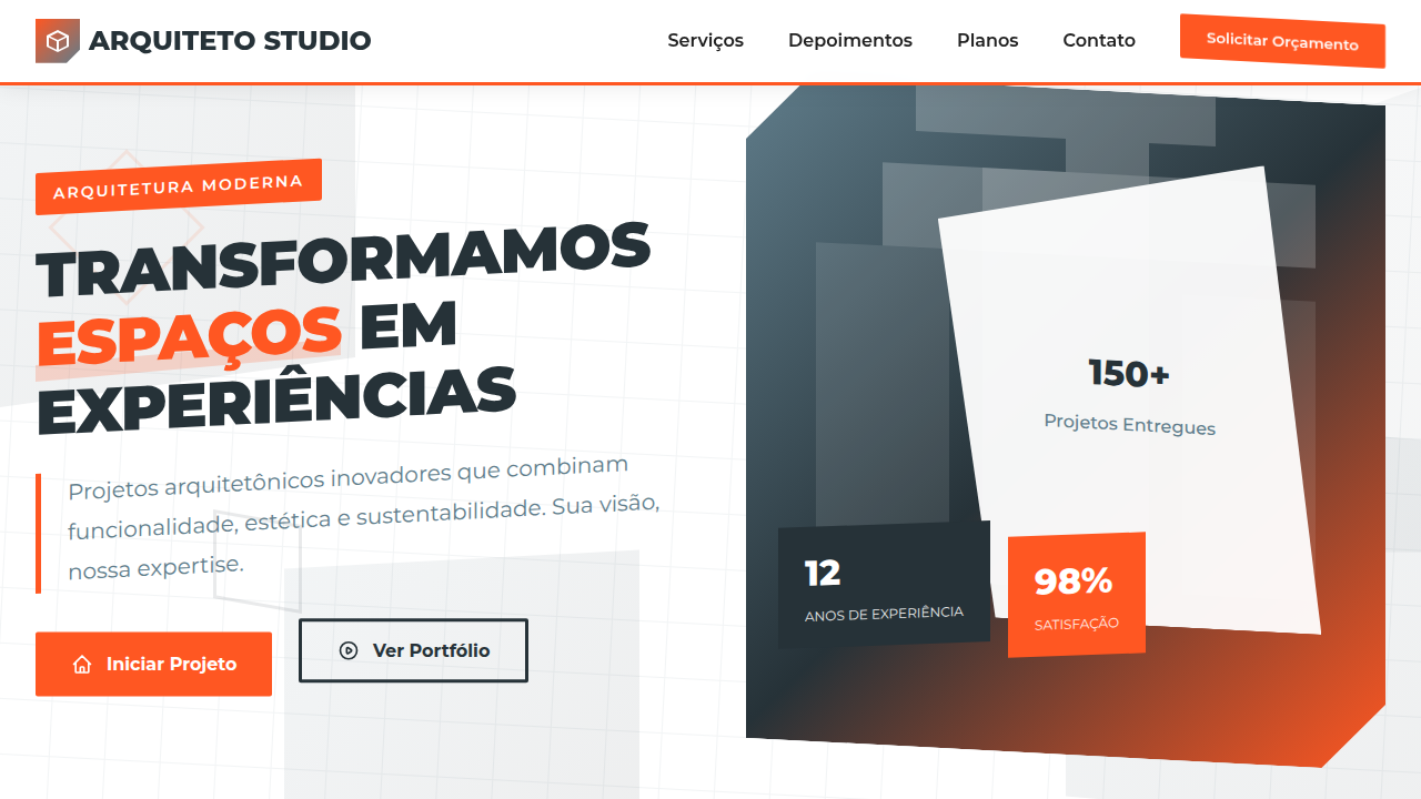
Russian Constructivism wasn't decoration. It was propaganda machinery — visual systems engineered to move masses. El Lissitzky's "Beat the Whites with the Red Wedge" didn't ask you to look. It demanded you act. That urgency, that kinetic force, is exactly what event design needs. When Rodchenko slashed diagonals across a poster, he was solving the same problem every conference organizer faces: how do you make someone stop scrolling and register? The Constructivists understood that geometric tension creates psychological momentum. A triangle piercing a circle isn't just composition — it's a call to action rendered in pure form. Modern tech conferences have rediscovered this. The angular energy of Constructivist layouts translates perfectly to innovation events because both share DNA: forward motion, disruption of the static, the collision of ideas made visible. When you see a summit identity built on intersecting planes and bold diagonals, you're looking at a century-old solution to a timeless problem — making people feel that something important is about to happen.
When to Use
Reach for this when your event needs to feel urgent and forward-leaning. Tech conferences announcing paradigm shifts. Hackathons where energy matters more than elegance. Innovation summits that need to signal disruption without resorting to tired startup clichés. Design events that want to honor craft history while feeling contemporary. It works best when the audience already self-identifies as builders — people who respond to structural boldness over decorative polish. Skip it for wellness retreats or luxury galas.
Design Principles
- Diagonal dominance — tilt your grid 15-45° to inject kinetic energy; static horizontals kill the urgency Constructivism demands
- Limited palette, maximum contrast — two or three colors max, always with red or orange as the activating force against neutral grounds
- Geometric collision over gentle overlap — shapes should intersect aggressively, creating tension points that anchor the viewer's eye
- Typography as architecture — letterforms aren't labels, they're structural elements; set them at angles, vary weight dramatically, let text become geometry
- Asymmetric balance — reject centered layouts entirely; weight one side heavily and counterbalance with a single bold element on the other
Technical Specs
Colors
Primary
Secondary
Effects
Colagens de imagens e texto com sobreposições, formas geométricas angulares, tipografia sans-serif impactante, layouts assimétricos que transmitem energia, micro-interações de hover com rotação de elementos, transições de seção com efeito de "desdobramento".
Light/Dark
✓ Full / ✗ No
Related
Last synced: 4/1/2026