Construtivismo Arquitetônico
Precise and structured constructivist landing page for a modern architecture firm. Ideal for landing pages, modern websites. AI-ready template.
Use case: Landing pages, Modern websites
Historical Context
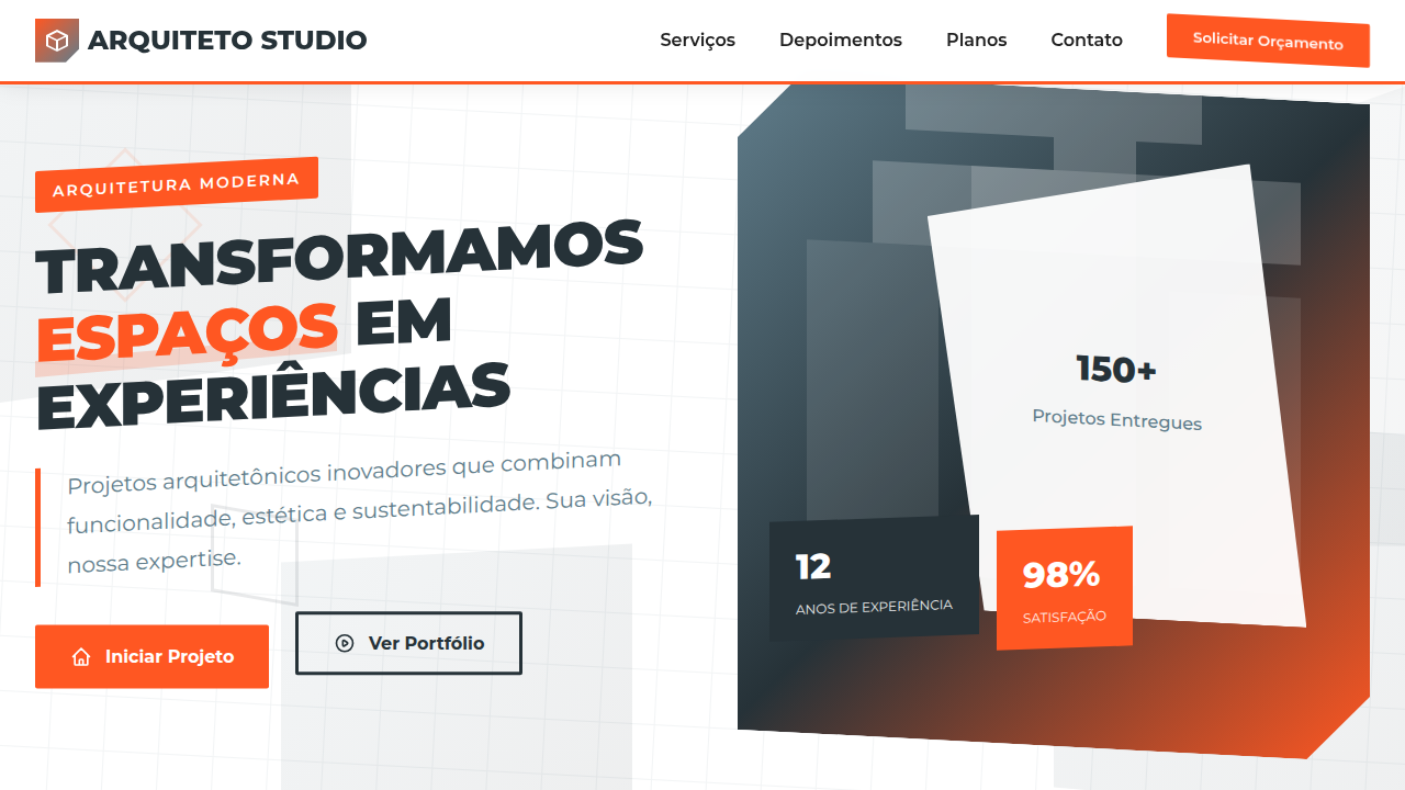
Tatlin's Monument to the Third International never got built. That's almost the point. The 1920 proposal — a leaning double helix of iron and glass, taller than the Eiffel Tower — was pure structural ambition rendered visible. No ornament. No apology. The skeleton was the building. Russian Constructivism treated architecture as ideology made physical. Rodchenko's graphics, Melnikov's workers' clubs, the Vesnin brothers' competition entries — they shared a conviction that form should expose its own logic. Diagonal tension. Asymmetric balance. Materials doing exactly what materials do, nothing more. This translates to digital design more directly than most historical movements. When you strip a UI to its structural bones — visible grid lines, exposed hierarchy, type that announces its own weight — you're working in the same territory. The Constructivists didn't decorate structure. They made structure the entire visual argument. That honesty hits different in an era of gratuitous blur and floating cards.
When to Use
Reach for this when the project demands intellectual weight. Architecture firms presenting monolithic concrete. Urban planning dashboards where data density is a feature, not a problem. Construction companies that want to look like they actually build things. Design studios tired of the same rounded-corner softness. It works when your client's work involves real materials, real forces, real engineering — and the visual language should reflect that seriousness without becoming cold.
Design Principles
- Expose the grid. Let structural lines remain visible — they're not scaffolding to hide, they're the composition itself.
- Diagonal tension over static symmetry. Angled elements create movement and ideological urgency that centered layouts cannot.
- Material honesty in color. Raw concrete grays, iron oxide reds, industrial black. No gradients pretending to be something they're not.
- Typography as architecture. Bold geometric sans-serifs at extreme scale become load-bearing elements, not decoration.
- Functional asymmetry. Weight distributed unevenly but deliberately — every element earns its position through visual counterbalance.
Technical Specs
Colors
Primary
Secondary
Effects
Grids complexos e sobrepostos, formas geométricas que guiam o olhar, tipografia sans-serif limpa e técnica, fotografias de arquitetura com ângulos dramáticos, micro-interações de hover com expansão de elementos, transições de seção com efeito de "construção".
Light/Dark
✓ Full / ✗ No
Related


Last synced: 4/1/2026