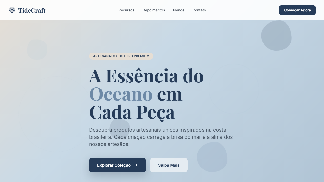
Coastal Commerce
Coastal-inspired e-commerce UI using navy, driftwood beige, and pale ocean blues. Ideal for e-commerce de moda praia, lojas de surf e lifestyle, produtos artesanais costeiros, decoração náutica. AI-ready template.
Use case: E-commerce de moda praia, Lojas de surf e lifestyle, Produtos artesanais costeiros, Decoração náutica
Historical Context
Coastal commerce design didn't emerge from fashion or tech — it came from surf shop culture and the mail-order catalogs of the late '80s. Patagonia, Billabong, and Rip Curl built visual languages around horizontal imagery long before e-commerce existed. Wide landscape photography, minimal text overlays, and that specific ratio of whitespace to product that makes everything feel unhurried. The digital translation happened awkwardly at first. Early coastal e-commerce sites crammed products into grids that killed the vibe entirely. The breakthrough was horizontal scrolling blocks — borrowed from editorial magazine layouts — that finally let product photography breathe the way it does in a physical lookbook. Brands like Saturdays NYC and Outerknown proved you could sell online without sacrificing the spatial generosity that coastal aesthetics demand. What we're seeing now is the maturation of that language. The horizontal block isn't decorative anymore — it's structural. It creates rhythm, controls pacing, and gives the customer permission to browse slowly. That's the whole point of coastal commerce: you're not rushing anyone.
When to Use
When the brand lives outdoors and the product photographs wide. Coastal Commerce works for surf, sailing, beach lifestyle, and premium outdoor brands where horizontal imagery is the natural format. Deploy it when your product catalog is small-to-medium and each item deserves cinematic presentation rather than grid compression. Skip it entirely if you're selling 500+ SKUs or anything that needs rapid comparison shopping — this layout rewards browsing, not efficiency.
Design Principles
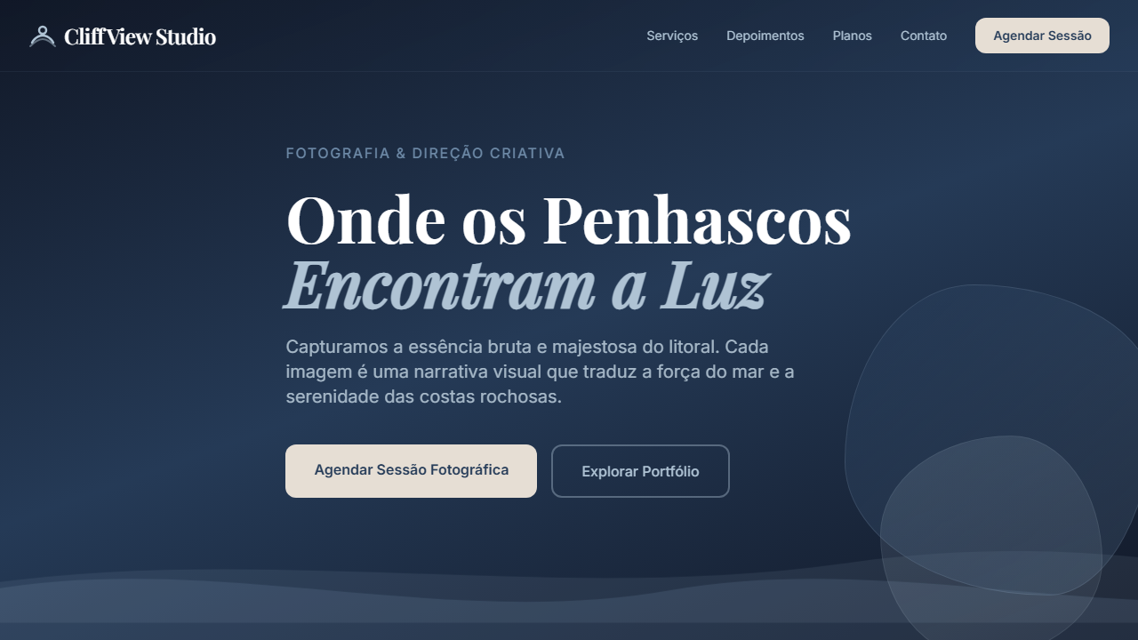
- Horizontal blocks as primary rhythm — stack wide containers that scroll the eye laterally before moving down, mimicking the horizon line itself
- Restrained palette pulled from sand, salt, and shadow — two neutrals, one accent max, let photography carry the color load
- Generous negative space as brand signal — tight layouts read as discount; breathing room reads as premium and intentional
- Typography stays dry and functional — one sans-serif, medium weight, no decorative faces competing with landscape imagery
- Product density stays low per viewport — three items maximum visible at once, forcing deliberate attention on each piece
Technical Specs
Colors
Primary
Secondary
Effects
Cards horizontais de produto, linhas finas em Coastal Slate, sombras em soft drop, botões com Deep Current sólido, tags e badges em Driftwood Pale
Light/Dark
✓ Full / ◐ Partial
Related
Last synced: 4/1/2026