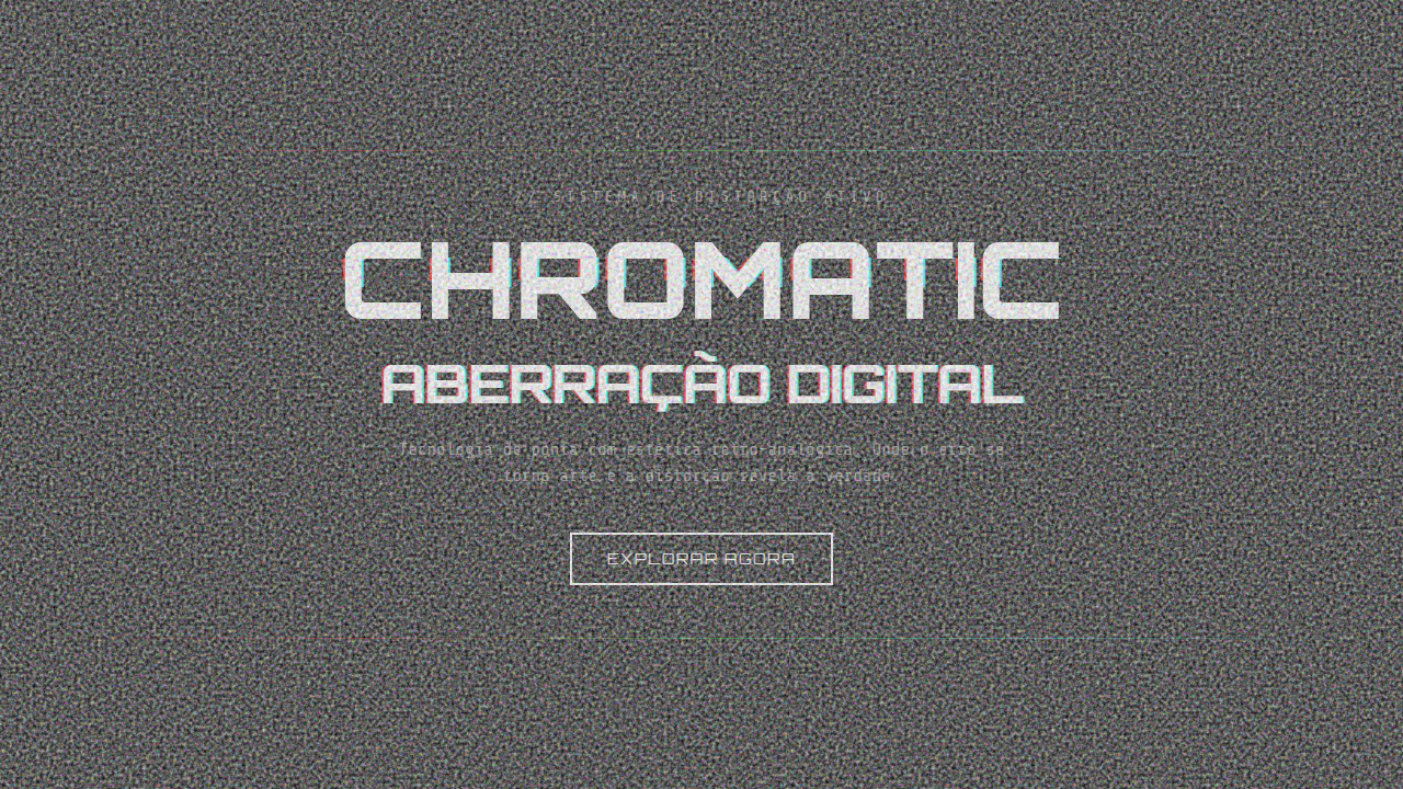
Chromatic Aberration / RGB Split
Design with chromatic aberration RGB split effect. Ideal for landing pages, saas. AI-ready template.
Use case: Landing pages, SaaS
Historical Context
Chromatic aberration was never supposed to be beautiful. It's a lens failure — light refracting at slightly different wavelengths, producing those telltale red-cyan fringes at the edges of an image. Photographers spent decades engineering it out. Then somewhere around 2012, glitch artists started engineering it back in. The glitch art movement treated digital errors as raw material. Datamoshing, pixel sorting, signal corruption — all fair game. RGB channel splitting fit right in: take an image, offset the red and blue channels by a few pixels, and suddenly you've got something that feels unstable. Dangerous. Alive. It wasn't decoration. It was a statement about the fragility of digital media. By the late 2010s, the aesthetic had been fully absorbed by mainstream design. Gaming brands, music platforms, tech startups — everyone wanted that split-channel energy. The effect became shorthand for 'we're technical, we're edgy, we don't play it safe.' Sometimes that's earned. Sometimes it's a crutch. The line between intentional disruption and lazy signaling is thinner than a one-pixel offset.
When to Use
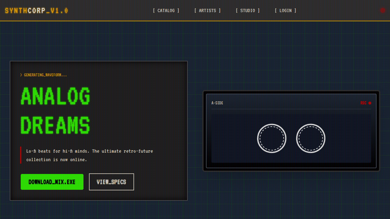
RGB split works when your brand actually lives in that space between precision and chaos. Gaming interfaces, electronic music visuals, cyberpunk aesthetics, experimental portfolios — contexts where visual instability reinforces the message. It's also effective for hover states and transitions where you want momentary disruption without permanent noise. Don't use it on healthcare sites. Don't use it on banking apps. And please — don't apply it to body text and call it a design decision.
Design Principles
- Subtlety over spectacle — 1-3px offsets read as intentional; 10px reads as broken. Restraint is the difference between a designer who understands the reference and one who just discovered a Photoshop filter.
- Animate with purpose — Static RGB split is a poster. Animated RGB split is an experience. Use it on interaction states (hover, focus, glitch-in transitions) where the motion reinforces a narrative of digital instability.
- Limit the surface area — Apply to headlines, hero imagery, or UI accents. Never to entire layouts. The effect needs negative space to breathe, otherwise it's just visual noise competing with itself.
- Respect readability thresholds — If users squint, you've gone too far. The channel offset should create atmosphere without sacrificing legibility. Test at every viewport size.
- Pair with clean geometry — RGB split gains power from contrast. Set it against rigid grids, monospace type, and minimal color palettes. Chaos needs structure to feel intentional rather than accidental.
Technical Specs
Colors
Primary
Effects
RGB offset animation, glitch timing, scan line movement, noise flicker, distortion on hover
Light/Dark
✓ Full / ✓ Dark preferred
Related
Last synced: 4/1/2026