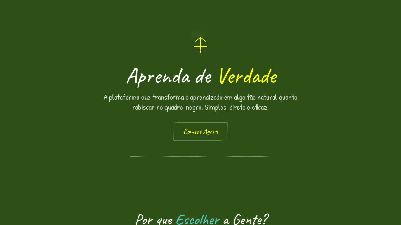
Chalkboard / Hand-Drawn
Chalkboard hand-drawn interface. Ideal for landing pages, saas. AI-ready template.
Use case: Landing pages, SaaS
Historical Context
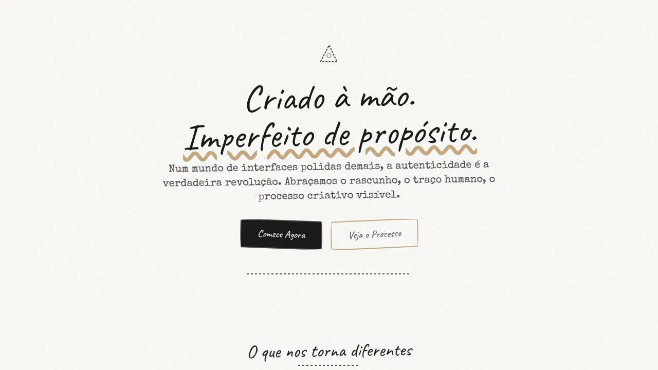
The chalkboard aesthetic didn't start on Pinterest. It started in pubs, in classrooms, on the sidewalk signs of bakeries that couldn't afford printed menus. Hand-drawn lettering carried information before typography was democratized — and it carried personality with it. Every wobbly serif, every smudged edge said: a human was here. Digital design rediscovered this in the early 2010s. Suddenly every coffee shop website needed a blackboard texture and some faux-chalk script. Most of it was terrible — slapping a grunge overlay on Lobster font isn't craft, it's costume. But the good stuff understood something deeper: imperfection is a trust signal. When everything around you is pixel-perfect and suspiciously polished, a hand-drawn line feels like eye contact. Now, in a landscape flooded with AI-generated imagery, the chalkboard style hits differently. It's a deliberate rejection of frictionless production. The eraser smudges, the uneven baselines, the dust — they say this wasn't generated in three seconds. Whether that's true or not, the feeling lands. Warmth through visible effort.
When to Use
Reach for chalkboard when your brand needs to feel approachable without feeling cheap. It works beautifully for education products aimed at younger audiences, restaurant menus that want character over minimalism, and craft brands that need to signal handmade origins. It's also a strong choice when you're fighting against a category that feels sterile — fintech for kids, health food that doesn't want to look clinical. Avoid it for anything requiring precision, authority, or luxury positioning. Chalk doesn't do corporate.
Design Principles
- Imperfection is intentional — uneven strokes, visible erasure marks, and baseline drift aren't bugs, they're the entire point. Sanitize them and you lose the soul.
- Texture carries weight — the blackboard surface isn't decoration, it's structure. Without grain and depth, chalk lettering floats in a void. Commit to the material.
- Restraint over novelty — one or two chalk elements against clean space is striking. An entire page of faux-handwriting is exhausting and illegible.
- Color palette stays dusty — true chalk lives in muted whites, pastels, and earth tones against dark grounds. Neon on blackboard is a costume party.
- Legibility is non-negotiable — hand-drawn doesn't mean unreadable. The best chalkboard typography balances character with clarity, especially at small sizes.
Technical Specs
Colors
Primary
Secondary
Effects
Flat classroom lighting, chalk drawing animations (stroke-dasharray), eraser wipe transitions, hand-drawn wobble, sketch reveal on scroll
Light/Dark
✓ Full / ✗ No (dark BG only)
Related
Last synced: 4/1/2026