Cassette Futurism
Cassette futurism landing page. Ideal for landing pages, saas. AI-ready template.
Use case: Landing pages, SaaS
Historical Context
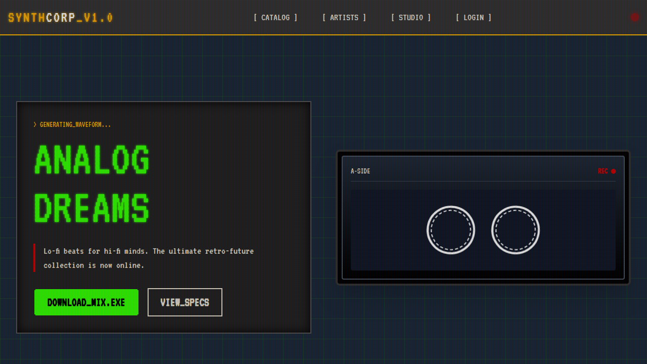
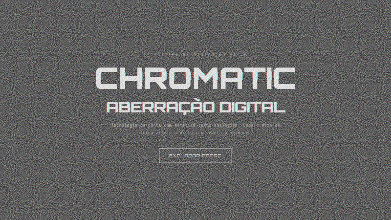
Before touchscreens flattened everything, the future looked physical. Ridley Scott's Alien gave us interfaces you could punch — toggle switches, amber phosphor displays, keyboards with travel. Kubrick's 2001 had screens embedded in padded walls like instruments in a cockpit. The future wasn't sleek. It was engineered. Cassette futurism lives in that gap between what designers in the 1970s and 80s imagined tomorrow would look like and what actually arrived. It's the aesthetic of futures that never happened — where data still lived on magnetic tape, where monitors had scan lines, where you heard the machine thinking. The appeal is tactile. Every interaction had weight, friction, consequence. This became a deliberate design language around 2015, when indie game developers and digital artists started mining that visual vocabulary — not out of laziness, but because those chunky bezels and blinking LEDs communicate something flat design never could: that technology is a thing you operate, not a surface you passively consume.
When to Use
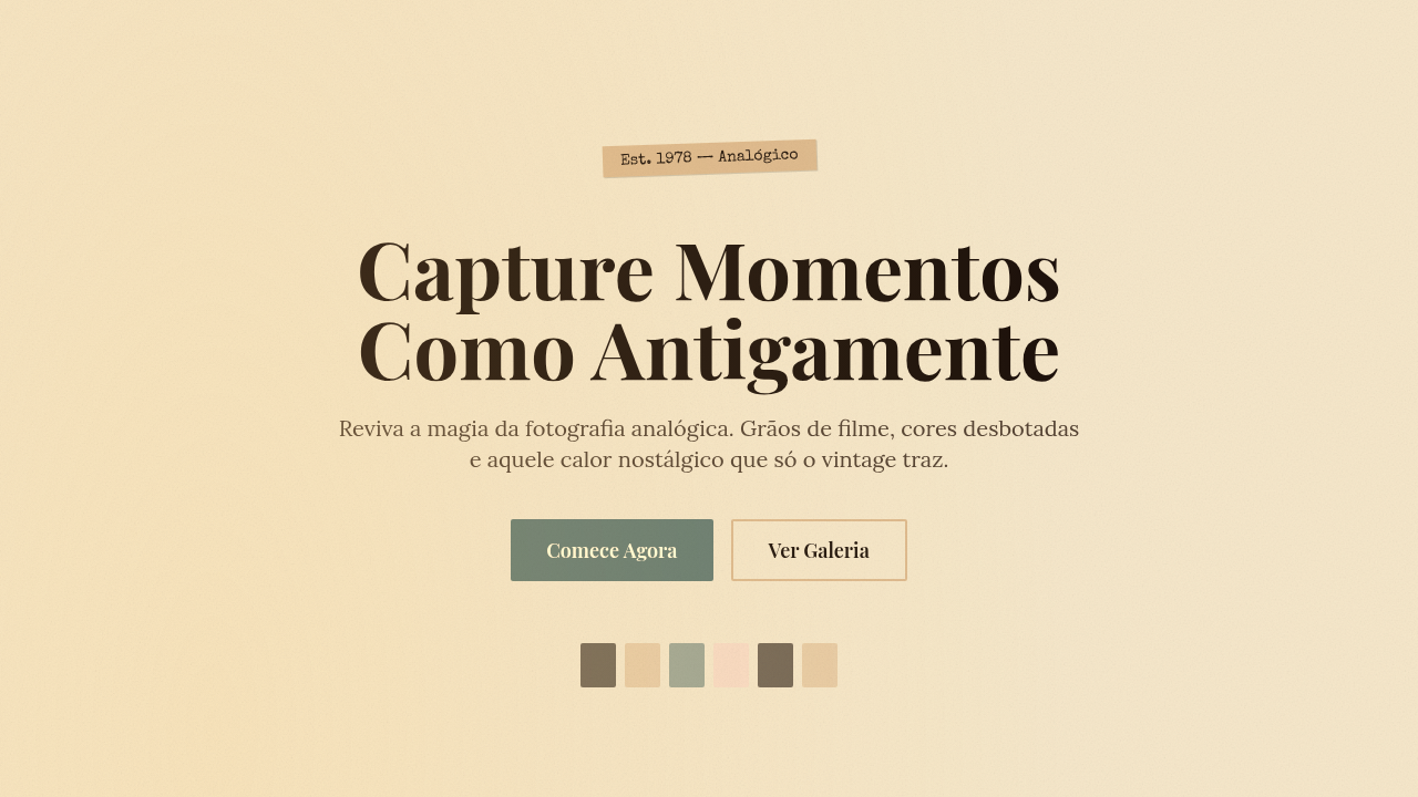
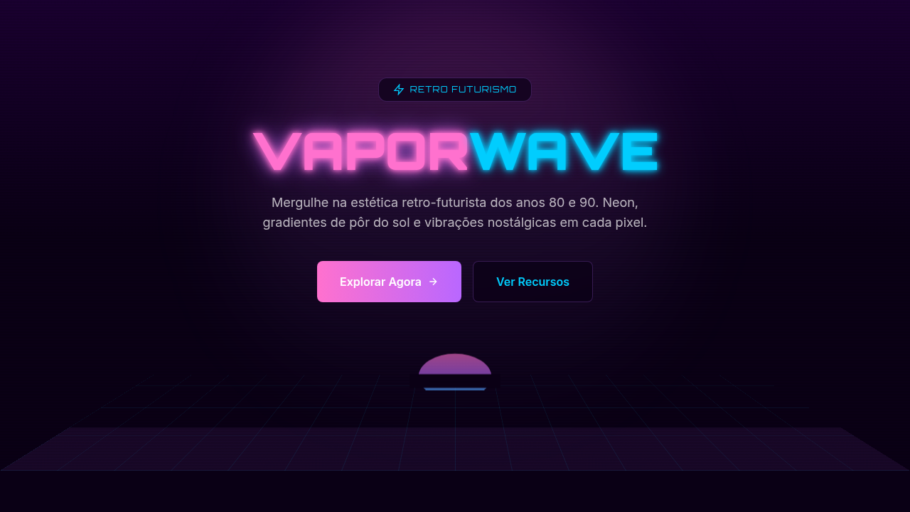
Reach for cassette futurism when your project needs to feel handmade and mechanical in a world of frictionless glass. It works for indie games that want atmosphere without AAA budgets, retro tech brands building identity around craft and durability, nostalgia products targeting the 30-45 demographic, and sci-fi projects that reject the sterile Apple-store vision of the future. Skip it if your audience expects polish and speed — this aesthetic deliberately slows things down.
Design Principles
- Physical metaphors over abstract ones — buttons should look like they depress, switches should toggle, screens should emit light rather than display it
- Imperfection is information — scan lines, noise, slight misalignment, and warm color drift all signal that a system is alive and analog
- Constrained color palettes — amber/green monochrome, limited RGB, or desaturated earth tones punctuated by single-color indicator lights
- Typography that respects the grid — monospaced, pixel-snapped, or dot-matrix letterforms that acknowledge the display medium
- Sound and motion carry weight — interactions click, hum, and whir; transitions feel mechanical rather than eased
Technical Specs
Colors
Primary
Secondary
Effects
CRT scanline overlay, VHS tracking distortion, phosphor glow, chunky pixel borders, tape reel animations, analog meter gauges, command-line text effects, LED dot matrix displays
Light/Dark
✗ No / ✓ Full
Related
Last synced: 4/1/2026