Cartesian
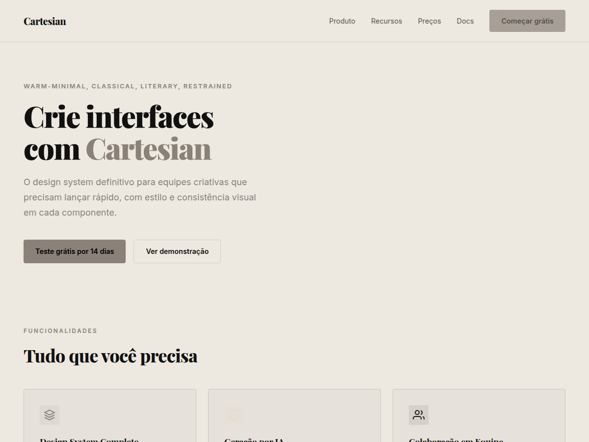
Cartesian — Quiet warm-neutral palette with classical Playfair serifs; tasteful and unhurried. Playfair Display typography. warm bone and stone neutrals only. Best for investment thesis, white paper, advisory deliverable. AI-ready design system.
Use case: investment thesis, white paper, advisory deliverable, research report, book / longform pitch, gallery / cultural
Historical Context
The Cartesian system draws its name from René Descartes' pursuit of clarity through reduction — the idea that truth emerges when you strip away ornament until only structure remains. This is Swiss design filtered through the lens of quiet luxury: the grid is sacred, but the palette refuses the clinical coldness that plagued mid-century rationalism. Where Müller-Brockmann reached for Akzidenz-Grotesk and stark black-on-white, Cartesian introduces warmth through material restraint. Playfair Display carries the weight of editorial tradition — its high contrast and refined hairlines speak to an era when typography was carved, not rendered. The warm neutrals (stone, sand, parchment) reject both the sterile whites of tech minimalism and the saturated palettes of consumer brands. This is the design language of spaces that don't need to shout. Think Aesop storefronts, Kinfolk editorial spreads, the quiet confidence of a well-bound book. It acknowledges that true minimalism isn't absence — it's the discipline of choosing exactly what earns its place on the page.
When to Use
Deploy Cartesian when your brand needs to communicate substance without spectacle. It works for luxury services where trust is built through restraint — private banking, architectural studios, high-end hospitality, curated retail. Choose this when your audience reads silence as confidence, not emptiness. Avoid it for anything requiring urgency, youth energy, or mass-market appeal. This system rewards patience and assumes a viewer who appreciates craft over stimulation.
Design Principles
- Warm restraint over cold minimalism — every neutral carries undertone, never pure gray or clinical white
- Typography as architecture — Playfair Display sets the structural rhythm; weight and scale do the work that color refuses to
- Negative space is compositional, not decorative — whitespace earns its proportion through grid logic, not aesthetic laziness
- Zero saturated color — if it wouldn't exist in sandstone, linen, or aged paper, it doesn't belong in the palette
- Every element justifies its existence — if removing it changes nothing, it was never needed
Technical Specs
Colors
Primary
Secondary
Effects
display font Playfair Display for hero headlines, subtle hover (opacity 0.8, 200ms), refined focus rings, warm bone/stone neutrals, zero saturated color, classical Playfair contrast, generous whitespace, clamp(4rem,8vw,8rem) section gaps
Light/Dark
✓ Full / ✗ None
Related
Last synced: 5/6/2026