CAD-Inspired Blueprint
CAD landing page style, blueprint aesthetic, dark blue background, white technical lines, mechanical details, engineering look. Ideal for landing pages, modern websites. AI-ready template.
Use case: Landing pages, Modern websites
Historical Context
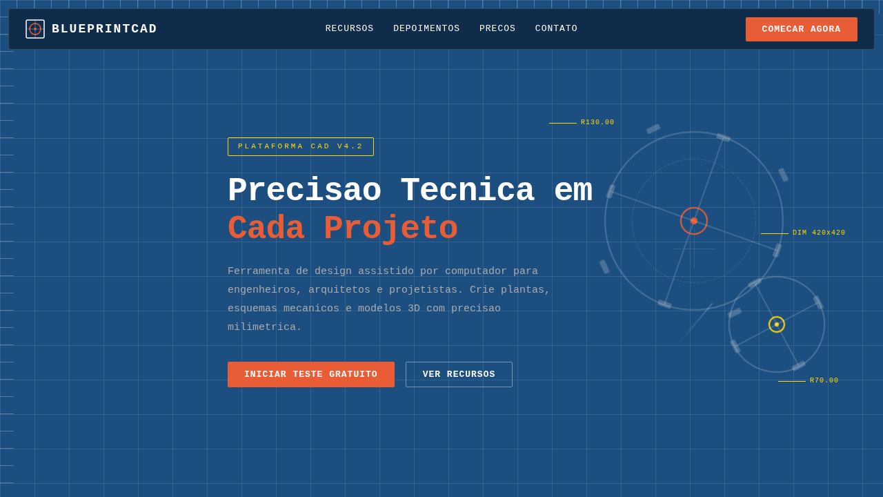
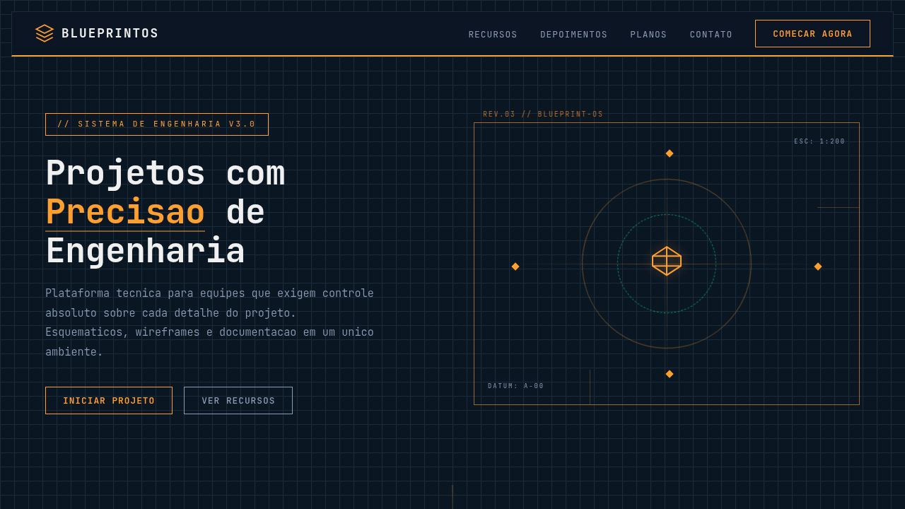
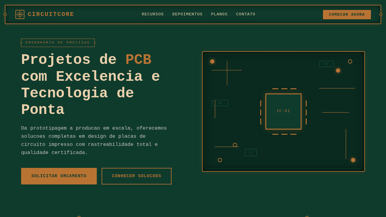
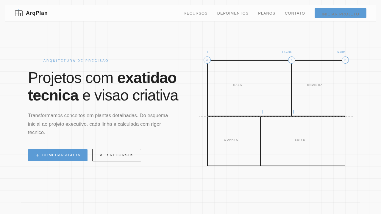
AutoCAD shipped in 1982 and quietly rewired how an entire generation thinks about precision. Those cyan lines on dark backgrounds, the obsessive dimensioning, the grid snaps — none of it was designed to be beautiful. It was designed to be correct. And yet, decades later, web designers keep returning to that visual language because correctness has its own magnetism. SolidWorks and CATIA pushed things further into 3D, but the flat blueprint aesthetic stuck around. There's something about the orthographic projection — that flattened, annotated view of complex geometry — that translates remarkably well to screen interfaces. It communicates: we built this with intention. Every measurement exists for a reason. The influence shows up in subtle ways across modern UI. Monospaced type for data. Hairline rules instead of heavy borders. Coordinate-based layouts that feel plotted rather than placed. When a product needs to signal engineering rigor without drowning users in complexity, CAD aesthetics deliver that credibility instantly. The blueprint doesn't lie.
When to Use
Reach for this when your product lives in technical territory — engineering platforms, 3D printing dashboards, manufacturing tools, anything where users already think in tolerances and specifications. It works beautifully for developer tools that want to feel precise without feeling cold. Also strong for hardware startups and robotics companies trying to bridge the gap between physical engineering and digital interface. Skip it for consumer apps or anything targeting casual users. This aesthetic rewards attention; it punishes skimming.
Design Principles
- Precision over decoration — every line, dimension, and annotation must serve a structural purpose, never ornamental
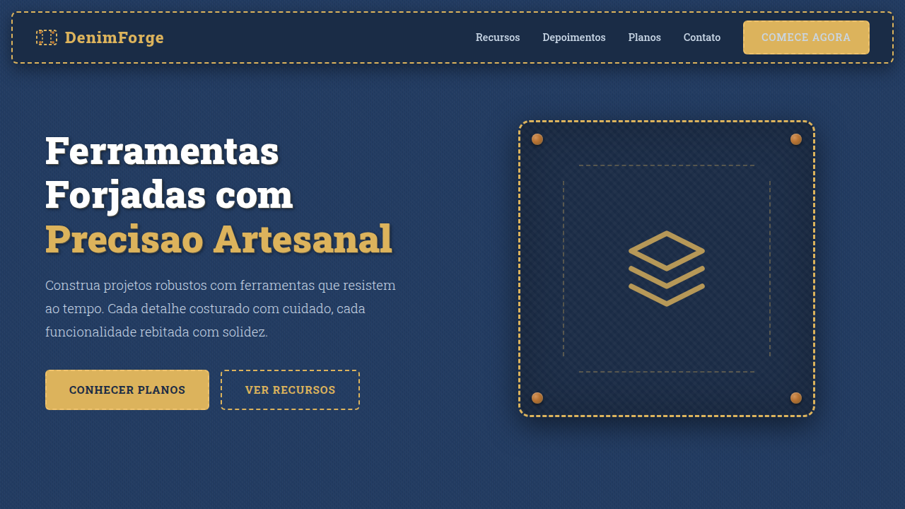
- Dark canvas with high-contrast linework — deep navy or near-black backgrounds with cyan, white, or amber strokes that reference plotter output
- Monospaced typography as default — technical data demands fixed-width type; proportional fonts feel imprecise in this context
- Grid as visible infrastructure — expose the underlying coordinate system rather than hiding it; the grid IS the design
- Annotation-driven hierarchy — use dimension lines, callouts, and technical labels to guide attention instead of conventional UI patterns like cards or shadows
Technical Specs
Colors
Primary
Secondary
Effects
Mechanical gear motifs, flowchart connectors, modular blocks, white square mesh overlay, precise fine-line vector grid.
Light/Dark
✗ No / ✓ Full
Related
Last synced: 4/1/2026