Brutalismo Urbano Expressivo
Design an edgy and expressive brutalist landing page for an urban art and streetwear store. Ideal for landing pages, modern websites. AI-ready template.
Use case: Landing pages, Modern websites
Historical Context
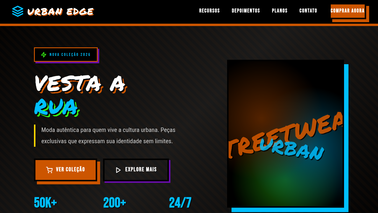
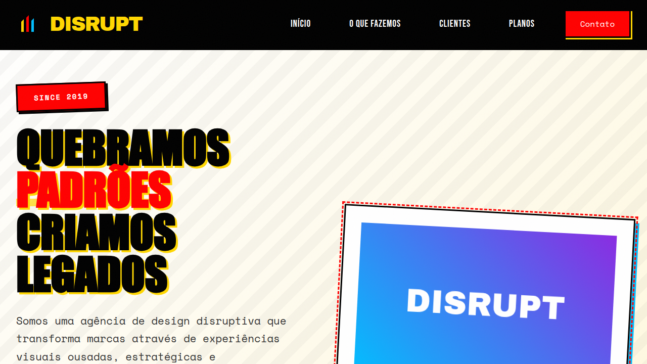
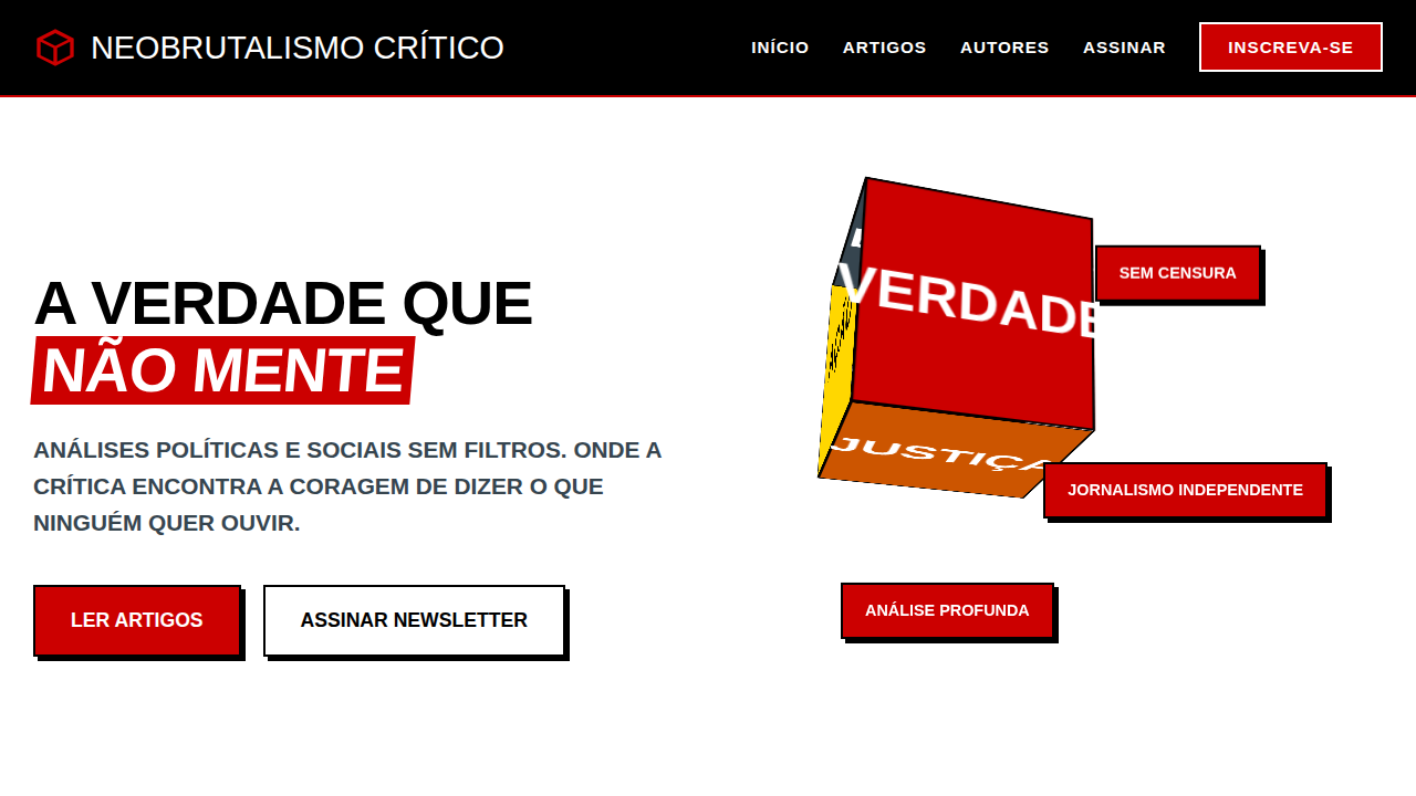
Graffiti never asked for permission. It showed up on concrete walls, train cars, shuttered storefronts — raw, loud, unapologetic. When streetwear brands started building websites in the early 2000s, the smart ones didn't sanitize that energy. They brought the grit straight to the screen. Stüssy's early web presence felt like a zine. Supreme treated their site like a wheat-paste poster. The typography was aggressive, the layouts were deliberately off-kilter, and whitespace was something that happened to other people. Urban brutalism in digital design isn't about being ugly — it's about being honest. It borrows from the same impulse that drives a writer to tag a wall at 3am: the need to mark territory, to exist loudly in a space that wasn't designed for you. The aesthetic pulls from hand-drawn lettering, spray-paint texture, photocopy degradation, and the chaotic layering you see on a construction site hoarding covered in six months of posters. This approach rejects the polished minimalism that dominates most e-commerce. It says: our audience doesn't want calm. They want energy. They want something that feels like the street smells — diesel, paint, concrete dust.
When to Use
When your brand lives in the margins. Streetwear drops, skate shop lookbooks, hip-hop event pages, urban art collectives, zine publishers. Any project where polish equals death and your audience reads authenticity in the imperfections. Works best when the content itself is bold enough to survive the visual noise — weak messaging gets eaten alive by this aesthetic. Not for brands that need to whisper. This is for brands that shout.
Design Principles
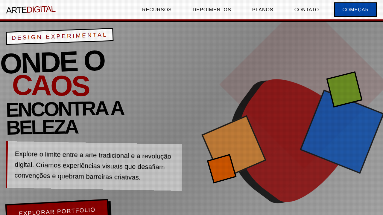
- Layer like a wall — stack elements with overlap, collision, and intentional visual tension. Nothing sits politely in its box.
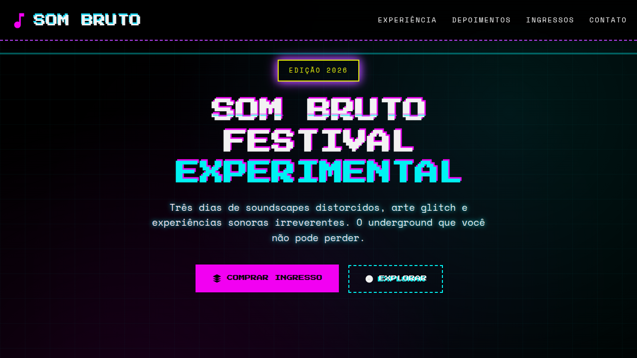
- Typography is territory — use type as a weapon. Oversized, distorted, hand-drawn, stenciled. Mix weights and styles like a wall covered in competing tags.
- Texture is non-negotiable — grain, noise, spray-paint spatter, concrete, photocopy artifacts. If it looks too clean, you've failed.
- Color hits hard or stays out — high-contrast palettes pulled from spray cans. Neon on black. Red on raw concrete. No pastels, no gradients, no comfort.
- Embrace the unfinished — exposed grids, visible construction marks, elements that bleed off-screen. The design should feel like it's still happening.
Technical Specs
Colors
Primary
Secondary
Effects
Texturas de parede de concreto, tipografia de stencil e grafite, imagens de arte de rua em grande escala, elementos de interface com "rasgos" ou "desgastes", micro-interações de hover com efeitos de spray, animações de transição de elementos bruscas.
Light/Dark
✓ Full / ✗ No
Related
Last synced: 4/1/2026