Bold Signal
Bold, confident dark landing page. Ideal for creative agencies, startups tech, portfolios de design, apresentações corporativas. AI-ready template.
Use case: Creative agencies, Startups tech, Portfolios de design, Apresentações corporativas
Historical Context
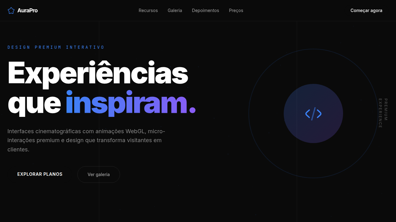
There's a moment in every design era where whisper stops working. The mid-2010s had it — everyone got quiet, minimal, polite. Thin type. Muted palettes. Careful spacing. And then the pendulum swung hard. Balenciaga's campaigns hit billboards with raw, oversized Helvetica on nothing. Brutalist web design stopped apologizing. Suddenly, taking up space wasn't arrogance — it was clarity. The bold signal movement isn't about volume for volume's sake. It's a rejection of the idea that sophistication requires restraint. Some messages deserve to land like a fist on a table. Oversized type, high-contrast color, zero ornamentation — these choices say "we know exactly what we are." No hedge. No maybe. This lineage runs through punk zines, through Barbara Kruger, through early Nike editorial. It's design that refuses to be scrolled past. Not loud — direct. There's a difference, and the best bold work knows it.
When to Use
When the brand has something to say and isn't interested in saying it quietly. Startups that need to own a position on day one. Challenger brands picking fights with incumbents. Product launches where the message is the differentiator, not the feature list. Any context where being forgettable is more dangerous than being polarizing. Works best when paired with editorial restraint — bold needs negative space to breathe, or it becomes noise.
Design Principles
- One message per surface. Bold fails when it competes with itself — pick the single thing that matters and give it everything.
- Contrast is the mechanism, not decoration. Size differences, weight differences, color differences — each one carries semantic meaning.
- Negative space is structural. The emptiness around bold elements isn't wasted — it's what makes the signal readable at speed.
- Typography does the heavy lifting. When type is confident enough, you don't need illustration, photography, or ornament to fill the silence.
- Confidence means commitment. No gradients softening the edges, no rounded corners hedging the tone. Sharp. Flat. Final.
Technical Specs
Colors
Primary
Secondary
Effects
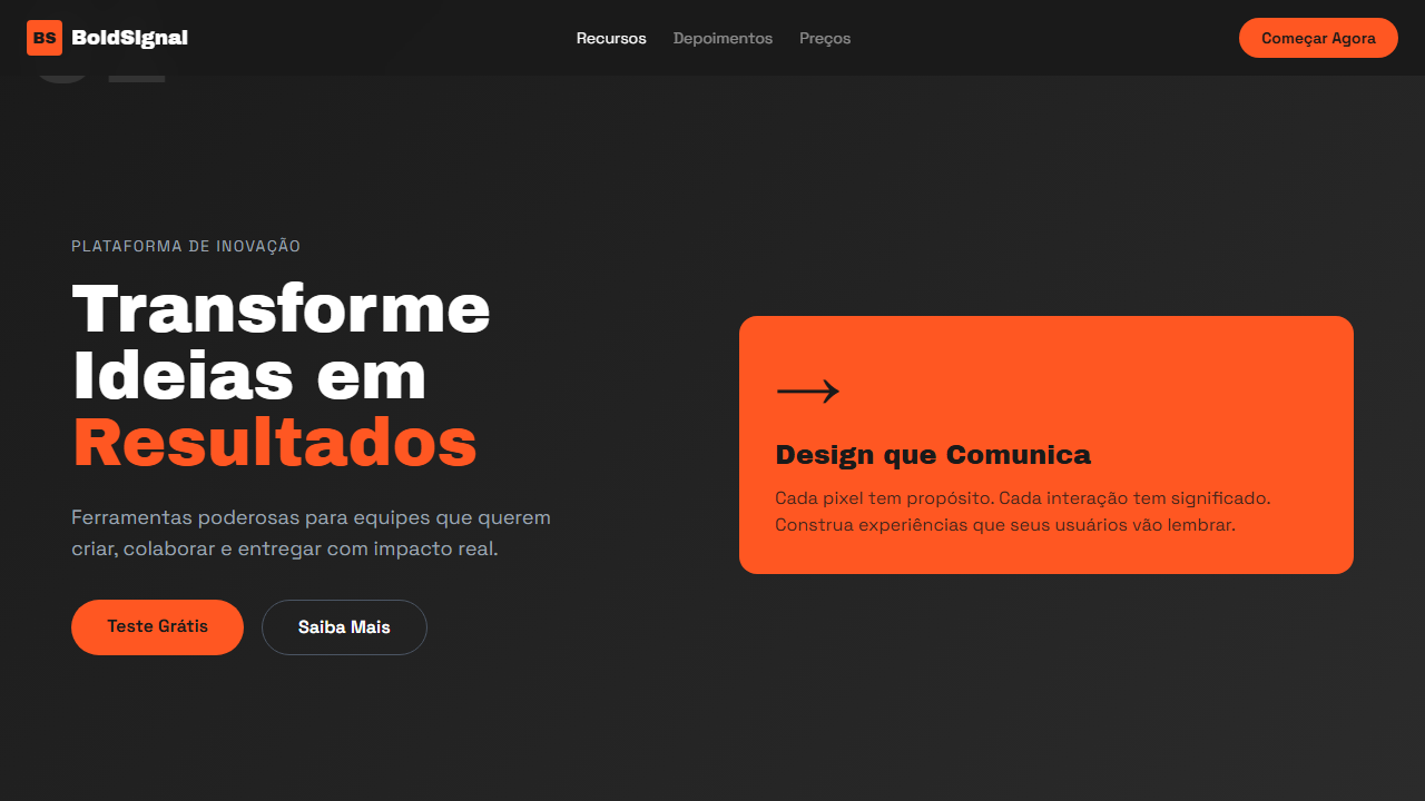
Bold colored card as focal point, large section numbers (01, 02), navigation breadcrumbs with opacity states, grid-based layout, smooth hover transitions 250ms
Light/Dark
✗ No / ✓ Full
Related
Last synced: 4/1/2026