Bold Portfolio Hero
Bold portfolio hero with vertical gradient from red-orange #fd2601 to orange #f37e1c. Ideal for creative portfolios, designers freelancer, agências de branding, sites pessoais de artistas. AI-ready template.
Use case: Creative portfolios, Designers freelancer, Agências de branding, Sites pessoais de artistas
Historical Context
The bold portfolio hero traces its lineage to the poster art movements of the 1960s and 70s — Polish film posters, psychedelic concert bills, Italian Futurist typography. These weren't polite compositions. They grabbed you by the collar. The red-orange gradient specifically echoes the heat of letterpress overprinting, where overlapping inks created accidental warmth that designers eventually learned to weaponize. When the web matured past its fear of color in the mid-2010s, portfolio sites started reclaiming this energy. Designers like Mike Dempsey and studios like Sagmeister & Walsh proved that a hero section could function as a manifesto — not just a header. The gradient became shorthand for creative confidence, a deliberate rejection of the safe navy-to-teal palettes that enterprise SaaS had colonized. Today this pattern persists because it solves a real problem: creative professionals need their site to do the selling before a single project thumbnail loads. The hero IS the portfolio piece.
When to Use
Deploy this when the work speaks loud and the designer needs to match that volume. Art directors presenting campaign work. Illustrators whose style already lives in saturated color. Anyone whose portfolio would feel dishonest wrapped in minimalist restraint. Skip it if the work is quiet, editorial, or typographic — you'll create a tonal mismatch that undermines both the hero and the projects below. This pattern demands that your personality can back up the visual aggression.
Design Principles
- Gradient as identity, not decoration — the red-orange sweep should feel like a signature, not a Figma default. Shift the stops asymmetrically.
- Typography carries weight literally — use display faces at sizes that make you slightly uncomfortable. If it feels safe, go bigger.
- Negative space is structural, not leftover — the boldness only reads as intentional when surrounded by deliberate emptiness.
- Motion earns attention or steals it — any animation must feel like a creative choice, not a loading state. Prefer reveals over loops.
- Contrast hierarchy is non-negotiable — with this much chromatic intensity, your text must either punch through at full opacity or disappear entirely. No muddy middle ground.
Technical Specs
Colors
Primary
Secondary
Effects
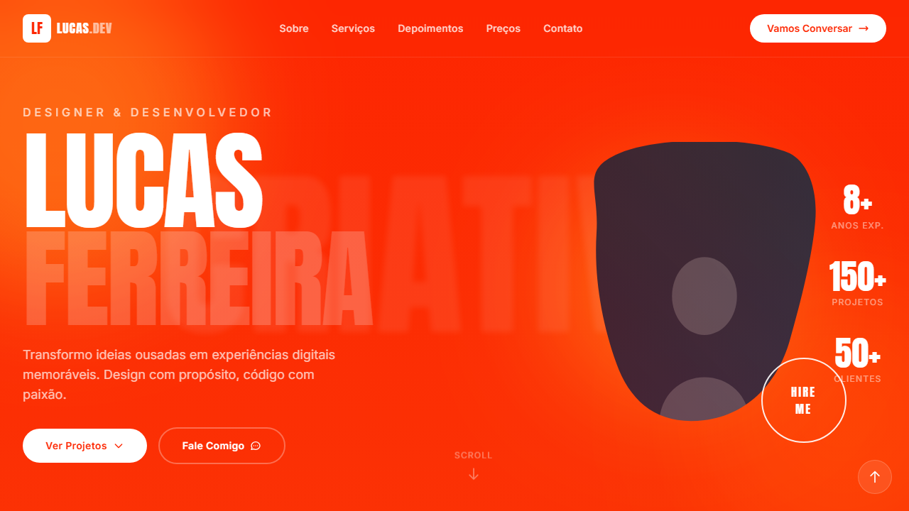
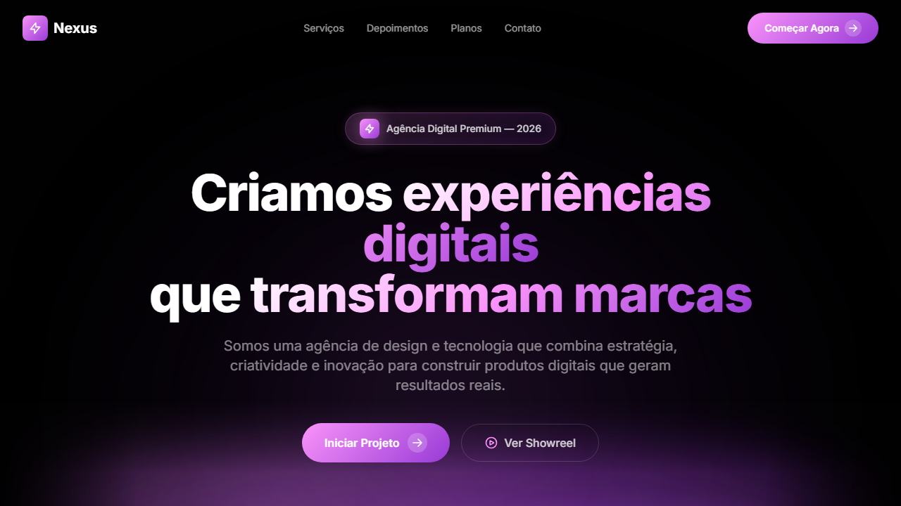
VÍDEO: Este estilo não utiliza vídeo de fundo. O impacto visual vem do gradiente vibrante vermelho-laranja (#fd2601 para #f37e1c), tipografia massiva Anton, imagem com CSS mask brush stroke, e blobs luminosos com mix-blend-screen. O fundo é puramente CSS com gradiente e efeitos de luz. | EFEITOS CSS: Gradiente vertical de vermelho-laranja para laranja como fundo, tipografia massiva (12vw, max 180px) com font Anton uppercase, imagem central com CSS mask (brush stroke shape) sobrepondo o texto criando profundidade, blobs luminosos (300-600px, blur 80px, mix-blend-screen, opacity-60), texto SVG gigante no fundo (opacity 0.08, blur 4px), botão HIRE ME circular com borda branca e hover fill branco, brand strip de logos na parte inferior
Light/Dark
✗ Not Recommended / ✓ Full
Related
Last synced: 4/1/2026