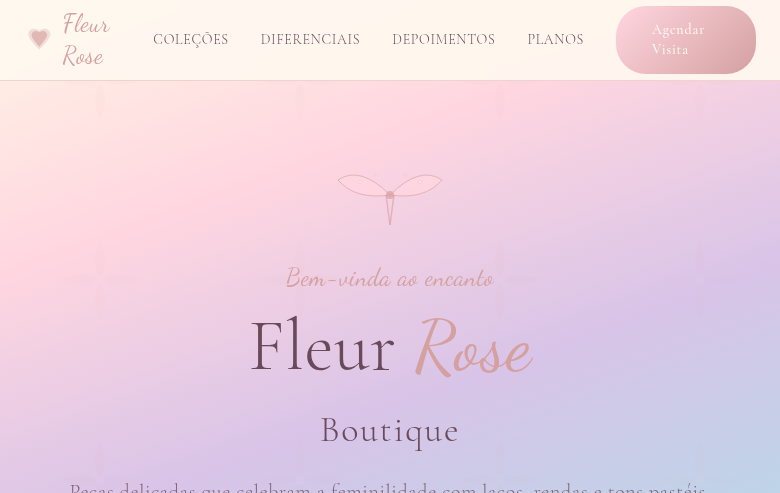
Bohemian (Boho)
Bohemian landing page with vibrant yet muted earthy tones. Ideal for branding de eventos, linhas de moda, produtos lifestyle, marcas de viagem. AI-ready template.
Use case: Branding de eventos, Linhas de moda, Produtos lifestyle, Marcas de viagem
Historical Context
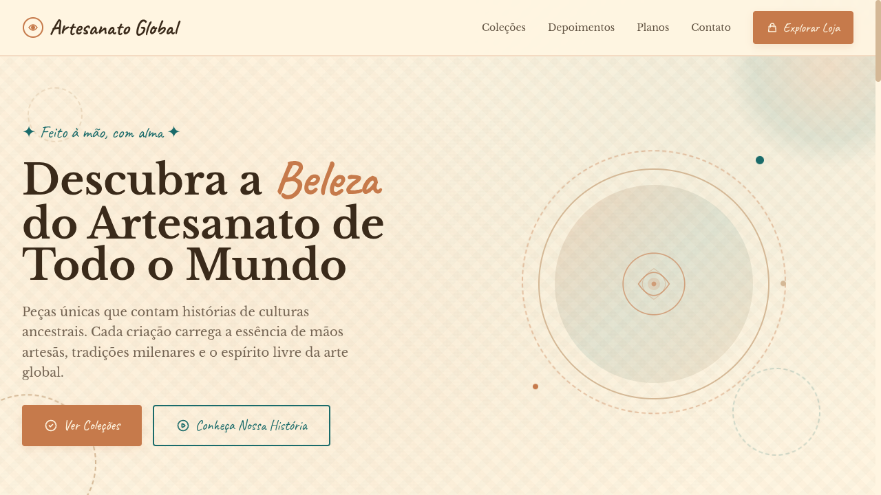
Bohemian visual language didn't emerge from a design studio — it crawled out of 19th-century Parisian garrets where artists, writers, and Roma travelers rejected bourgeois aesthetics in favor of layered, imperfect beauty. The term itself comes from French society's assumption that Romani people originated in Bohemia, and the artists who lived like them — broke, nomadic, deliberately unkempt — adopted the label as a badge of honor. William Morris and the Arts & Crafts movement formalized some of these instincts into repeating organic patterns, but boho always resisted full systematization. The 1960s and 70s counterculture gave it a second life. Moroccan tiles, Indian block prints, Turkish kilims, Guatemalan textiles — all got flattened into a Western aesthetic vocabulary that prioritized feeling over cultural specificity. This is the tension every designer working in boho must navigate: the style's power comes from its eclecticism, but eclecticism without intention is just appropriation with better typography. Today's boho sits in a more considered place. The best implementations use muted vibrancy — terracotta instead of orange, sage instead of green, dusty rose instead of pink — creating warmth without the visual noise that plagued early-2010s boho Pinterest boards.
When to Use
Reach for bohemian when your brand needs to feel handmade without looking amateur, or spiritual without sliding into new-age kitsch. It works when your audience values authenticity over polish — yoga studios, artisan marketplaces, slow-travel platforms, wellness brands that actually mean it. Boho falls apart instantly when applied to anything requiring trust signals around precision: fintech, healthcare, enterprise SaaS. If your product needs to feel reliable more than it needs to feel soulful, walk away from this palette entirely.
Design Principles
- Layer texture over flatness — linen paper grains, watercolor washes, hand-drawn line weights. Every surface should feel touched by a human hand, never rendered by default.
- Mute your vibrancy. Pure saturated hues read as craft-store, not craft. Pull every color toward earth: add brown to your oranges, grey to your greens, dust to your pinks.
- Embrace asymmetric composition. Boho rejects grid rigidity — offset your elements, let whitespace breathe unevenly, allow illustrations to break containers. Symmetry here reads as corporate cosplay.
- Mix pattern scales deliberately. Pair a large-scale floral with a tight geometric, a loose brushstroke with a precise mandala. Contrast in pattern density creates the eclectic richness that defines the style.
- Typography should feel collected, not designed. Combine a serif with visible personality (irregular stroke weights, soft terminals) alongside a handwritten or brush script — but never more than two decorative faces per layout. Restraint separates boho from chaos.
Technical Specs
Colors
Primary
Secondary
Effects
Layered textile-like textures (CSS patterns), hand-drawn style borders, warm gradient overlays, macramé-inspired decorative dividers via SVG, gentle parallax on background textures, earthy shadow tones
Light/Dark
✓ Full / ◐ Partial
Related
Last synced: 4/1/2026