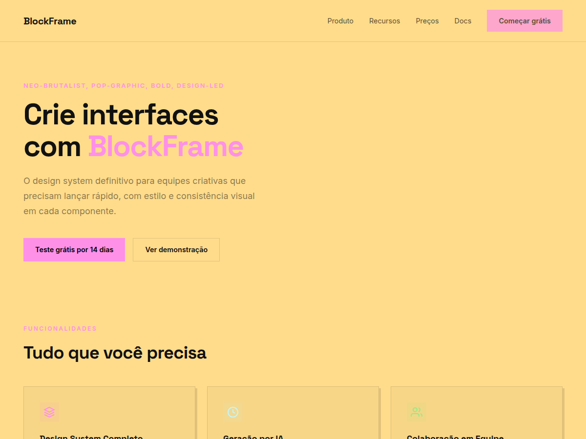
BlockFrame
BlockFrame — Neobrutalist deck with pastel-neon color blocks and chunky black borders. Space Grotesk typography. off-white background with neon pastel blocks (hot pink, sky blue, lime green, go. Best for creative agency pitch, indie SaaS launch, designer portfolio. AI-ready design system.
Use case: creative agency pitch, indie SaaS launch, designer portfolio, brand redesign, modern startup deck
Historical Context
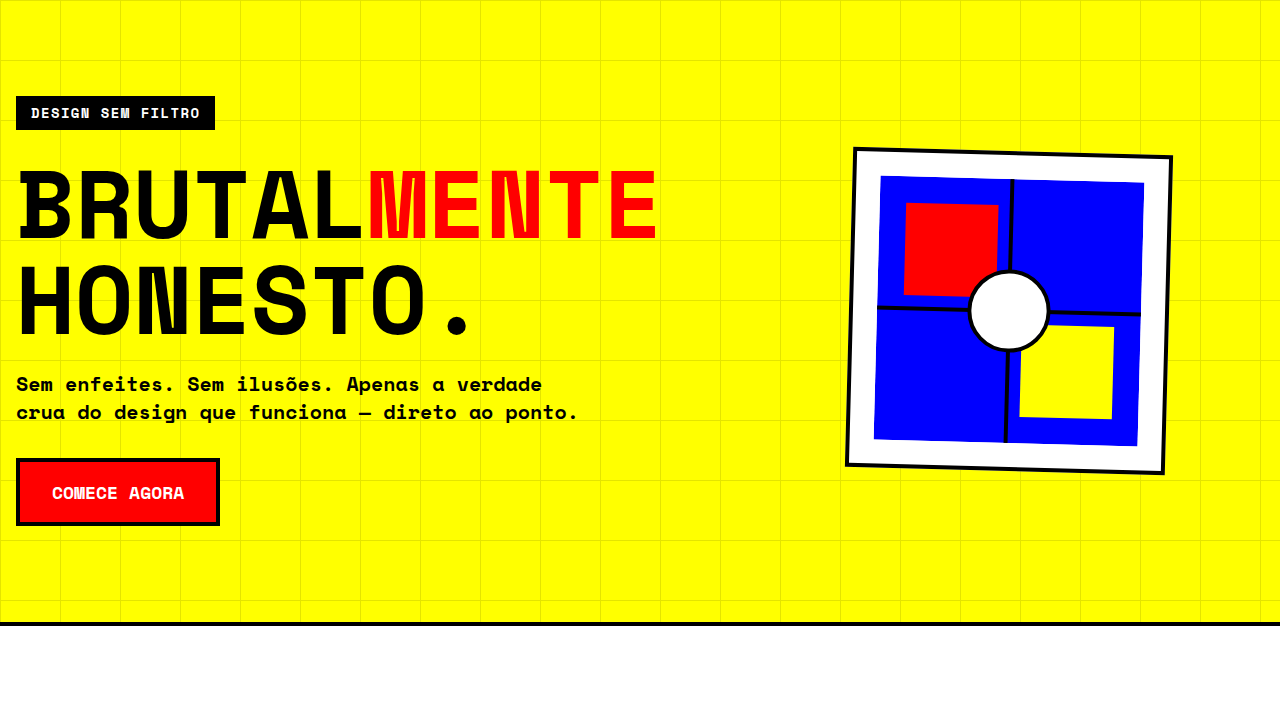
Brutalism in graphic design was never meant to be pretty — it was a rejection of the polished, the corporate, the safe. When it migrated to the web in the mid-2010s, it carried that same defiance: raw HTML energy, system fonts, borders that screamed rather than whispered. But something interesting happened around 2020. Designers started softening the edges — literally. Pastel backgrounds crept in. Neon accents replaced monochrome severity. The chunky borders stayed, but they became playful rather than aggressive. Neobrutalism was born from this tension. BlockFrame sits squarely in this lineage. It takes the structural honesty of brutalism — visible borders, flat surfaces, no pretense of depth — and wraps it in candy colors. The hard drop shadows aren't decorative; they're architectural. They tell you exactly where one element ends and another begins. There's no blur, no gradient trying to fake materiality. Every pixel knows its place. What makes this approach endure is its legibility. In an era of glassmorphism and blurred overlays competing for attention, neobrutalism cuts through by being unapologetically flat and loud. It's the design equivalent of speaking in a clear voice instead of whispering through frosted glass.
When to Use
BlockFrame works when your product refuses to take itself too seriously but still needs to function. Indie SaaS tools, creative platforms, Web3 projects that want to signal 'we're different' without resorting to dark-mode-everything. It's perfect for products where personality is a feature — where the interface itself communicates that this isn't another sterile enterprise dashboard. Avoid it for anything requiring gravitas: healthcare, finance, legal. The chunky borders and neon palette will fight you every step of the way if your users expect quiet professionalism.
Design Principles
- Borders are structural, not decorative — use consistent 2-4px solid strokes to define hierarchy, never as afterthought ornamentation
- Shadows are flat and offset, never blurred — hard drop shadows (4-8px) in a single direction create depth without faking three-dimensionality
- Color is bold but controlled — pair one pastel background with one neon accent maximum per component; restraint prevents carnival
- Typography is chunky and confident — heavy weights, tight tracking, generous size contrast between headings and body to match the weight of the borders
- Whitespace is generous inside, tight outside — pad interiors liberally but let components sit close together so the border grid reads as a cohesive system
Technical Specs
Colors
Primary
Secondary
Effects
display font Space Grotesk for hero headlines, bold hover color shift (150ms), high-contrast active states, chunky 3px black borders, offset box-shadow brutalist cards, dense grid, compact 1.2rem gaps
Light/Dark
✓ Full / ✗ None
Related
Last synced: 5/6/2026