Biomimetic / Organic 2.0
Biomimetic organic interface. Ideal for landing pages, saas. AI-ready template.
Use case: Landing pages, SaaS
Historical Context
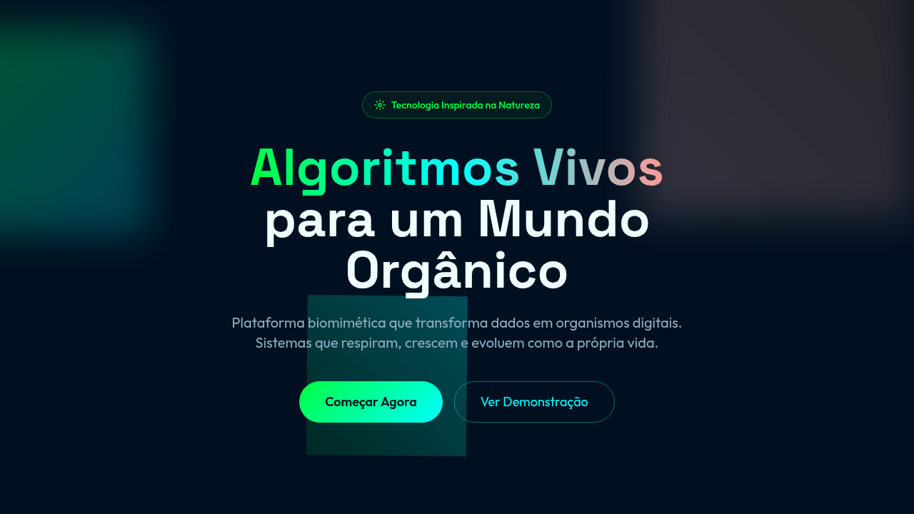
Designers have always stolen from nature. Buckminster Fuller's geodesic domes, Frei Otto's soap-film tensile structures, the Voronoi diagrams that showed up in everything from architecture to textile design — biomimicry isn't new. What changed is the tooling. Around 2018, creative coders started pushing p5.js and Three.js beyond demo reels into production interfaces. Reaction-diffusion patterns, L-systems, flocking algorithms — suddenly these weren't just generative art experiments. They were navigation systems, data visualizations, brand identities. The math that describes how cells divide or how slime mold finds the shortest path became a legitimate design language. Organic 2.0 is the maturation of that moment. It's not about slapping a leaf texture on a card component. It's algorithmic: growth patterns that respond to data, fluid simulations driven by user input, cellular structures that reorganize based on content density. The aesthetic emerges from rules, not decoration. Nature as system logic, not surface treatment.
When to Use
Reach for this when your product lives in the space between science and wonder. Biotech platforms explaining CRISPR to investors. Sustainability dashboards that need to feel alive without feeling frivolous. Generative art marketplaces. Research tools where the complexity of the subject demands an interface that breathes rather than grids everything into submission. Skip it for fintech, skip it for B2B SaaS dashboards — unless you want your CFO asking why the quarterly report is pulsating.
Design Principles
- Growth over placement — let elements emerge from algorithmic rules rather than fixed coordinates. Position is a result, not a decision.
- Imperfection is the point — embrace asymmetry, irregular edges, and organic variation. If every cell in your Voronoi grid is the same size, you've missed it entirely.
- Motion reveals structure — use animation to show how forms were generated. The process is the aesthetic. Static screenshots should feel like paused simulations.
- Data as nutrient — feed real information into your generative systems. The visualization should change shape when the underlying data changes, not just swap colors.
- Constraint breeds life — the most convincing organic systems come from simple rules applied recursively. Three parameters creating infinite variation beats fifty hand-tuned states.
Technical Specs
Colors
Primary
Secondary
Effects
Breathing animations, fluid morphing, generative growth, physics-based movement
Light/Dark
✓ Full / ✓ Full
Related


Last synced: 4/1/2026