Bento Portfólio de Produto
Visual and organized Bento Style landing page for a product designer portfolio. Ideal for landing pages, modern websites. AI-ready template.
Use case: Landing pages, Modern websites
Historical Context
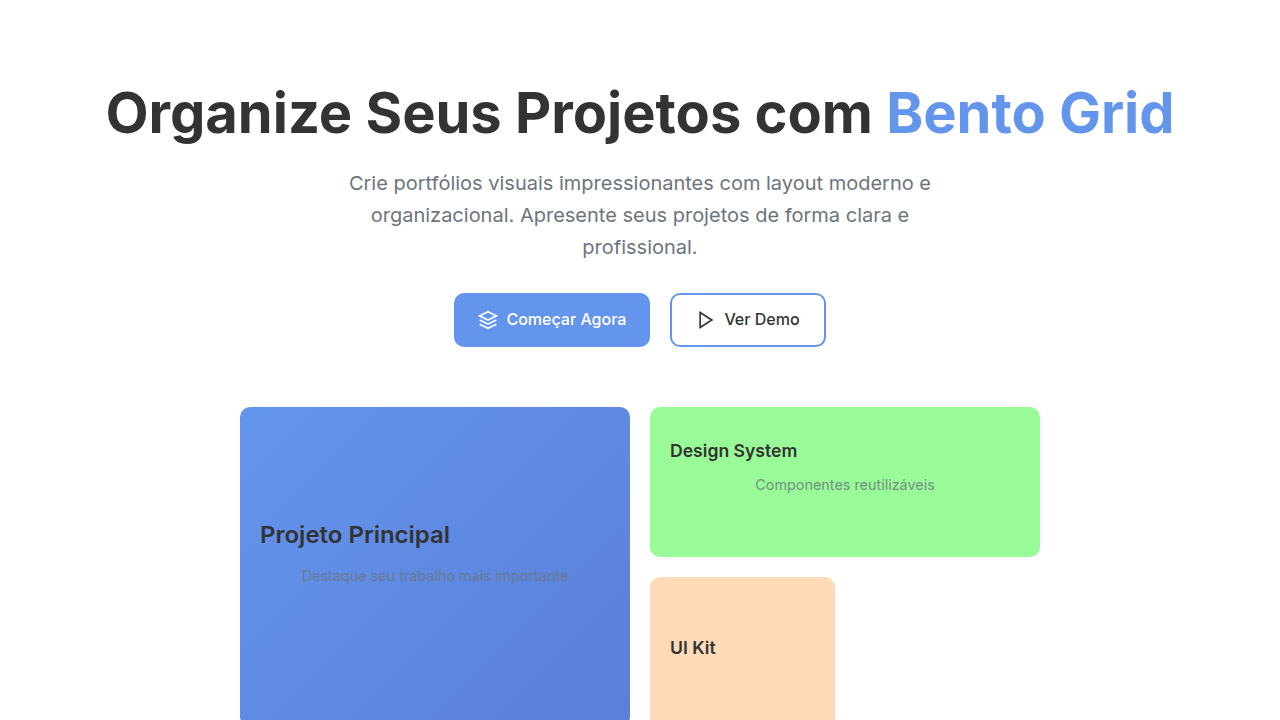
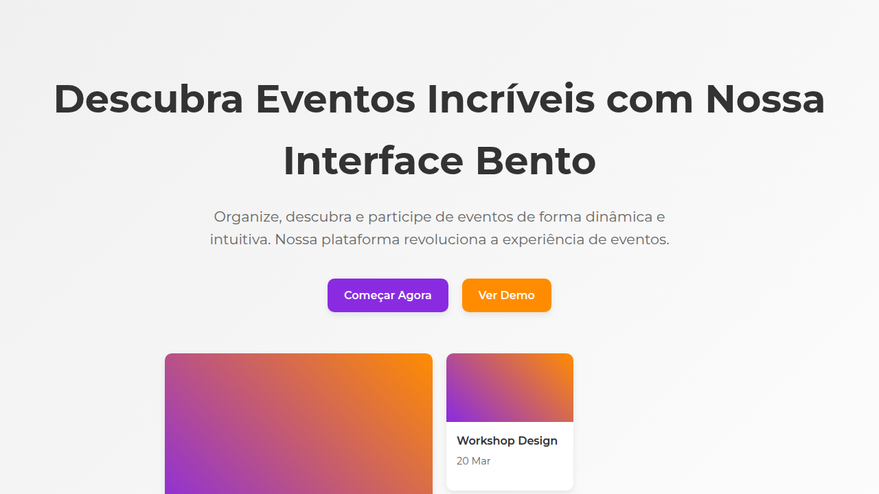
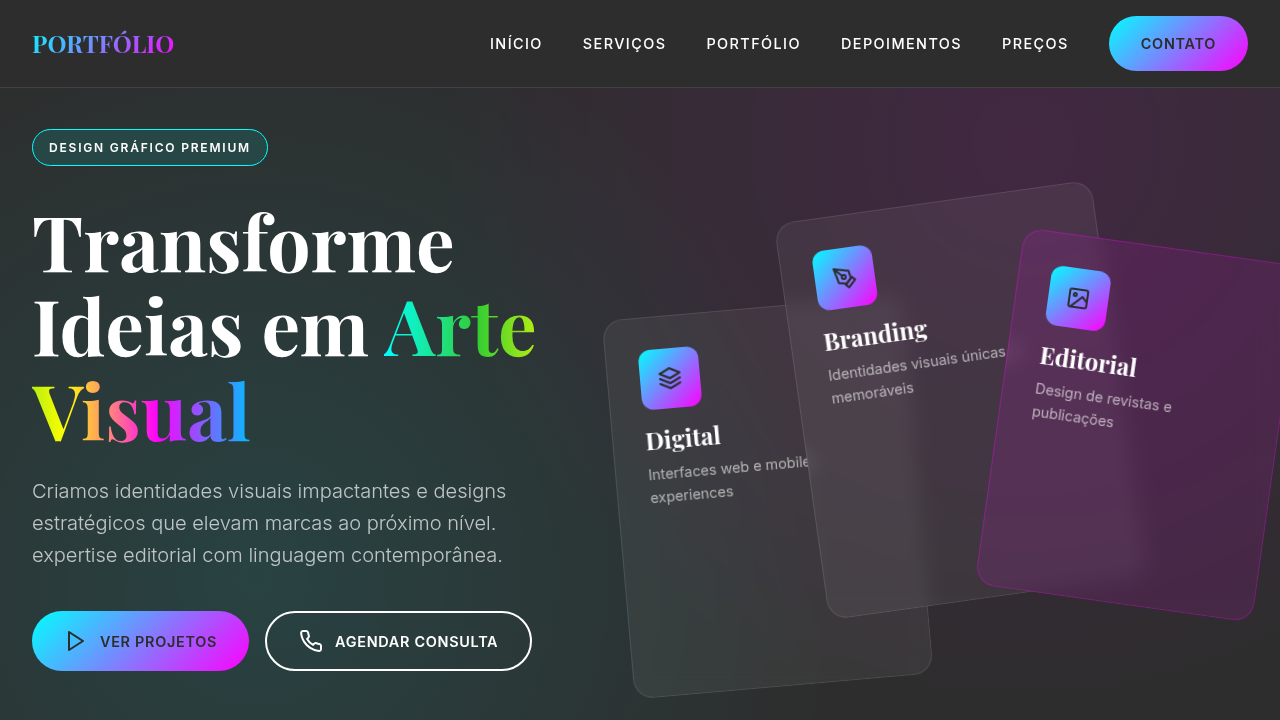
Apple's product pages changed everything. Before 2012, portfolios were slideshows — linear, predictable, forgettable. Then Cupertino started breaking features into discrete visual moments: a camera module gets its own full-bleed block, a chip gets a dark cinematic panel, battery life gets breathing room. Each section fought for attention independently. Designers noticed. The bento grid became the natural translation of that philosophy into portfolio work. Instead of forcing products into uniform cards, you give each piece the container it deserves. A hero shot spans two columns. A detail crop sits tight in a square. Typography anchors the negative space between. The grid isn't decorative — it's editorial hierarchy applied to product storytelling. What makes this different from a generic masonry layout: intentionality. Every cell size is a decision about importance. The large panel says "this is the headline." The small ones say "context, texture, proof." Product portfolios finally started feeling like magazine spreads instead of image dumps.
When to Use
When your product needs to breathe. Feature presentations where each capability deserves its own moment. Design portfolios that need to show range without visual monotony. Product showcases where you're selling craft, not just listing specs. Particularly effective when you have mixed media — photography alongside typography alongside data — and need them to coexist without hierarchy collapse. Skip it for single-product landing pages with one story to tell linearly.
Design Principles
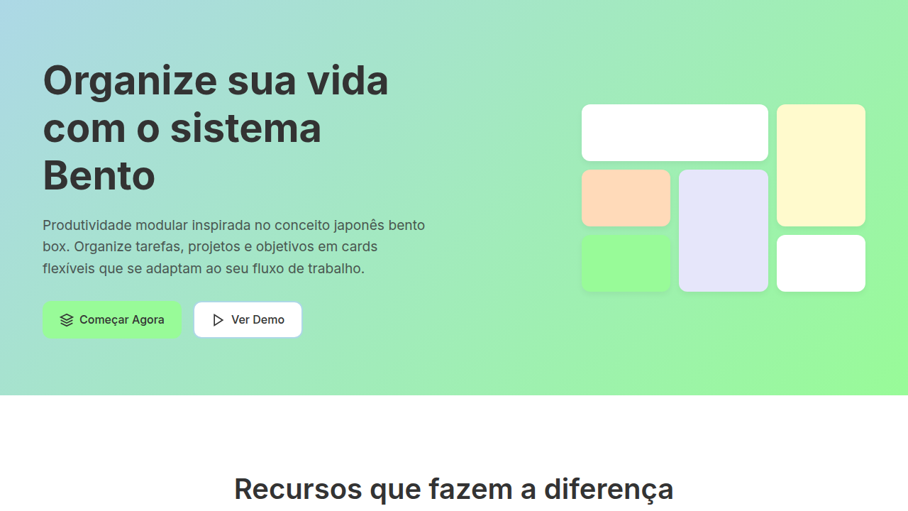
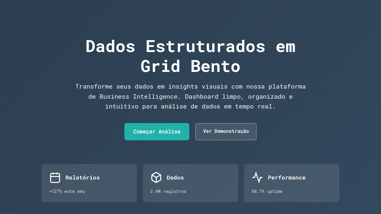
- Cell size encodes hierarchy — the grid is your editorial voice, not a neutral container. Large panels are headlines, small panels are supporting evidence.
- Let typography do structural work. A bold type-only cell between product shots creates rhythm breaks that prevent visual fatigue across the grid.
- Maintain consistent gutter width religiously. The white space between cells is what makes bento feel intentional rather than broken — 16px or 24px, pick one, never mix.
- Contrast density across cells. Pair a visually dense product photograph against a minimal text-only block. The tension between full and empty is what creates the magazine quality.
- Limit your palette to three cell aspect ratios maximum. Square, 2:1 landscape, and 1:2 portrait cover every product storytelling need without the grid feeling chaotic.
Technical Specs
Colors
Primary
Secondary
Effects
Layouts de grid "Bento" para apresentação de projetos, cards com miniaturas de projetos e descrições concisas, tipografia sans-serif limpa, ícones de processo minimalistas, micro-interações de hover com pré-visualização de projeto, transições de elementos suaves e focadas, foco na organização e detalhes do projeto.
Light/Dark
✓ Full / ✗ No
Related
Last synced: 4/1/2026