Bento Grid
Bento Grid landing page inspired by Japanese bento boxes and Apple's design language. Ideal for ui/ux, dashboards, portfólios, web design limpo, branding de produtos apple. AI-ready template.
Use case: UI/UX, Dashboards, Portfólios, Web design limpo, Branding de produtos Apple
Historical Context
The bento grid didn't emerge from some design system committee. It came from Japanese lunch boxes — compartmentalized, purposeful, every section earning its space. Apple's marketing pages around 2020-2022 made the pattern unavoidable: asymmetric cards of varying heights and widths, each one a self-contained story. Suddenly every SaaS landing page wanted that same energy. What makes bento work where traditional grids feel rigid is the deliberate breaking of uniformity. A 2×2 card sits next to a 1×1. A tall vertical piece anchors the left while three small squares stack on the right. The asymmetry isn't random — it's editorial hierarchy expressed through spatial proportion. The bigger the card, the bigger the idea. The pattern matured quickly. Early implementations were just CSS Grid with span tricks. The good ones today treat each cell as a micro-composition — its own typographic hierarchy, its own breathing room, its own moment. The grid is the scaffolding, not the design.
When to Use
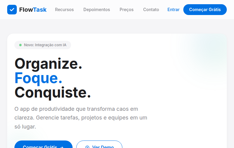
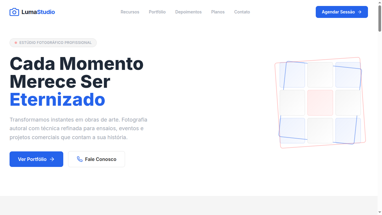
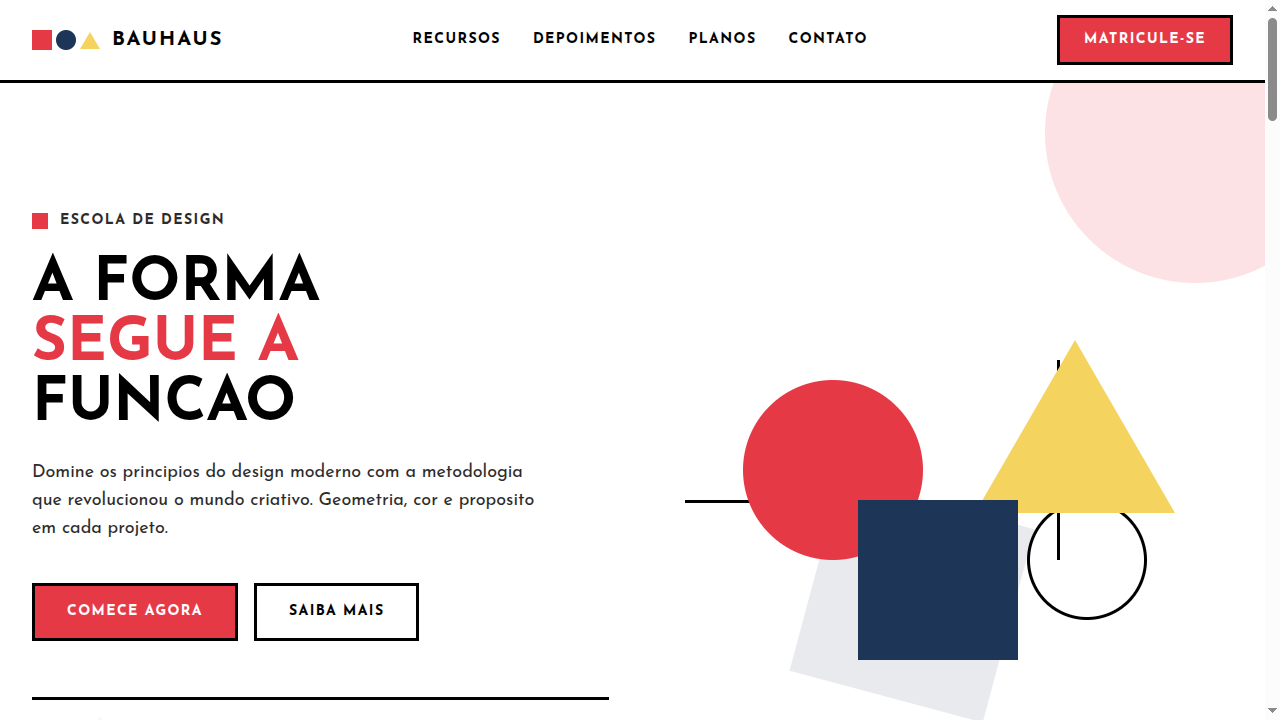
Bento grids shine when you have 4-8 features of unequal importance and need to communicate hierarchy without numbering things. Perfect for product marketing pages where one hero feature deserves twice the visual weight. Use them for SaaS feature overviews, product showcases, and any layout where you'd otherwise resort to a boring alternating left-right section pattern. Skip them for content that's genuinely equal in weight — that's what uniform grids are for.
Design Principles
- Size encodes importance — the largest cell carries the primary message, never waste a 2×2 on secondary content
- Each cell is a self-contained composition with its own internal typographic hierarchy, padding, and focal point
- Maintain consistent gap values across the entire grid; the whitespace between cells is what makes the pattern read as unified rather than chaotic
- Limit your grid to 2-3 distinct cell sizes maximum — too many proportions destroy the rhythm and make the layout feel accidental rather than designed
- Content density must vary with cell size: large cells get breathing room and illustration, small cells get tight copy and an icon at most
Technical Specs
Colors
Primary
Secondary
Effects
CSS grid with varying span sizes (1x1, 2x1, 1x2, 2x2), uniform gap (12-16px), subtle rounded corners (16-20px), very soft shadows (0 2px 8px rgba(0,0,0,0.04)), smooth hover lift (translateY -2px), clean compartment borders
Light/Dark
✓ Full / ✓ Full
Related
Last synced: 4/1/2026